I have a framework that I find very helpful in teaching my apprentices how to design. It’s 3 steps:
Here are the details.
1. Imitate
The first step to being just a competent designer—or a competent anything, for that matter—is doing what someone else can do. It’s a test: can you follow directions? Except, instead of following directions you read or hear, you follow directions that you see.
It’s no coincidence that junior designers often get trained up by doing production work after an art director has set an art direction. If the art director makes the main headline 48px bold Helvetica with 16px of margin on each side, do you do the same on every screen you design? Sounds simple, but many junior designers struggle to even get this down. Why? Many want to be chefs but aren’t willing to be line cooks first. It’s not glamorous work, but it builds design muscles, muscles that you’ll need in order to get better and advance to the next step.
Think of it like learning to draw by tracing. In fact, it’s literally the same thing. The first few assignments of my designers’ apprenticeships are taking screenshots of existing websites, pasting them into Sketch or Photoshop, dropping the opacity and locking the layer, and tracing over it to produce the same layout, colors, illustrations, typography, and everything else needed to reproduce the site pixel for pixel.
In his article Copy If You Can: Improving Your UI Design Skills With Copywork, Erik Kennedy extols the virtues of copywork as a great way to practice and hone UI design skills. Even more, it gets you out of going to your usual bag of tricks and instead gives you new ones to add.
Done right, copywork exposes you to design decisions you simply wouldn’t have made on your own.
Erik Kennedy
Whether new to design or a seasoned creative director, this simple exercise will get you warmed up, like stretching before a long run.
2. Remix
Once you can confidently imitate any style you come across, you can start to tweak the elements to feel more custom to the way you need to use it. This step has the least parameters and needs the least guidelines, because it’s up to your imagination and the amount of changes you’re willing to try.
I’m a firm believer in the idea that there’s nothing new under the sun. Said differently, everything is a remix. Freed from the pressure that all things designers do need to be original works of art, I can instead focus my efforts on what sources to combine in a unique way that my audience is less accustomed to.
3. Invent
Pablo Picasso is well known for his original Cubist work, but most people don’t know that he was an excellent classical artist first. He could draw and paint photorealism as well as any of the great masters, but it wasn’t until he got that down that he ventured into his own unknown stylistic territory.
In his Wall Street Journal article, The Genius of the Tinkerer, author Steven Johnson describes a concept he calls the adjacent possible. He tells the story of a young orthopedic surgeon who, while diving in the Great Barrier Reef, observes a species of coral that seem to be able to heal itself as it breaks. Years later, while operating on a patient, he recalls this coral and its amazing bonding powers. Several years and patents later, his method is the leading way that orthopedic surgeons around the world help their patients mend their broken bones.
The adjacent possible is about taking two seemingly unconnected ideas and metaphorically placing them next to each other to see how they might work together. Clients often hire me to invent unique and original art directions for them. I can deliver on this by using the adjacent possible to steal my way to something original.
The strange and beautiful truth about the adjacent possible is that its boundaries grow as you explore them. Each new combination opens up the possibility of other new combinations.
Steven Johnson
Let’s look at how this works in practice.
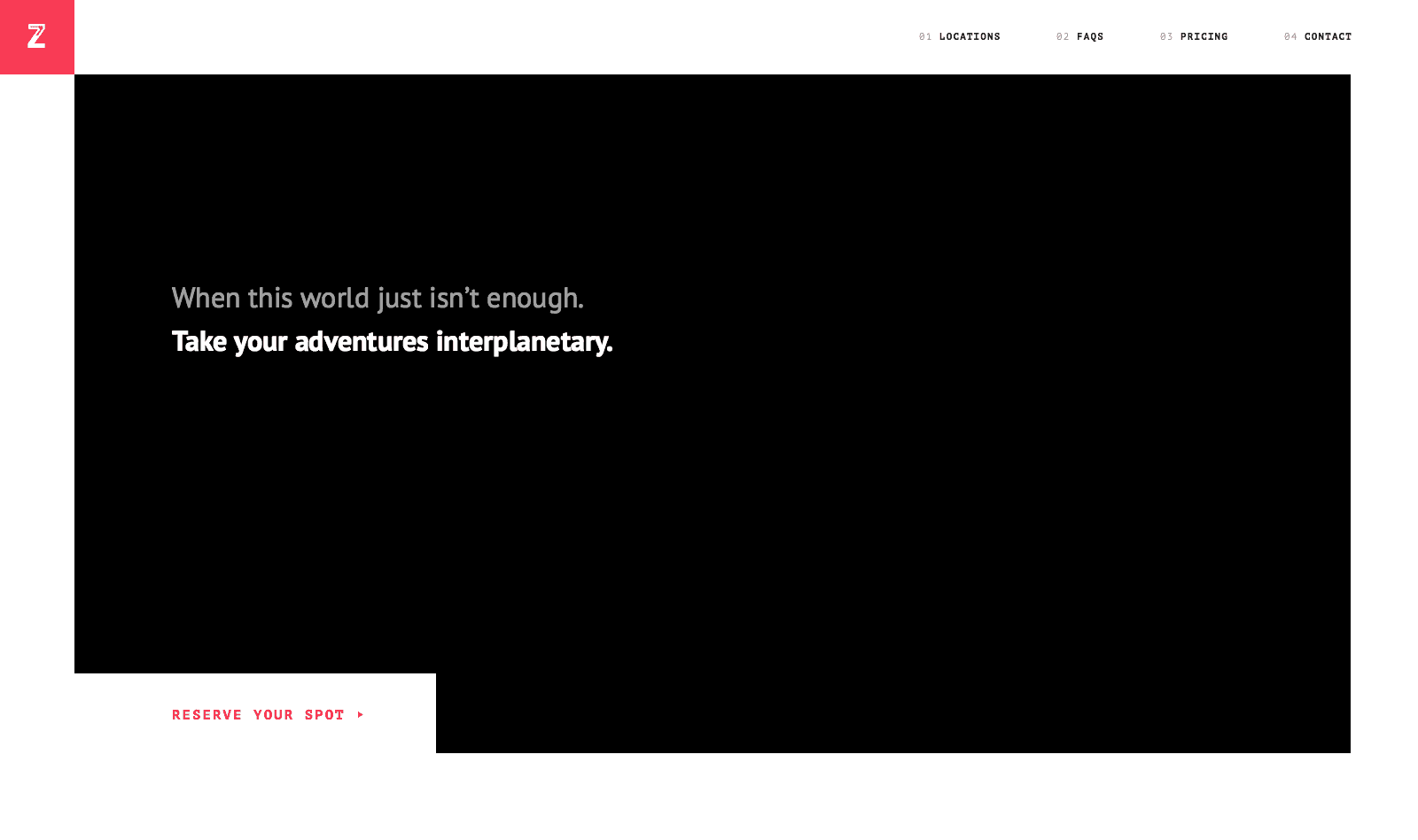
Say SpaceZzzz™ hired me to create a site to advertise a new service they’re offering: rental properties on different planets. They’d get you there, you stay as long as you’d like, and they’ll get you back. Think Uber meets Airbnb meets Interstellar.
The first thing I’ll do is make a list of all of the types of content I’ll need on the homepage. After talking to stakeholders and potential users in the target market, perhaps I’d arrive at 5 different sections:
- An elevator pitch about the new service
- A featured destination (or a few features)
- Some details about what people may be anxious about, like long travel or planetary accommodations
- Price
- Contact details
To start, I’ll block out these main sections with a few gray boxes.
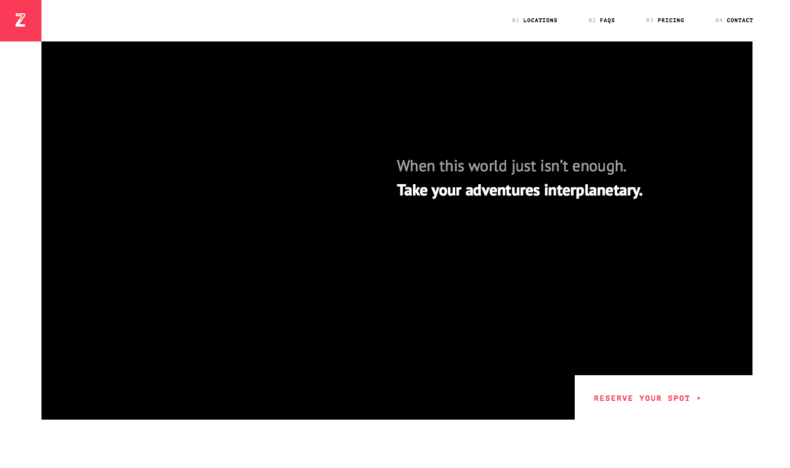
Next, I’ll start to choose a few reference sources to imitate. This is key: be sure to choose sources far away from what you’re designing. If you’re designing a bank site, don’t choose another bank site as reference, especially within the same competitive set. Since we may be modeling this after Airbnb, using Airbnb as a reference is probably too close to feel original. One trick I often use is to start smaller. Rather than try to use a whole page as a reference, I’ll pick a few different designs to source different elements from.
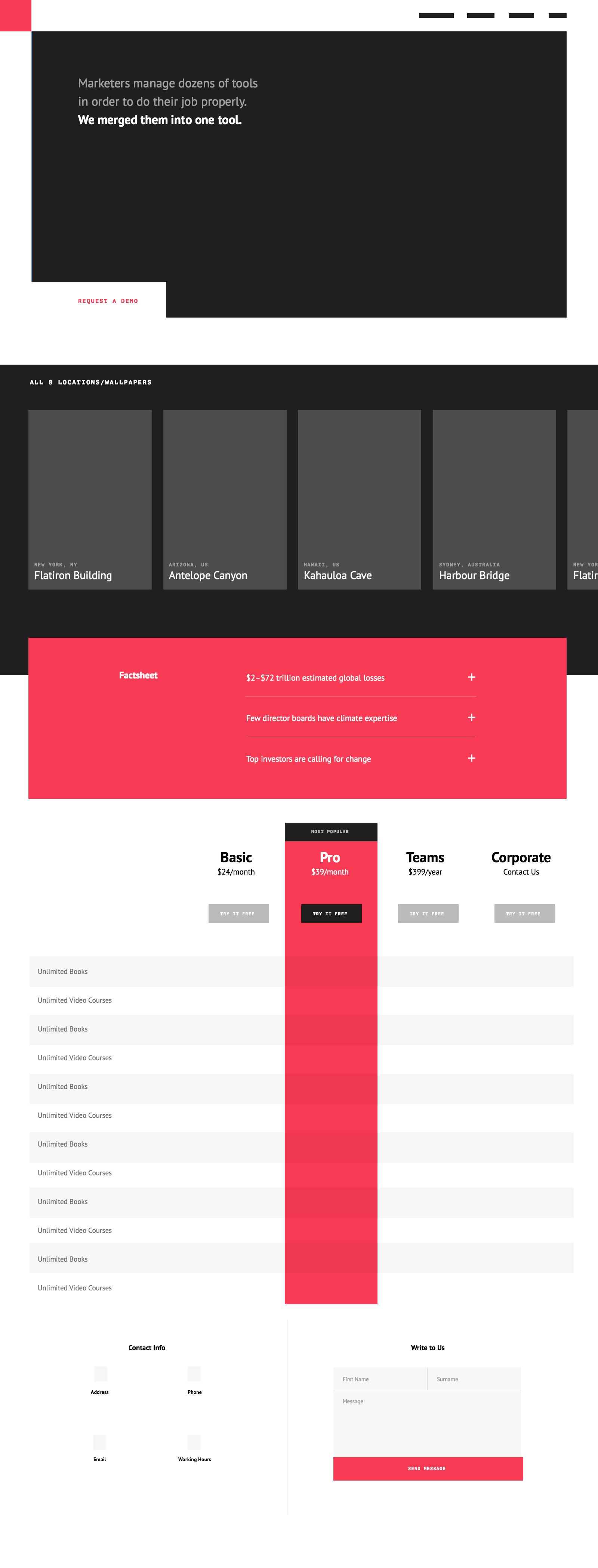
I’ll stub out each section by simply copying and pasting from my source material into my gray box document. (I’m using Photoshop for this example because it’s where I’m fastest, but you can use any design app you prefer.) This sets me up with something to imitate and remix.
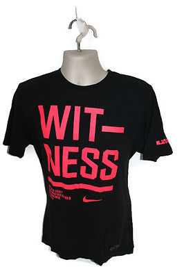
Next, I’ll trace over my stubbed-out version with simple shapes to get a feel for how it could work together. I’ll also start to remix a bit by choosing some new colors. I own this Nike Witness shirt and thought these colors would work well for this subject matter.
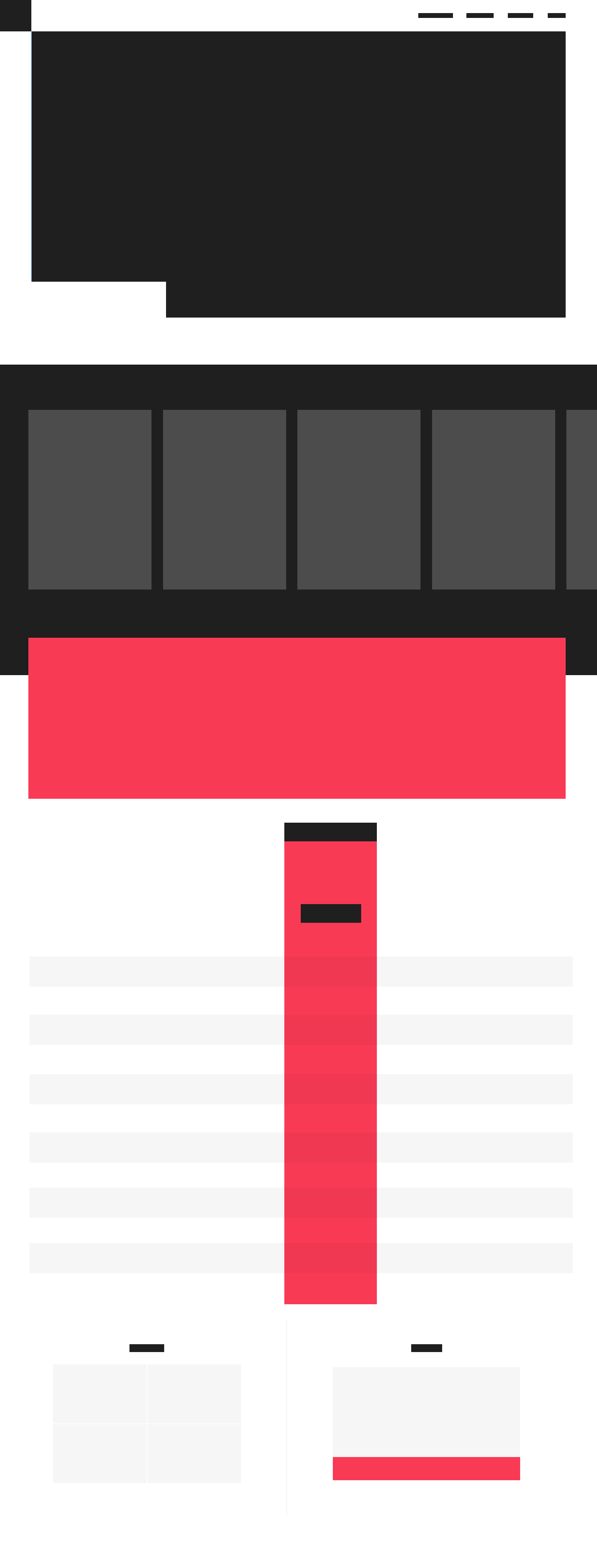
Now I’ll fill in some text content by tracing over the text of the original stubs, but trying to unify them by remixing them with the same typeface. I decide on PT Sans and PT Mono and use this stage to start working out some sizing of headlines and body copy to rough out my typographic hierarchy.
Now that I have a good approximation of all my content, I’ll start to draw a grid so I can organize that content appropriately. My approach to grids has always been to start with content and use the least amount of columns possible. Looking at the Locations section, that’s a pretty good candidate for 4 equal-width columns, so I’ll start there.
However, as I look at the top hero and FAQ areas, I realize that some of those headings need to start in the middle of a column, so I’ll split the 4-column grid into 8 columns instead.
I’ve written about using an 8-point grid before—which I’m using increasingly more in my own work—so all my spacings and type sizes here are a multiple of 8.
A 4-column grid

An 8-column grid
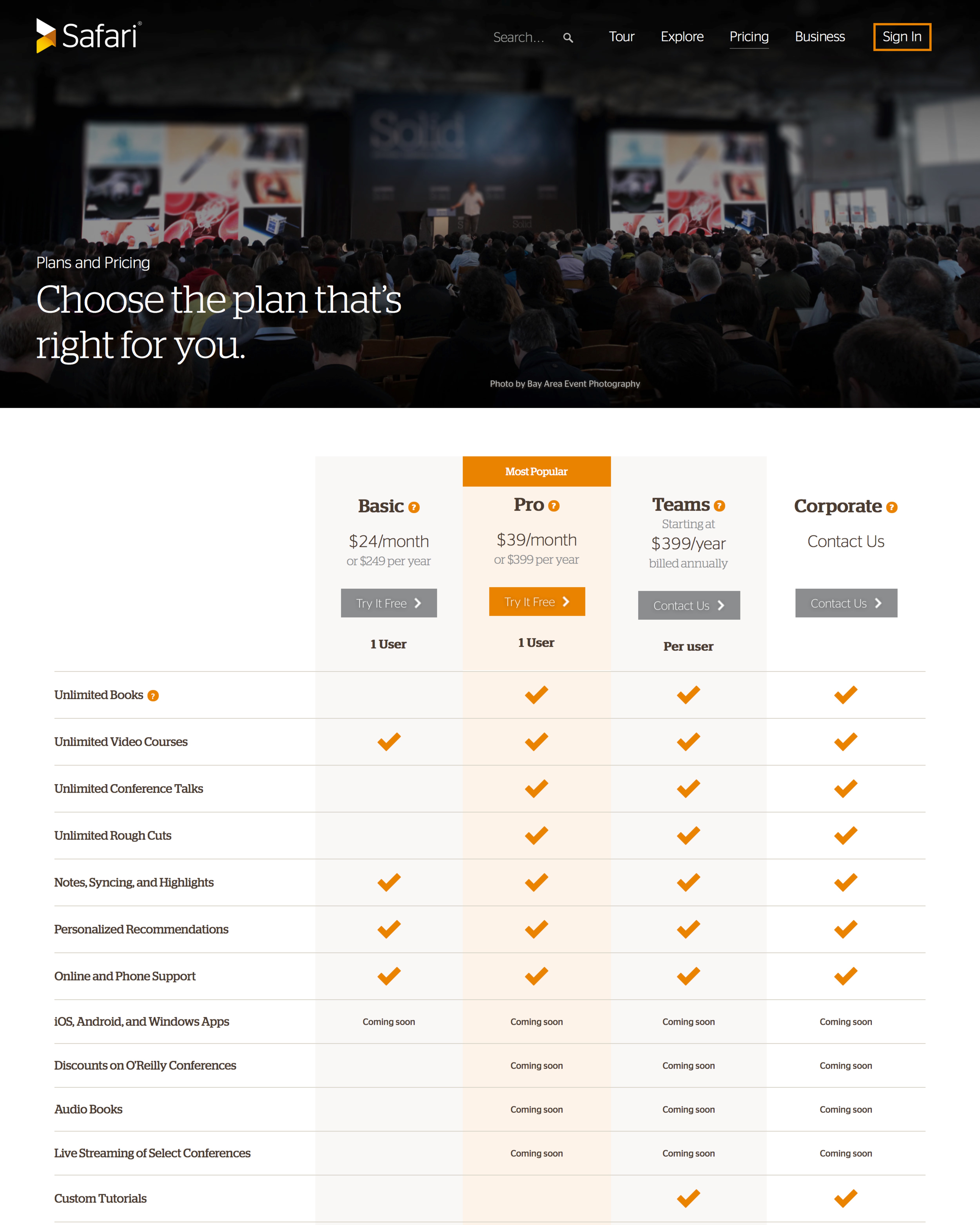
That 8-column grid is looking pretty good everywhere except for the Pricing table. That section contains 5 specific areas:
- Features
- Basic
- Pro
- Teams
- Corporate
5 sections over 8 columns doesn’t divide evenly, so I’ll need another split. By subdividing into 16 columns, that’ll let me do a 4-column feature listing and 3 columns for each of the plans. 16 columns it is.

A 16-column grid
All content realigned to the new 16-column grid
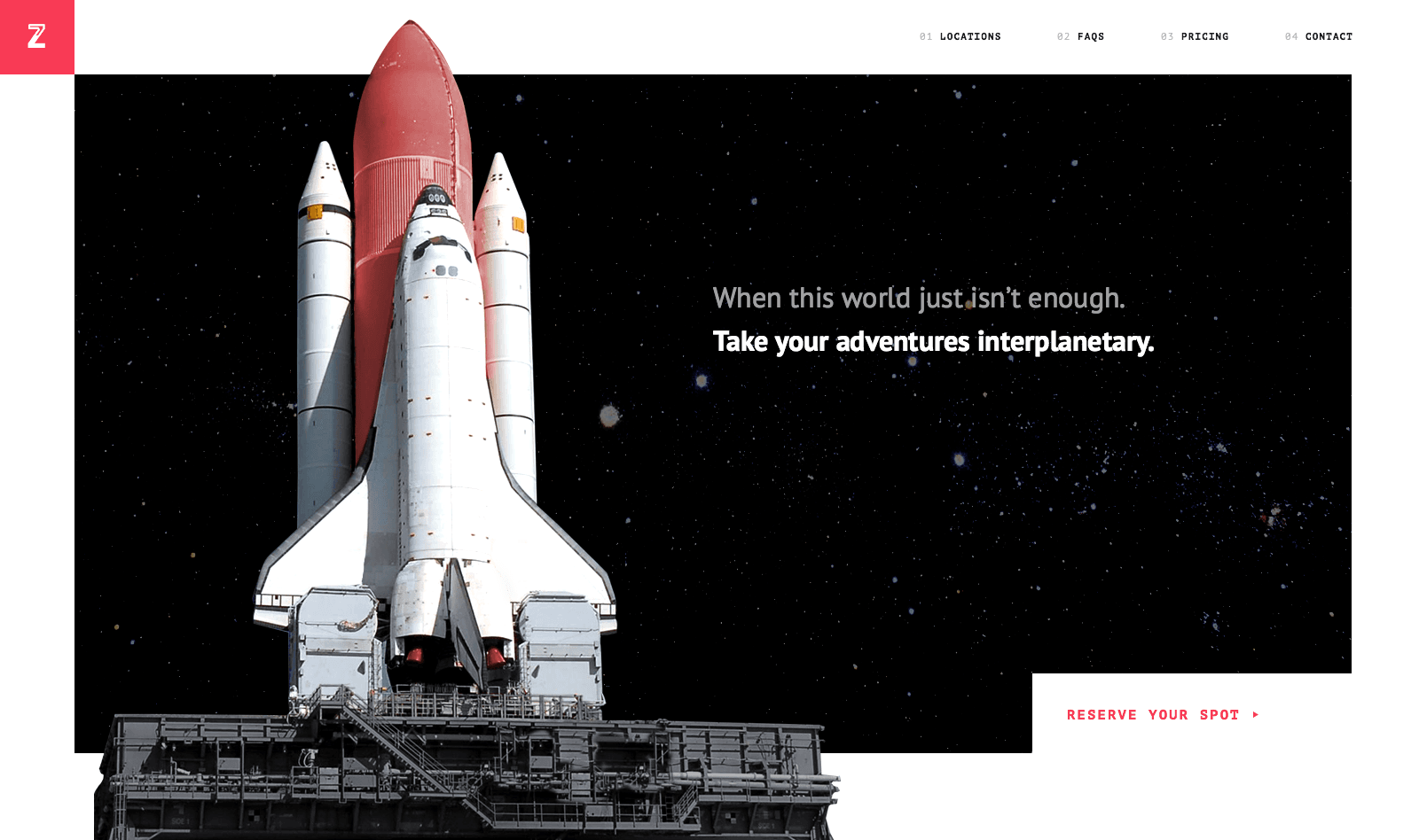
I’m ready to start inserting more of my content into this shell, specifically my own copy and artwork 1 . The key to stealing in a way that leads to something original is that your result needs to be unrecognizable from the source material as much as possible. Take the hero unit for example.
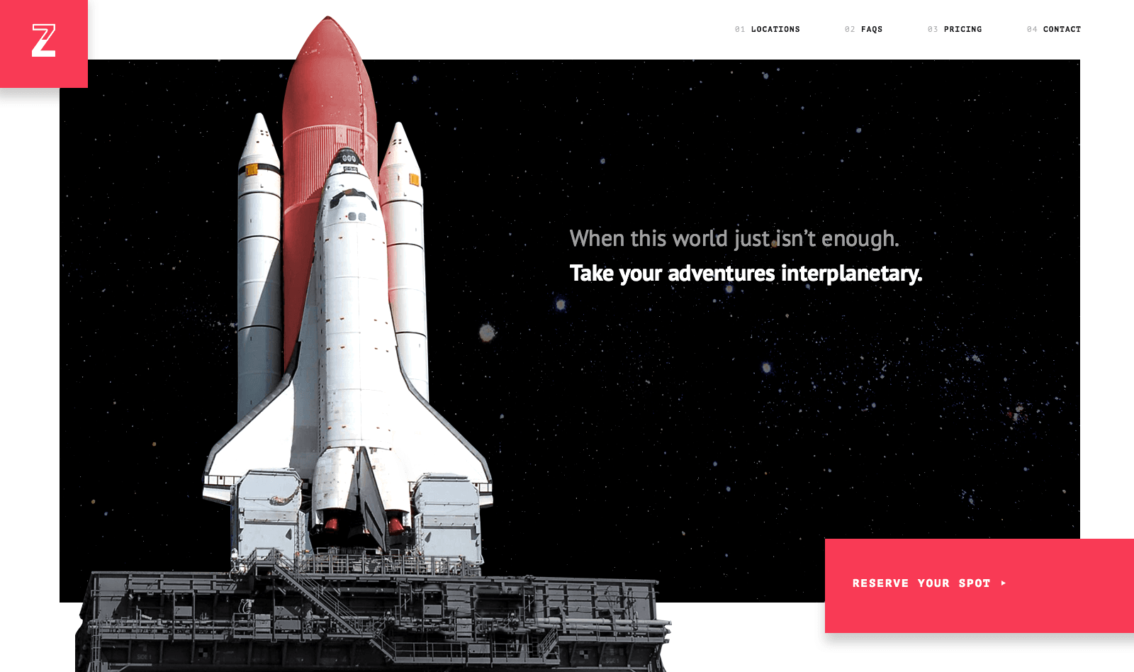
It’s easy to compare this to the original source and tell where it came from. Flipping the orientation of elements is a really useful way to to get around that. Let’s move the main headline and the call to action to the opposite side of the screen.
Let’s add our own artwork.
The artwork goes a long way into making this feel original, but there’s still one more thing we need to do. That notched-out call to action is such a unique piece that it’s become signature to the original source. It still feels like someone could identify the source from that element.
Instead of notching it out, let’s do a colorblocked overlap call-to-action. Once I do that, I realize the opportunity to mirror that visual language on the top left with the logo. Given that the original source is so flat, I’ll add a subtle drop shadow to give those elements some depth.
You can see that, with just a few moves, I’ve moved this away from an interface I’ve stolen to something that feels way more original.
If I take that approach to each element of this page—just a few moves each to distinguish it from its original source—I can easily go from a design I’ve stolen to an original version I’ve invented on my own.
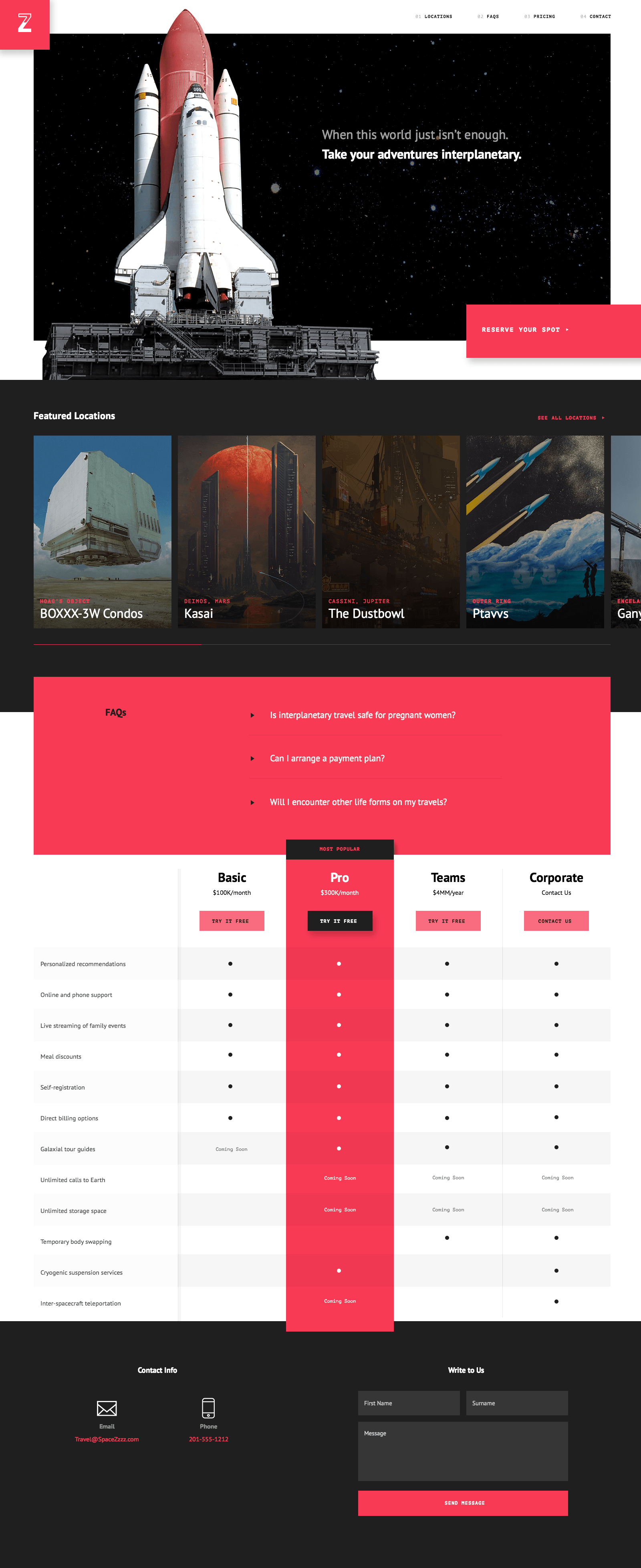
And lastly, a side-by-side comparison for effect.
I hope this was a useful primer in showing you how to steal you way to an original design. In the words of English philosopher C.E.M. Joad, “Creativity is knowing how to hide your sources.” The more obscure your references, the more sources you combine, the more moves away from the original you can take, the more original your design will become.
For those that want to dissect the final source file in more detail, you can download the PSD (51.2MB) here.
Good luck with your stealing!
- The wonderful artwork in this comp was graciously borrowed from artists publishing their work on the web. Credits: NASA STS-122 Rollout, Space/The Beast Below, Kasai by JosephBiwald, BOXXX-3W by beeple, Pioneers Again by Morris Scott Dollens, and Waterfall Stations by Christian Schumann.2.
- Designer Ross Floate wrote Pretty URLs Make Graves, a rebuttal to this article.
- Developer Mark Huot used these files as an exercise to learn more about React. Follow along on the interplanetary Github repo.
Read Next
Design Systems: Pilots & Scorecards
Join 67,200+ subscribers to the weekly Dan Mall Teaches newsletter. I promise to keep my communication light and valuable!