My dad (Tanveer Mall) spent 40 years as an in-house CFO. After he helped his company get acquired last year, he decided to start his own accounting consultancy. He asked me to help him put up a new website, and of course I said yes. Here’s the story of that process.
I had grand ambitions for this project. I knew I could probably put up a website in a day, but that seemed boring. Instead, maybe I could work with a junior or mid-level designer who’s never had the chance to work with a creative director before. I wanted to record or livestream it like a reality show. I wanted a sponsor to help subsidize it.
As with most things I work on, I grossly underestimated the time it’d take me to do. I thought it’d take a week. It took 3 months (part-time) from start to finish.
I got a lot of interest from junior and mid-level designers who wanted to work with me on this. (Many senior designers too.)
One of the applicants—Nadine Sarraj—was a great fit, so we sorted out details and got started!
Tan already had a name picked out for his new accounting consultancy: Numbers Kruncher.
I didn’t like it, and I really didn’t like it for him.
It’s a bit of a clumsy phrase that can be easily misspelled or misspoken. I’ve always heard the phrase as “number crunchers,” but he had the opposite word pluralized. And replacing the “c” with a “k” was just another variable to add to the confusion.
Also, it’s a very playful name, and Tan isn’t playful. He’s a lot of things: wise, creative, mindful, experienced… playful isn’t at the top of that list. I also fit that its connotation was a bit derogatory, in the same vein as “bean counter.” I think that’s part of what Tan liked about the name: as a humble person, I think he appreciated that it implies he’s “just here to help,” to do the lowly tasks of counting the beans and crunching the numbers. Still though, as his son who has seen for years how valuable his approach to accounting and money in general has been genuinely transformative to his colleagues, friends, and family members, I thought the name severely undersold what Tan brings to the table.
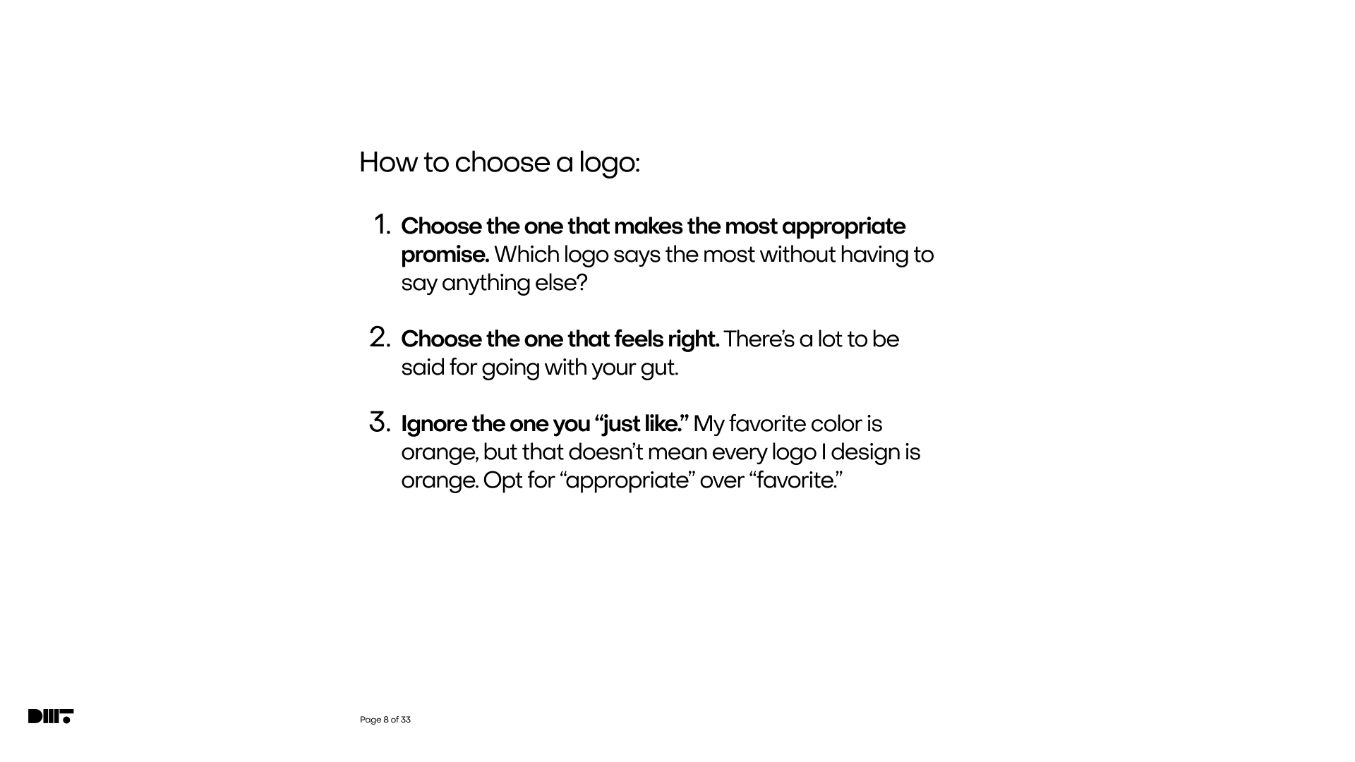
Said differently, the name didn’t match my perception of Tan’s brand. So, even though all he wanted was a website, I decided we needed to start with branding. Bonus: branding work wasn’t something Nadine had done much of, so that was something new for her to learn. We met every day for about an hour, and I talked her through why branding was important and gave her assignments to practice what she was learning. We started with 2 quotes that I include in the beginning of almost every conversation I have with a client:
A brand is a person’s gut feeling about a product, service, or organization.
A brand is the promise of an experience.
That’s how I contextualize the work, and it’s how I recommend clients give feedback too. Here’s a slide I use in every presentation that gives clients guidance about what feedback I’m looking for:
We started with the obvious, expected thing: a logo for “Numbers Kruncher.”


I was really happy with this concept, as I thought it did justice to the idea of this name. I try to not show a client anything I wouldn’t be content with them choosing. Still though, I didn’t think it fit Tan, so I poured on some extra sauce to dissuade him from this idea.
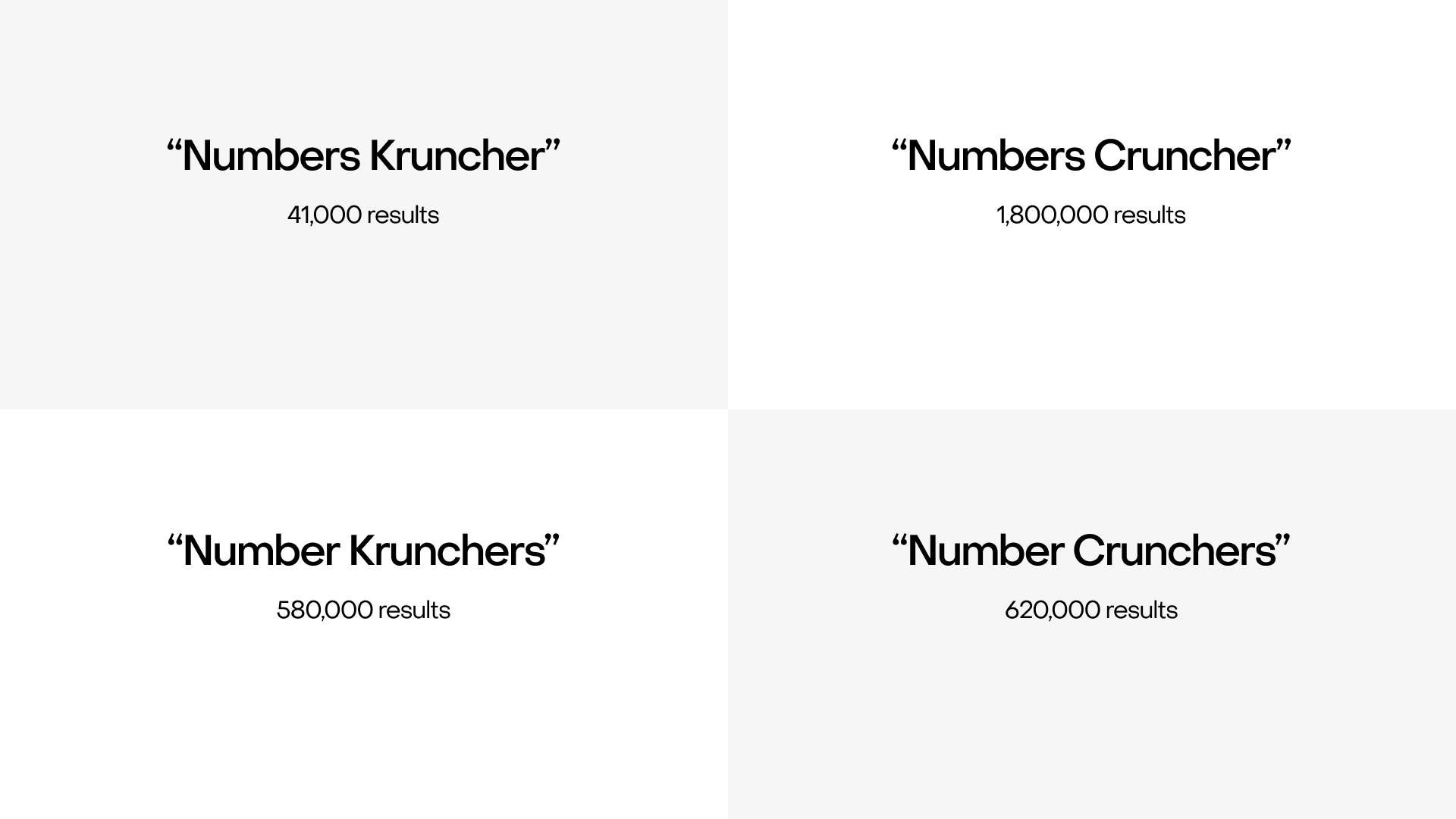
As an evolution away from that name to something more palatable, I tried to make the case for at least losing the “K.” I included a slide with this quote:
Fifty-seven years in this business, you learn a few things. You know what words are funny and which words are not funny. Alka Seltzer is funny. You say “Alka Seltzer” you get a laugh. Words with “k” in them are funny. Kevin Stengel: that’s a funny name. Robert Taylor is not funny. Cupcake is funny. Tomato is not funny. Cookie is funny. Kentucky is funny. Maryland is not funny. Then, there’s chicken. Chicken is funny. Pickle is funny.
I showed the number of search results in Google for different variations of the spelling.
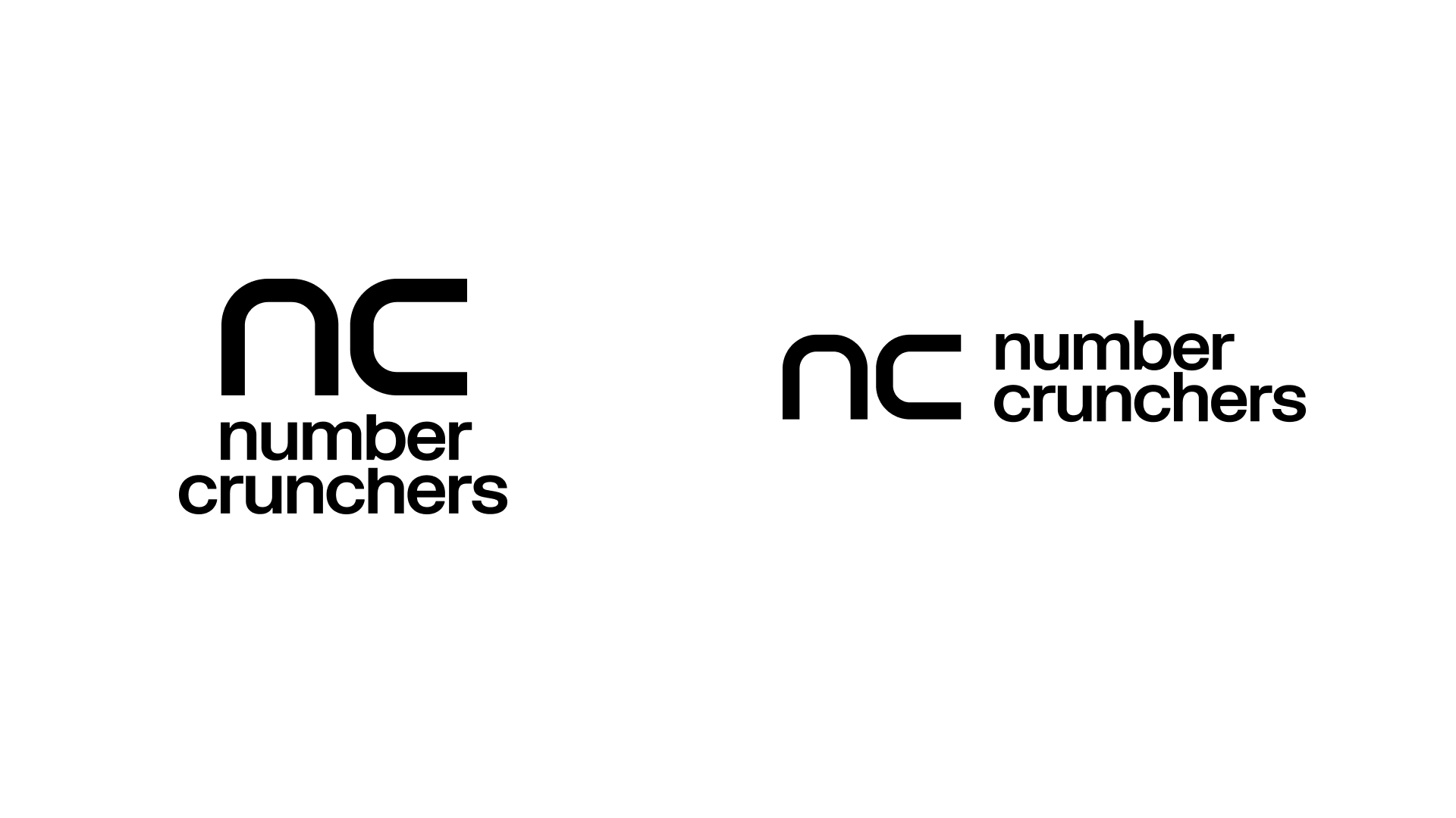
Then I showed a much simpler mark, made from the same shape that evoked a retro calculator vibe.


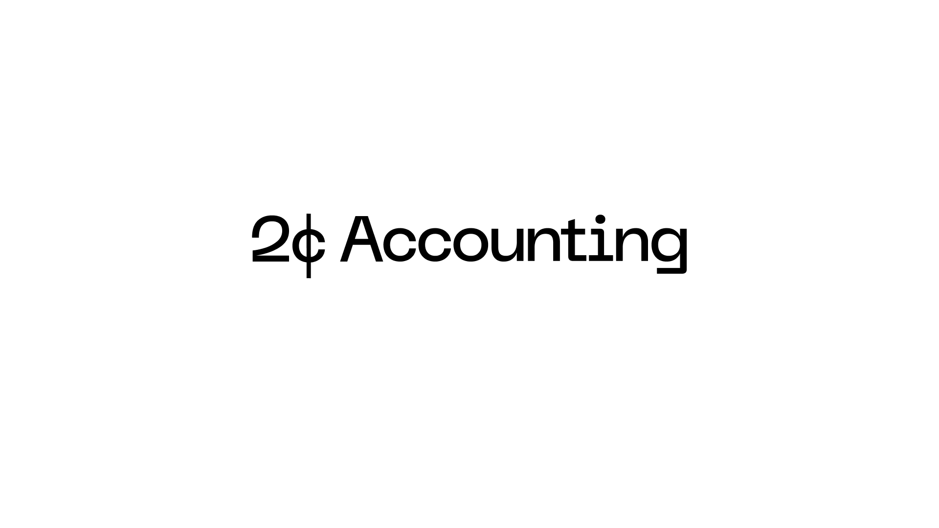
Now that the door to considering other name variations was cracked open, I dialed it up by throwing a completely new name into the mix.
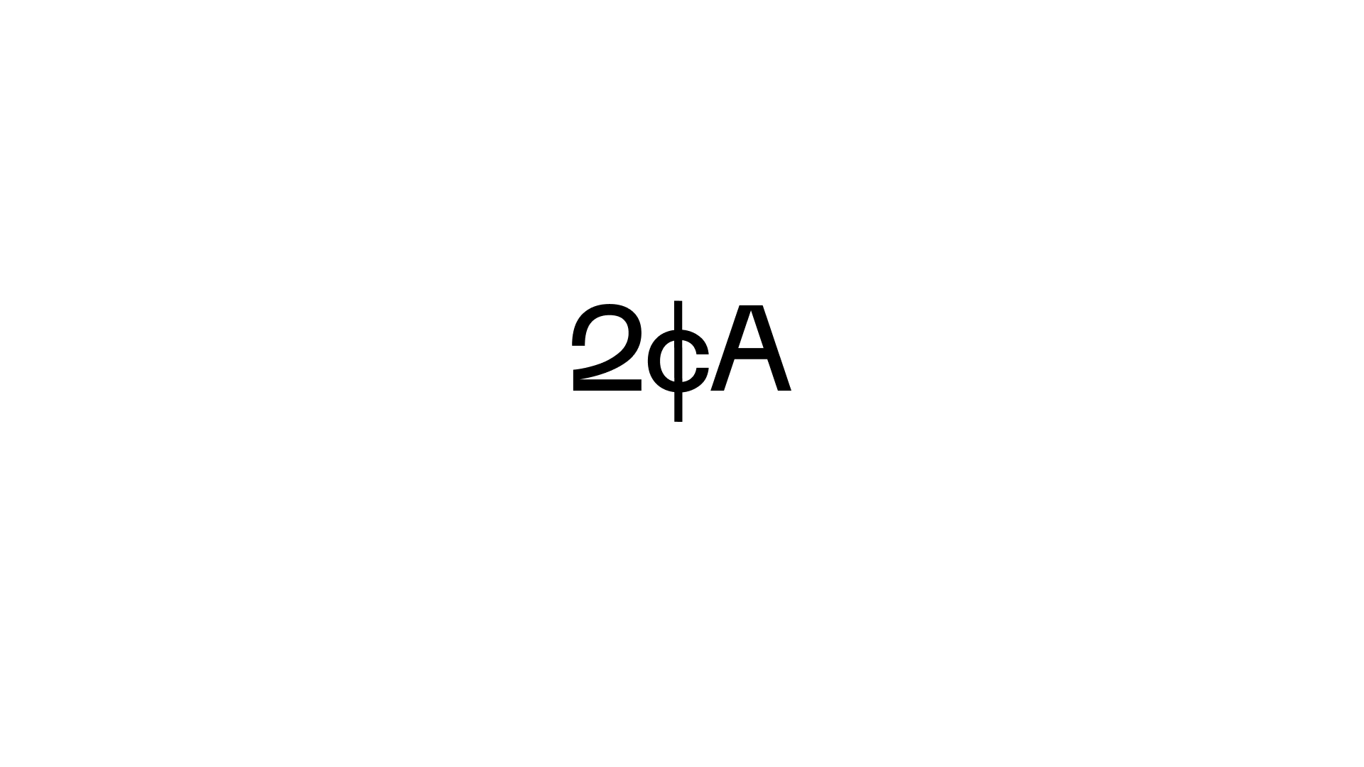
One special thing about Tan is that he gives great advice. Even though he’s the youngest of 7 siblings, all of them, including their kids and grandkids, often go to Tan when they need advice. There’s a common idiom for sharing small bits of wisdom: giving someone your two cents. Given the monetary orientation, I proposed changing the name to “2¢ Accounting.”
As a way to carry the concept forward, I mocked up a series of business cards that would each have a different piece of financial advice as different flavors of Tan’s 2¢.
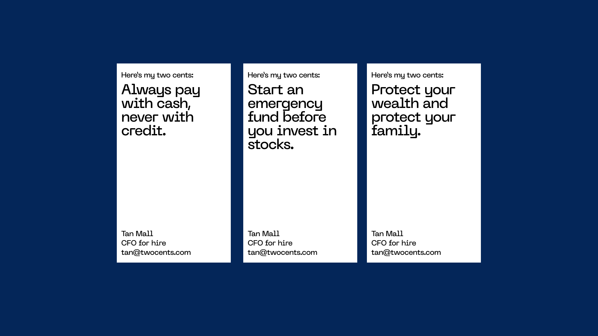
With 3 concepts to choose from, Tan took a day to sleep on, think about, and review the options. We had the call the next day to hear his thoughts.
He preferred 2¢ Accounting! Huzzah! I told him that the next steps were to start tightening this up and move into creating a website that extended what we started for this brand.
What I didn’t say was that I wasn’t content here yet. As a contrast to the Numbers Kruncher version where I didn’t think the concept worked but I thought the execution did, I really though the 2¢ Accounting concept was spot on but thought there was still something to be desired in the execution. I’m not crazy about giving a client a logo that just about seems typed out in a nice font, as I like to make it a bit more defensible that that. If it’s hard for a non-designer to replicate, that’s at least a good start.
There were also a few logistical hurdles to conquer as well. Regarding registering domain names and and email addresses, there were options available, but nothing I could put my full recommendation behind. My preference would have been 2CentsAccounting.com, but it wasn’t available at the time. The more hyphens and non-.com top level domains and mix of numbers and characters there are, the more difficult I think it’ll be to remember and/or get right.
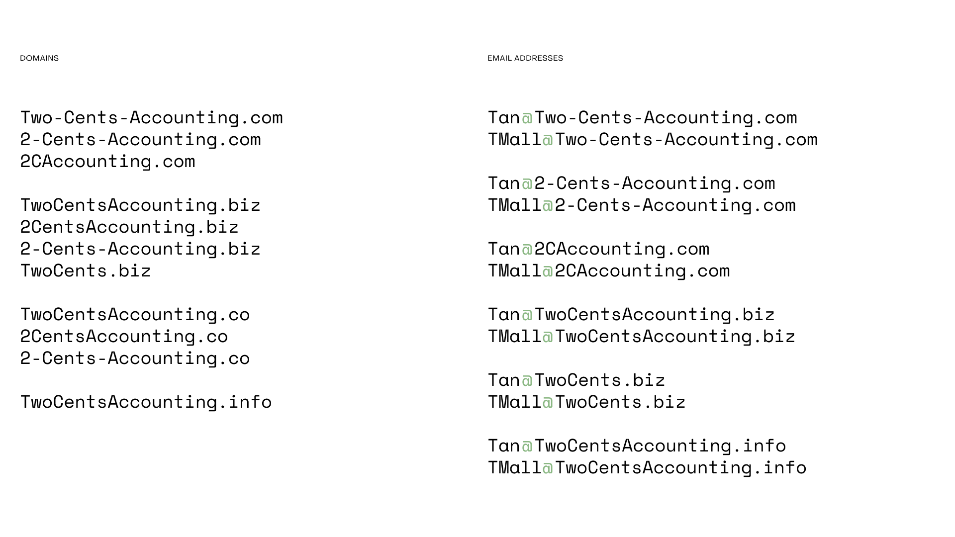
As I was looking for other domain ideas, I thought to myself, “What’s better than 2CentsAcccounting.com?” I laughed out loud as a funny answer popped into my head. Three Cents Accounting! I looked up the domain for fun.
Available.
Hmm.
I just convinced Tan to consider a new name. Was it a good idea to do that again?
Absolutely! One lesson that has served me well for years is to never hold back a good idea. I always try to pitch it.
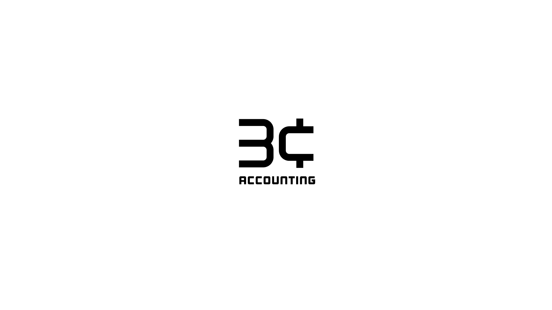
I started sketching around this idea and quickly realized that I could use the “nc” shapes to create a “3” and a “¢”. We got on a quick call with Tan to review this. I pitched it exactly how it came to me. “What’s better than getting your two cents? Getting your three cents!” He agreed. Onward!

Nadine was active in all of the branding conversations, but the web part was much more her comfort zone. While I led the branding efforts, Nadine was working on setting up the site structure and information architecture. Once we landed on a decent hierarchy, she continued the sketching work she was doing in Figma over into Webflow.
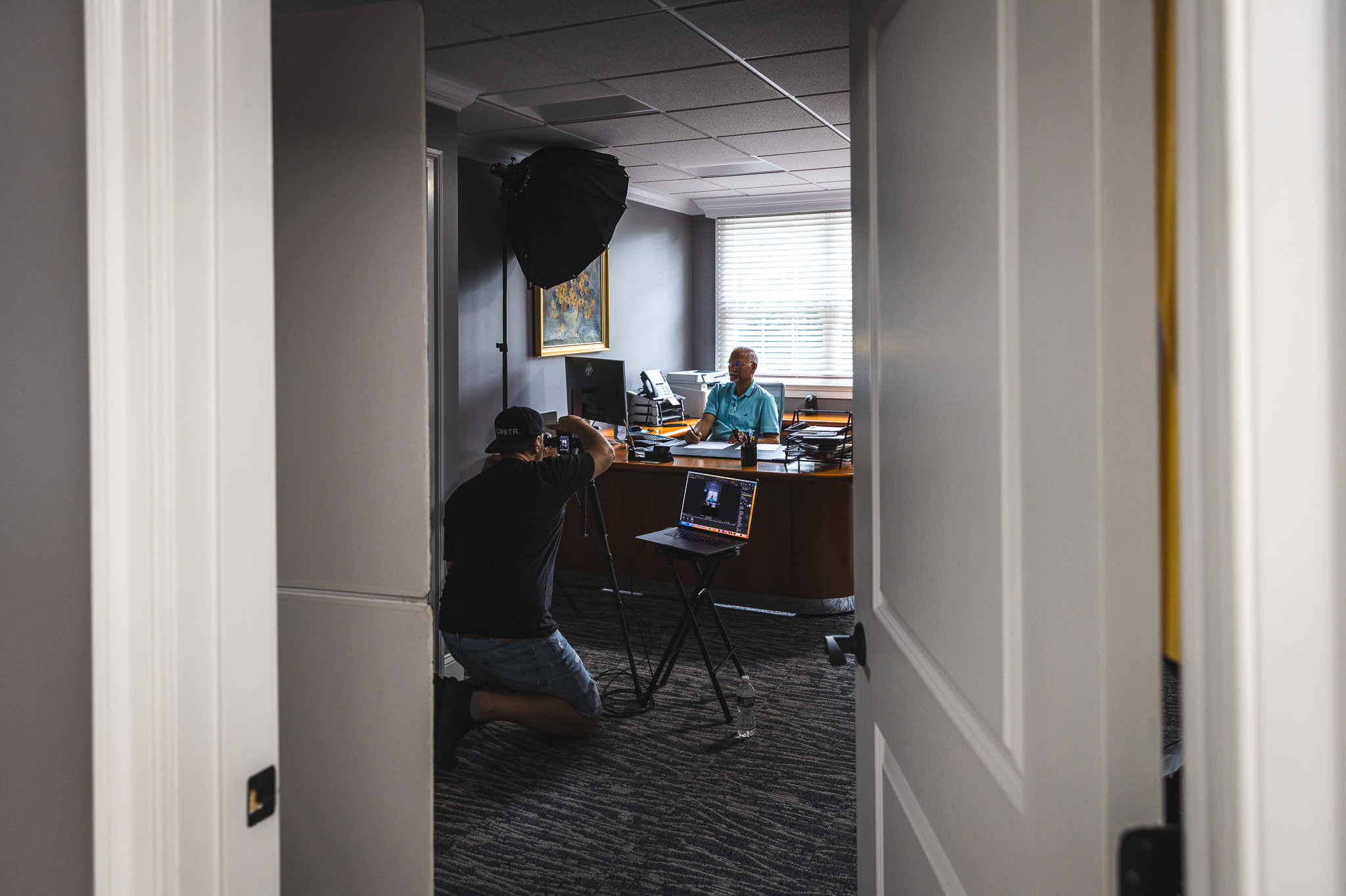
From the beginning of the project, one thing I felt strongly about was that there should be a big photo of Tan on the site, probably at the very top of the page. One thing that’s unmistakable and distinct about him that everyone realizes when they meet him is just how dang nice he is. He’s warm, disarming, and kind… everything you want in trusting someone to take care of your business’ finances. I thought a good photo of him would communicate that in an instant. While we were still working on the branding and the site, I commissioned my friend Josh Luciano to take new portraits of Tan that we could use for the site. Josh never disappoints! He’s my go-to for anything photo-related.
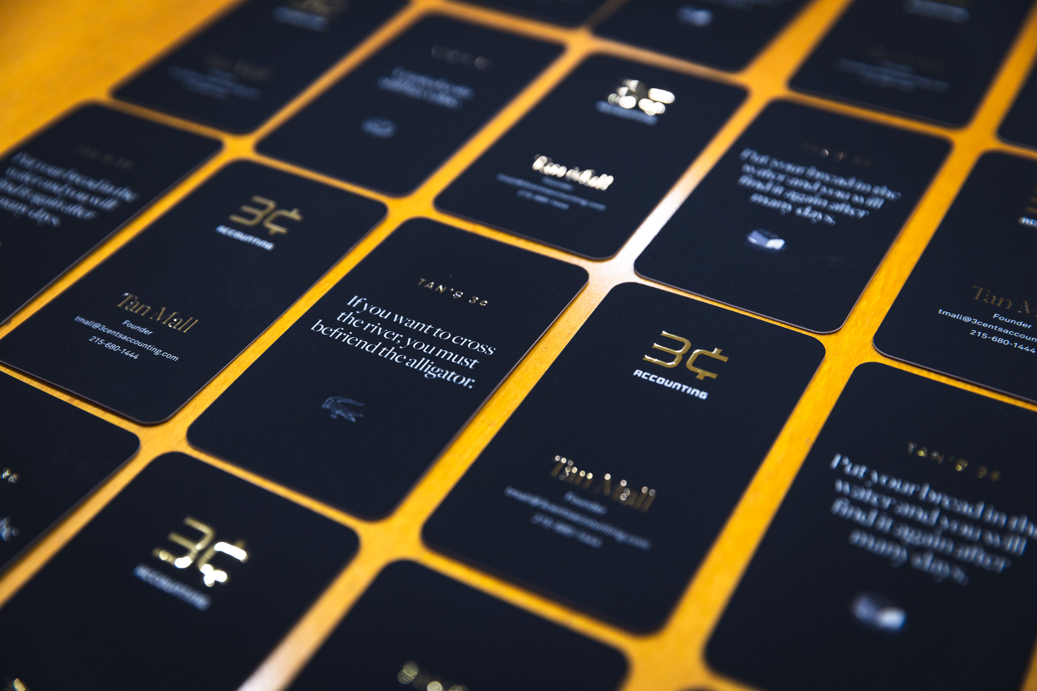
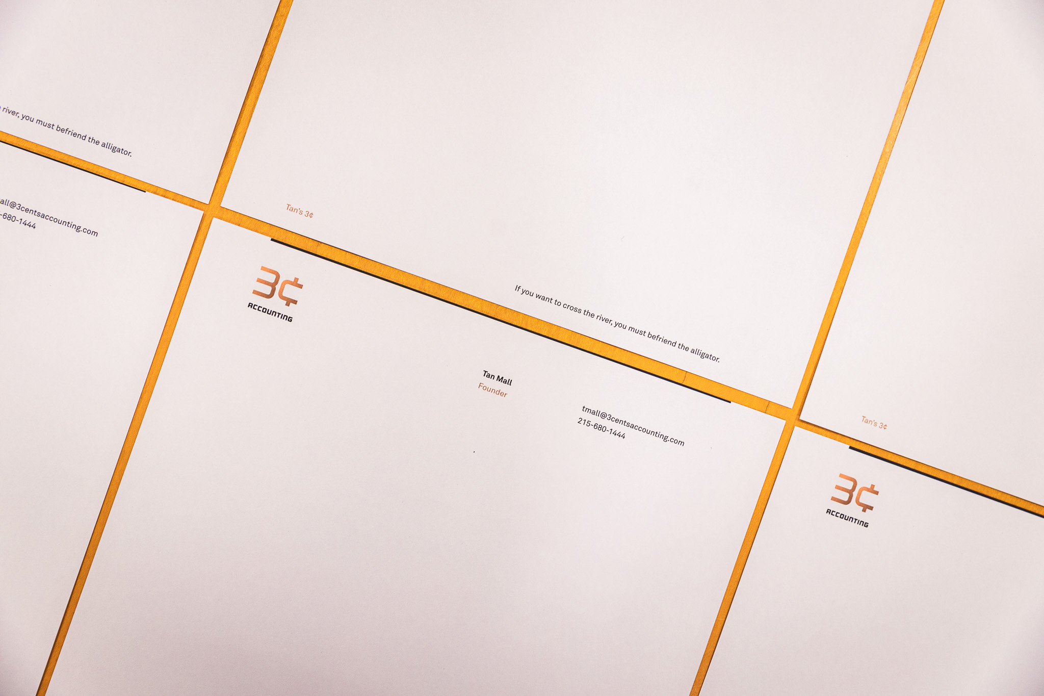
I finalized the logo, assets, and color palette simultaneously with the art direction for the site so that I could get Tan the thing he needed most immediately: business cards and letterhead. As I was working on the business card series, it occured to me that the business card tips weren’t as personal as everything else. One advantage of doing branding for someone you know really well is that you have a wealth of experience to draw from. Growing up, Tan occasionally had these quaint sayings that he would drop into a conversation. Most of them were old Pakistani proverbs that just didn’t translate exactly to English, so they were hilarious to me and my brother. I called my brother to make a short list together of some of the sayings, and I mocked them up as a series of business cards that would each have a different flavor of Tan’s 3¢. These include gems like:
If you want to cross the river, you must befriend the alligator.
and
A rusted coin still has value.
I love them so much! They appear on his business cards, letterhead, and randomly generate a new one every time you visit the website.
Overall, I had a ton of fun working on this little project, and I’m honored to help my dad launch his new business. Of course, I’m one of his first clients. If you’re looking for seasoned CFO to work with you or know someone who does, please point them to 3¢ Accounting!
Read Next
Commit to Commit
Join 67,200+ subscribers to the weekly Dan Mall Teaches newsletter. I promise to keep my communication light and valuable!