If all goes well, I’ll be launching my new website in the next week or two. Fingers crossed! 🤞🏽
In the meantime, I figured I’d share a few behind-the-scenes thoughts that you might be interested in.
Today, I want to talk about flowers.
The role of beauty in modern design
One of the earliest thoughts I had about a new site is that I wanted it to be beautiful. And I don’t mean beautiful in a “someone in the know can appreciate the understated beauty in the nuance of subconscious design elements like whitespace and typographic subtleties.” I mean any human in the world can viscerally react, “Wow, that’s gorgeous.”
I really like my current site. From a functional perspective, it does a lot of things for me. But it isn’t beautiful, not in that visceral way. And beauty is such an important part of design.
As digital design evolved over the last two decades, the industry started to realize the impact of design at increasingly larger scales. Naturally, efficiency through systems became more valuable too.
My career has also evolved in lockstep with the industry. Where I started making standalone microsites and brochureware one-and-done websites grew into working with clients who manage hundreds of digital products that serve millions and billions of customers. In that kind of work, beauty quietly recedes in the list of priorities. Understandably so, there’s a growing notion that people who work on design systems—that’s me—don’t, can’t, or won’t make beautiful things. Part of my goals for this new site is to prove that notion wrong.
Beauty as creative direction
For some reason, I associate beauty with nature. One of the most beautiful things I can think of is a pile of flowers. I’ve often had the shallow thought that “I should make my website have flowers all over.”
But I’m a fairly left-brained designer, the kind who always has to have a reason for everything on the screen. I couldn’t think of a reason for adding a bunch of flowers other than I liked it, which is the exact kind of logic I caution younger designers against. “Don’t just include stuff because you like it,” I’d hear myself scolding them. “It has to have a purpose!” And yet, if I was ever gonna include something just for the sake of it, my personal website would be the place, no?
Still, the idea plagued me. As a junior designer in 2005, I remember coming across John Oxton’s “Joshuaink” site. It featured an illustration of flowers by Denis Radenkovic that I remember vividly to this day. I remember distinctly thinking, “This is gorgeous! But what do flowers have to do with anything on this site?” It was too challenging of an idea for my fledgling designer brain. But I knew I still really liked it, even though I didn’t understand it.
About 6 months ago, I was journaling about what I wanted from my new site, which is currently my favorite way to write what would be traditionally known as a “creative brief.” I was free-association, stream-of-consciousness letting the thoughts flow about the purpose, the audience, my hopes and dreams, and more. Among other things, I wrote this line:
“I really want to help more designers get their flowers.”
I paused and realized I had my creative direction.
(A side note about creative direction. Many people misunderstand creative direction to mean “look and feel.” Apologies for the pedantry, but I think they really mean “art direction.” Creative direction includes art direction, but it’s more about how art direction and business strategy meet. It’s “the big idea.” For this site, the big idea was that designers deserve their flowers but often don’t know how to get them. I can help with that.)
Honing in on the art direction
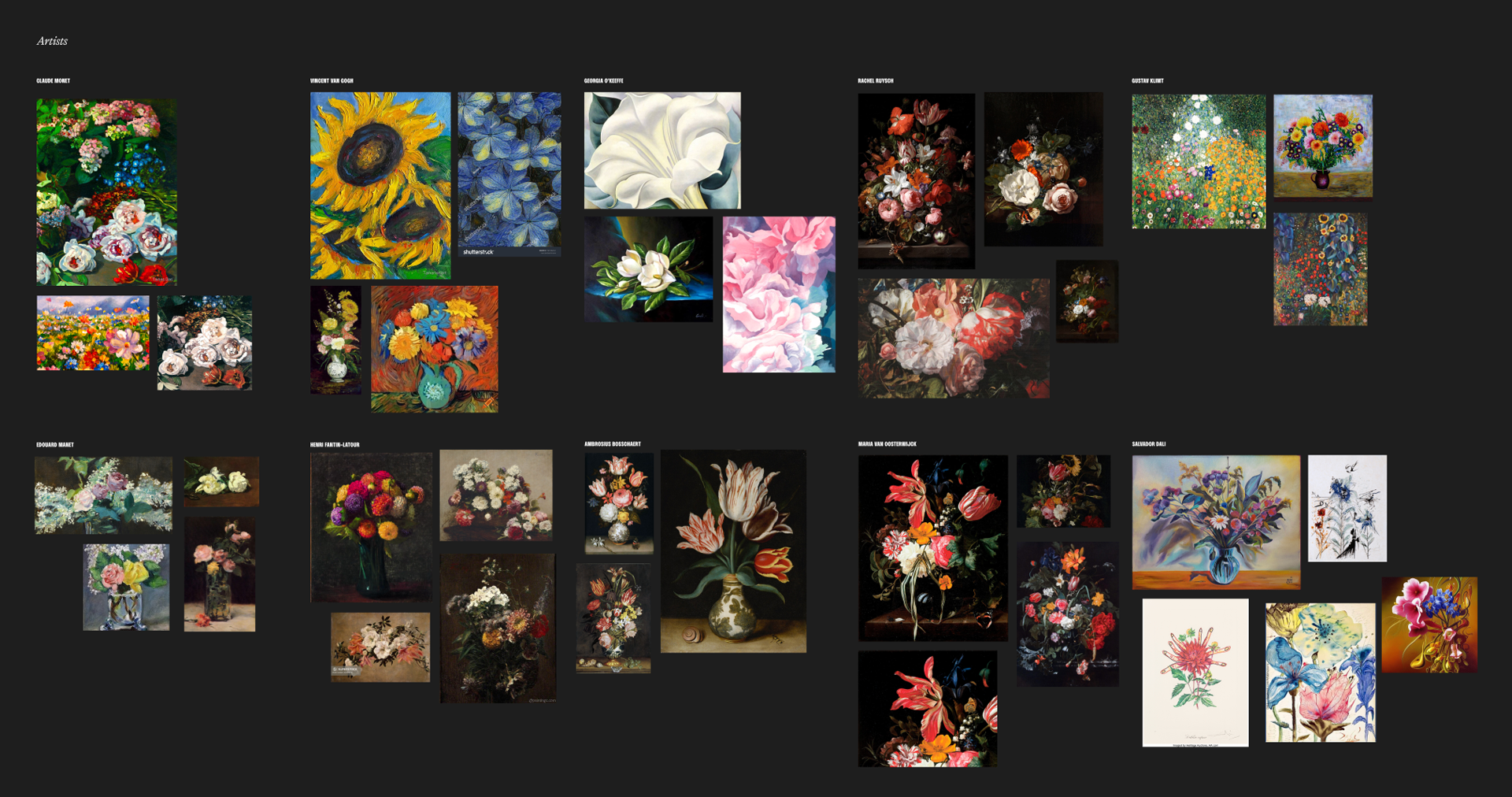
Fortunately for me, my home library is filled with books featuring flowers. (I know not why. Perhaps for this very moment.) So I assembled them all—bought some more, naturally—and started to let my brain steep in the subject matter.
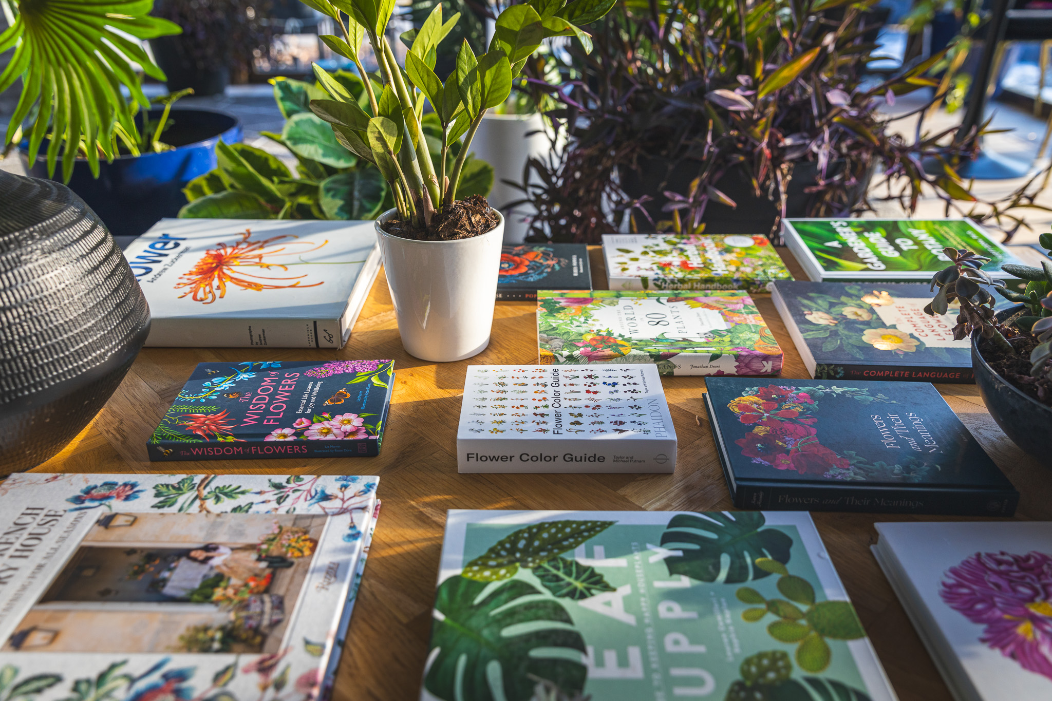
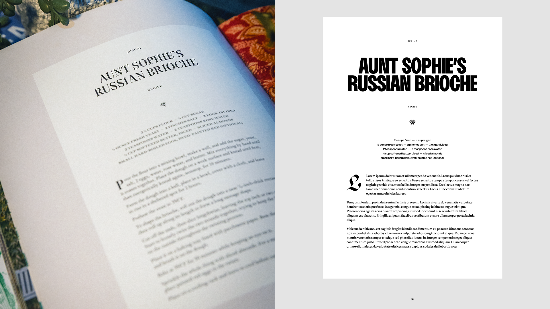
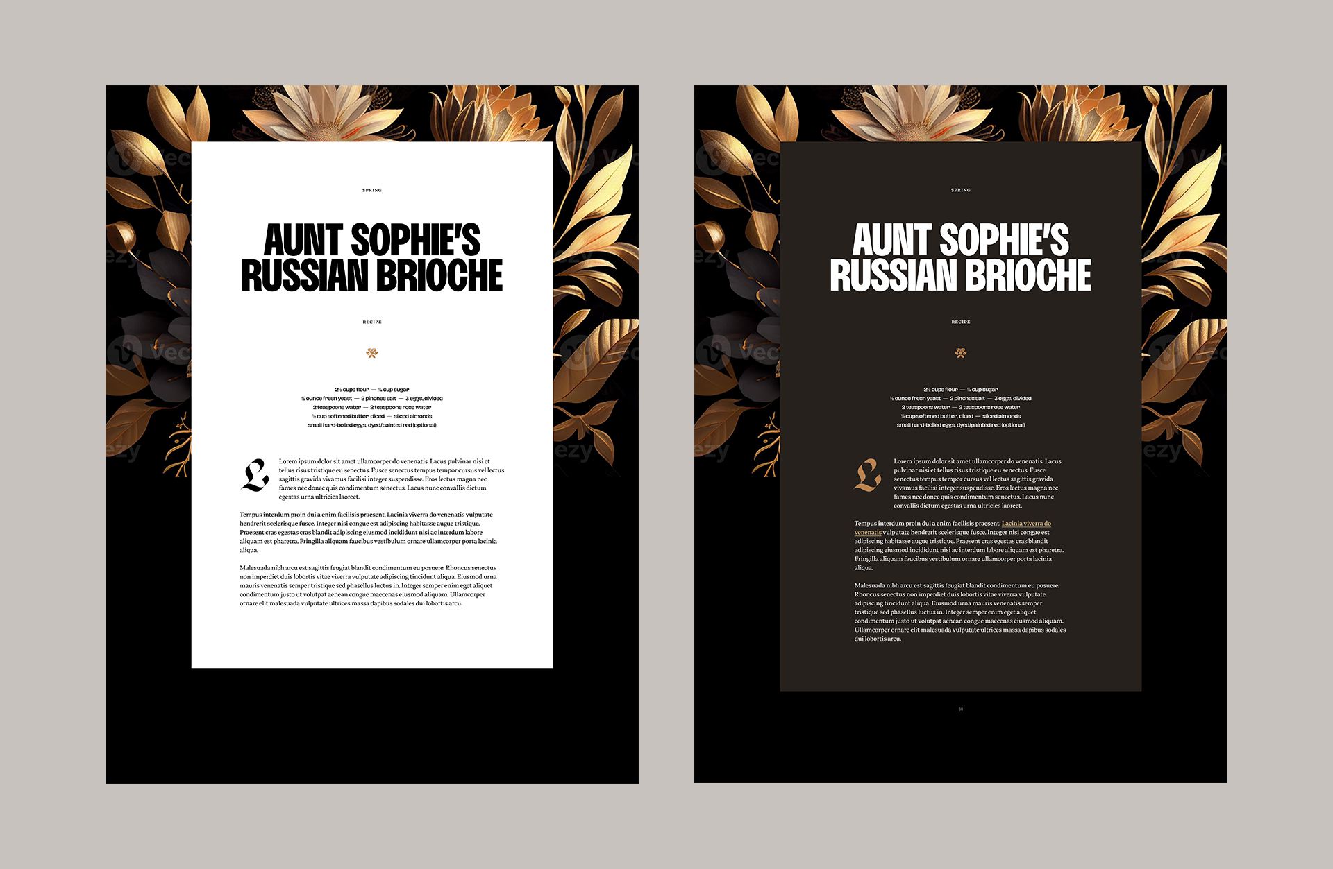
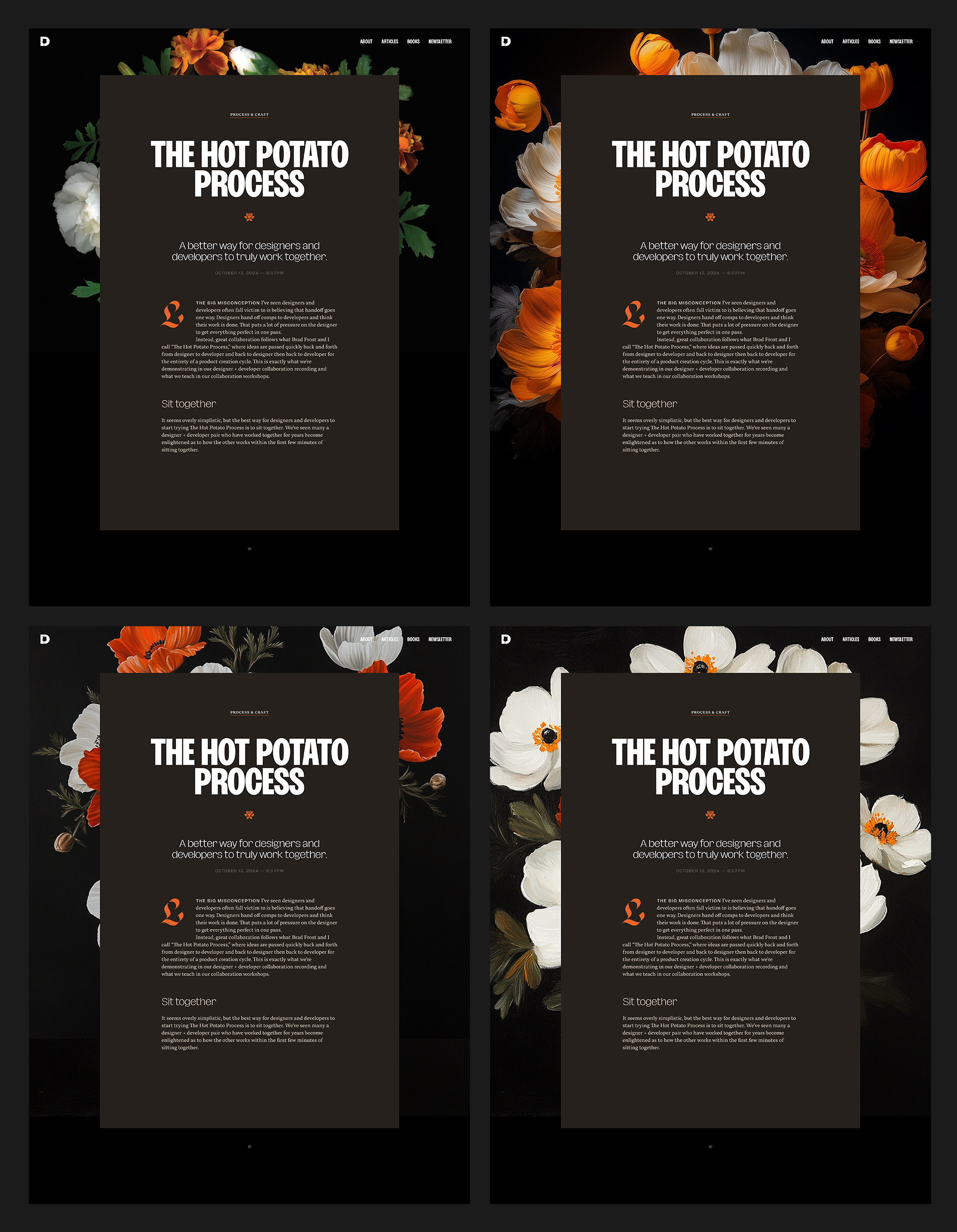
I found the first reference I wanted to steal and remix: a page out of Cordelia de Castellane’s Life in a French Country House. I copied it almost exactly, with the exception of using a few typefaces I’d been eyeing for a long while: Rajesh Rajput’s Bueno, Reset Type’s Thermal, and Zetafonts’ Hagrid.
I started to remix, quickly finding some surreal looking flowers on Google images to drop in and try, which made me start to play with different color schemes.
I started to layer in my own content to see how well this would fit for my site. I also generated some images and illustrations with Midjourney, Visual Electric, and Adobe Firefly to see what kind of style I wanted for the flowers.
It was tough to choose! I liked them all!
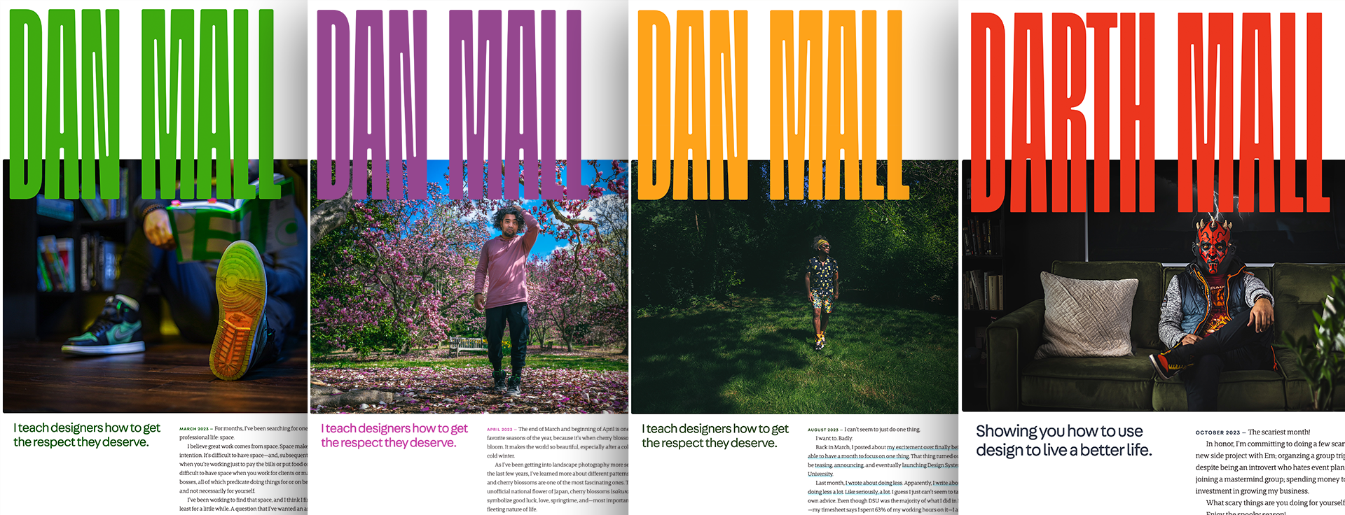
From my early days as a designer, I’ve been drawn to fixed formats that change slightly over time. I loved that the designs of WIRED and Oprah magazines morphed from issue to issue within the same overall art direction. Jason Santa Maria’s seminal redesign of A List Apart had a different color scheme for each issue. Bostonia designed custom feature articles for their 2008 and 2009 issues. When I worked on the website for the Maryland Institute College of Art, we let the entire site’s art direction be driven by the colors in uploaded student artwork. Remember blogazines? I did it too for every article I wrote from 2011 to 2015.
Until I didn’t. It’s a lot of work. So I tried finding smaller ways to do it. For the current version of my site, I played with the same idea of of changing the homepage image monthly. (Yes, I will be Oprah one day.)
Even that got tough to maintain. Some part of me wants to think that I lost steam on it because it was a gimmick. Back to my left-brain designer tendencies, I didn’t really have a reason to do this under than the fact that I liked it and wanted to. I’m learning that, sometimes, that’s enough.
But flowers! They’re inherently seasonal! What if I picked some specific species for every season of the year? I’d only have to update the site 4 times a year. Perhaps I can manage that. I did some research into seasonal blooms and chose a few to explore further.
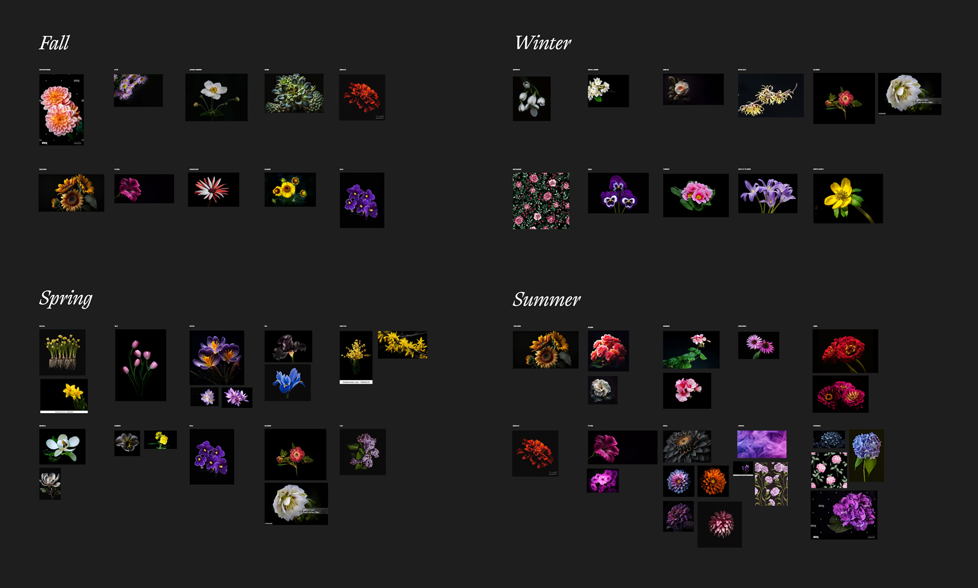
While going down this path, it quickly dawned on me that there are infinite approaches to depicting flowers. Abstract, photorealistic, monochromatic, vector, watercolor… how do I choose?
My go-to design style is pretty modern and contemporary in general, so I knew whatever I came up with would feel of-the-time. However, since this site is all about helping other designers get their flowers through my own mentorship, coaching, and direction, trust and credibility are some of the most important parts of my brand. Many people who read this newsletter have been following my work for a decade or more and have come to trust it over time. For new readers, perhaps they’ll start to trust me if they feel like I’ve been doing what I’ve been doing for a long time. (Which I have… 27 years now!)
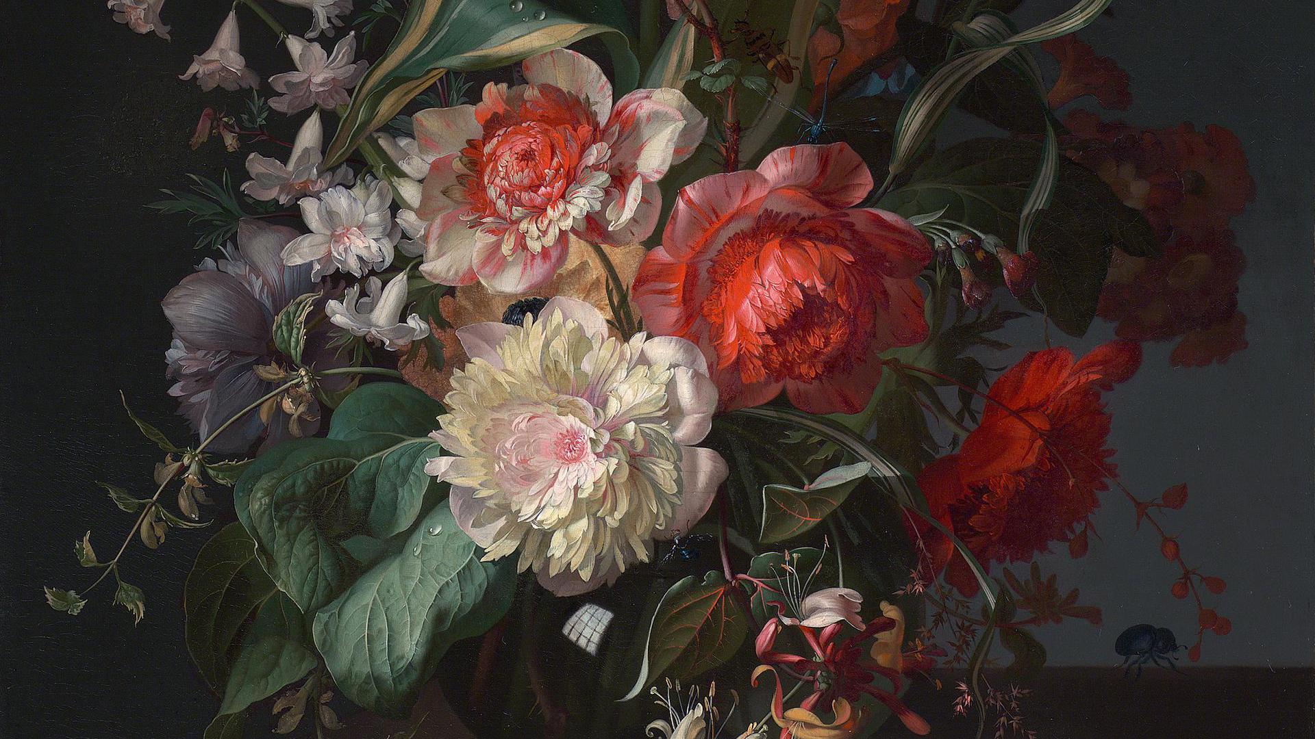
From an art direction standpoint, that made me think that an older visual style could subconsciously communicate that. After a lot of exploration, I settled on a European Baroque style of the Dutch Golden Age, specifically the work of Rachel Ruysch. Perhaps another time, I’ll go into all of the different ways her work makes even more conceptual sense here as inspiration, but, for now, suffice it to say that it fits really nicely.
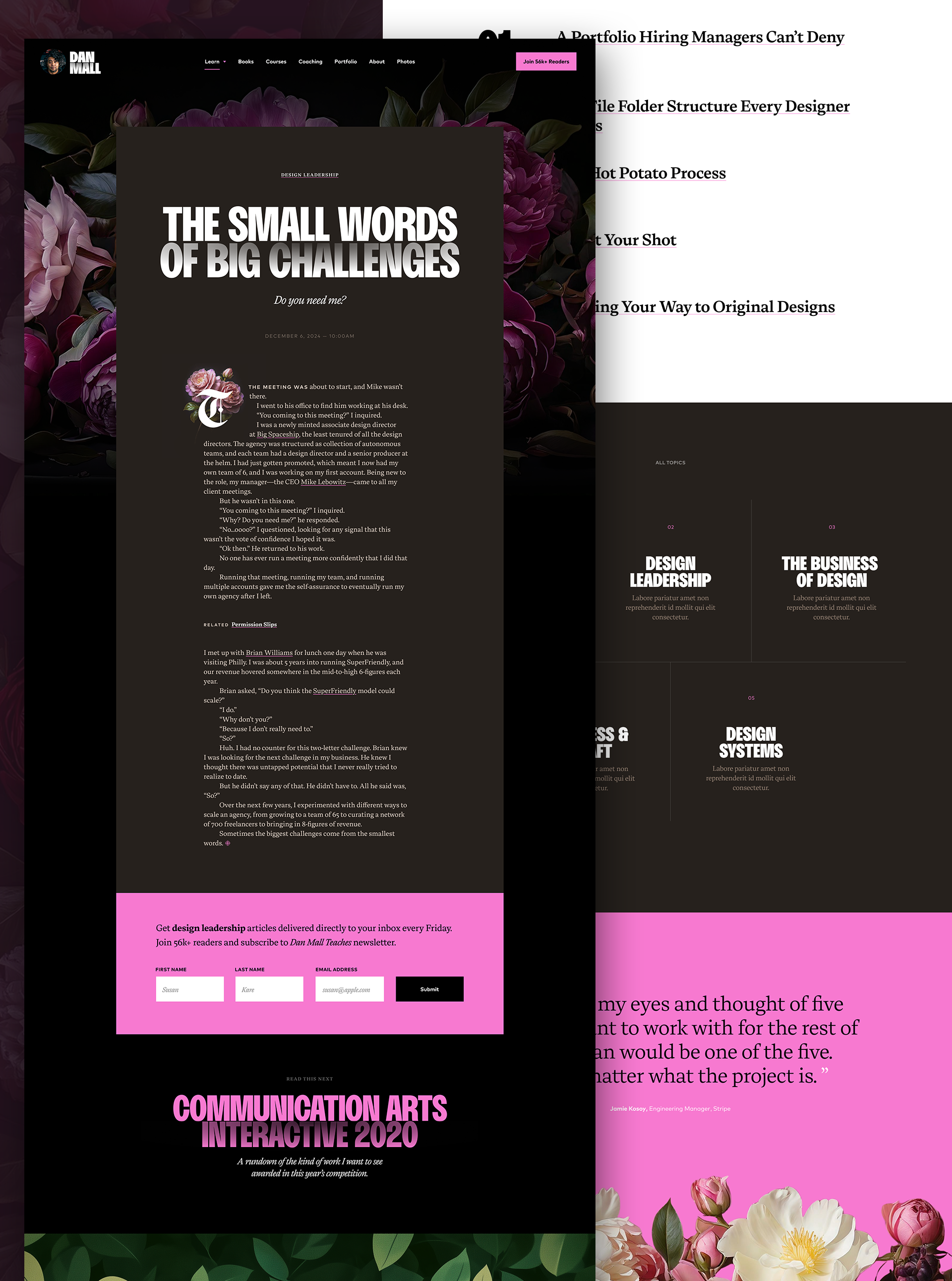
Not being an illustrator myself, I’ve relied heavily on generative AI tools to bring this art direction to life. One benefit of that—as opposed to going a more photographic direction, which is more in my wheelhouse—is that I can cheat a bit in the world-building of the site’s art direction. For example, in an earlier version, I was using Japanese anemones as the primary species of flower you’d find around the site. They typically come in shades of pink, white, and lavender. However, I choose to generate them orange and blue, something you’d never see in real life. Even for the uneducated nature lovers, they might subconsciously intuit that this was a fictitious world I’m building.
Now that I have a better sense of the style I want, I hired an illustrator to work with me to create even better and more fitting images than I could generate on my own.
After many months of iterating through it, here’s how the final art direction and design ended up, specifically on the article template:
In next week’s issue, I’ll tell you more about the content strategy and information architecture of the new site and why I think it’ll be easier to browse for designers who want to learn how to—you guessed it—get their flowers.
Join 67,200+ subscribers to the weekly Dan Mall Teaches newsletter. I promise to keep my communication light and valuable!