Most of SuperFriendly’s work over the last few years has been with organizations that need specific help with crafting design systems that enable them to extend the work long after we’ve handed off initial work. It’s not uncommon to receive initial inquiries containing sentences like these:
We are looking for a partner to help us evolve the design language that will guide future UI design of our internal-facing web applications.
We’re looking for help in re-writing our visual style in a way that makes it extremely modular. We’re not interested in abandoning our original design but want users to see this as an evolution.
We’re aiming for a core design system that’s consistent across our whole family of sites, with variations in color, branding, and swappable modules/widgets (galleries, content buckets, etc.).
Littered throughout these emails are words like “style guide,” “atomic design,” “modular,” “responsive design,” “patterns,” “frameworks,” and the like. The common theme seems to be a tipping point in either managing multiple sites independently and longing for the efficiency of a shared system across them, or feeling stuck by traditional “templates” not being modular enough to repurpose elements for different configurations.
During the TechCrunch and Entertainment Weekly redesigns, our goal of building an infinitely scalable, modular design system was the perfect excuse for Brad Frost to exercise some ideas he had about this very topic. Those exercises eventually led to his atomic design methodology and to the tool that eventually became Pattern Lab. I’ve done ten projects with Pattern Lab now—it’s certainly the closest thing to my default tool of choice—and a handful of projects with more custom, hand-rolled approaches. Perhaps the most important lesson in building modular systems I’ve learned is this:
Content patterns are different than Display patterns.
This dichotomy was originally described by Karen McGrane.
Let’s dissect that a bit:
- In his excellent book Modular Web Design, Nathan Curtis defines a pattern as “a solution to a recurring design problem, such that you could use the solution many times and never use it in the same way twice.”
- A Content pattern describes the types of elements within and can be rendered in multiple forms.
- A Display pattern describes a specific rendering and can be applied to multiple types of Content patterns.
Each is incomplete without the other. In order to make a site that people can use, every element on the screen needs a Content pattern and a Display pattern applied to it. Embracing the difference in pattern types is the key to making a modular design system infinitely more scalable.
If you run or work on any kind of web-based business, thinking and building in terms of patterns is incredibly valuable for your organization, as it’ll help you build leaner, faster, and more future-friendly. This approach transcends industries, as I’ve seen this work wonders for retail, publishers, travel, financial services, government, nonprofits, and more.
Identifying and abstracting patterns
Let’s look at a common example. When constructing a page, I’ll often hear a team member say something like, “We can use the Event pattern here.” What does that actually mean? Perhaps the most obvious place to start is from a previously designed comp that looks like this:

A simple way to mark that up—using BEM methodology—could look like this (for simplicity, I’ve omitted useful markup like microformats):
<div class="event">
  <h1 class="event__title">Star Wars: The Force Awakens Premiere</h1>
  <p class="event__date">Dec 20, 2015</p>
  <p class="event__location">Ritz East, Philadelphia PA</p>
</div>
While there’s nothing technically incorrect about this markup, it may not be abstract enough for reuse. As we think about the content model for an Event, the pieces displayed here are Title, Date, and Location. There’s nothing that ties an Event to this specific display. Other types of content that may exist on the site could have similar content models, like Articles: Title, Date, Description. I could easily use the same Display pattern to render an Article:

Interaction designer Alla Kholmatova wisely observes, “If you give [a pattern] a presentational name, its future will be limited, because it will be confined by its style.” Calling this an Event pattern might mean that I never even consider it for an Article, even though it could work just as well. Mr. Responsive Design himself Ethan Marcotte admits from his own work, “Back in the old days—you know, like six months ago—I probably would’ve marked this module up to match the design. In other words, I would’ve looked at the module’s visual hierarchy and written [very specific] HTML… But then I caught myself, and realized this wasn’t the best approach.”
So, how can I make a more useful pattern? Perhaps I can abstract the display from both an Event as well as an Article into a pattern that can apply to both:

With an abstract Display pattern like this, I can choose multiple kinds of Content patterns to visualize. That leads me to an interesting approach when thinking about how to think and talk about patterns for modular sites:
- Identify the type of content (Content pattern).
- Choose visual option (Display pattern) to render said content.
What does this look like in practice?
A real-world example
When I was working on the new O’Reilly site with my Big Medium friends, one of our team goals was to eschew traditional paper wireframes. On previous projects we’d worked on together, wireframes were too time-consuming to make and constrained our client’s thinking on graphic design a little too much. Over burritos in the park, we realized that the most valuable thing about our previous wireframes was having a list of content for each page.
So, when Jennifer Brook sat down to map out the content strategy for the site, she whipped out a list of Organisms for each major page on the site:
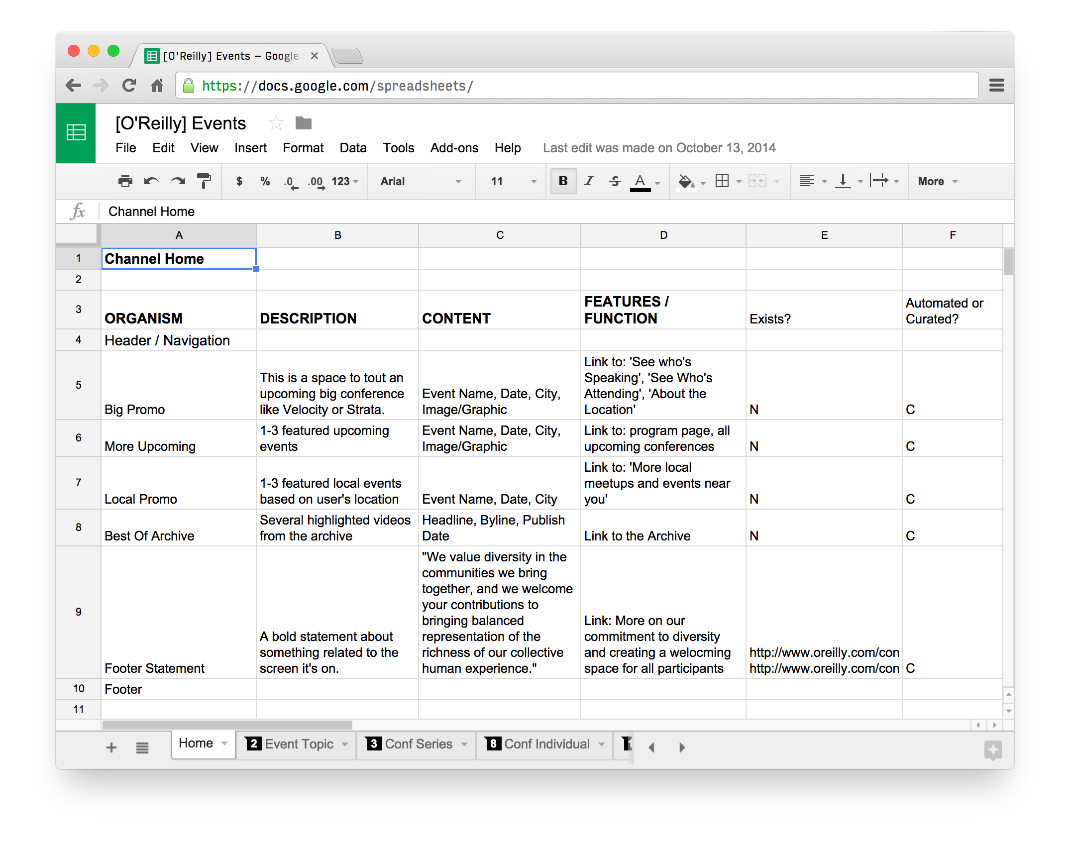
This allowed both developer and designer (TJ Pitre and me respectively) to work simultaneously, assembling all the parts in our own ways and riffing off each other’s work. Watching this process unfold revealed another important insight: when thinking about patterns, content strategists are primarily thinking about Content patterns, designers are primarily thinking about Display patterns, and front-end developers are responsible for bringing the two together. Certainly a bit of an oversimplification, but I’ve witnessed it being true more often than not. Obvious in hindsight, but definitely easily overlooked when you’re heads down in the middle of a project.
Have a look at that spreadsheet. “Big Promo,” “More Upcoming,” and “Local Promo” are all listed as separate organisms because they do different jobs (see the “Features/Functions” column), but their Content patterns are exactly the same. Jennifer was making sure that we wouldn’t forget about that content and leaving it up to me to decide on the best display pattern for this data to be rendered across different screen sizes. TJ could decide how much to abstract these in code to make them as reusable and easily understood as possible.
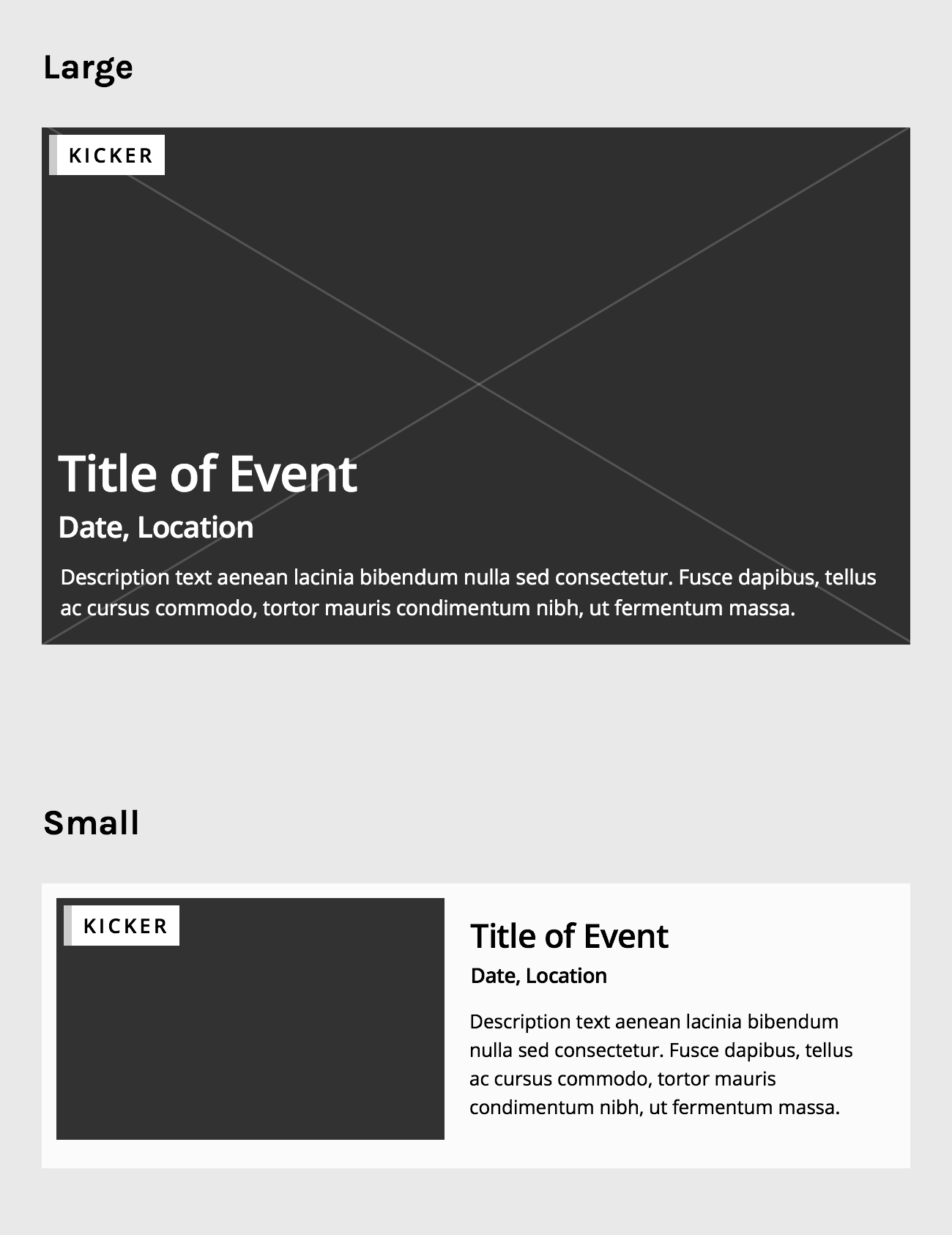
I hypothesized that we could build these Content patterns with multiple instances of just two Display patterns, so I started by designing these:
TJ then translated both Display patterns into one block of code:
<div class="g-item">
  <div class="block block-thumb">
    <div class="b-thumb">…</div>
    <div class="b-text">
      <h2 class="b-title">…</h2>
      <div class="date-city">…</div>
      <div class="dek">…</div>
    </div>
    <!-- .b-text -->
  </div>
  <!-- .block -->
</div>
<!-- .g-item -->
He then created a modifier called .g-item-hero that turns the small Display pattern into the large one.
The final page ended up looking something like this:
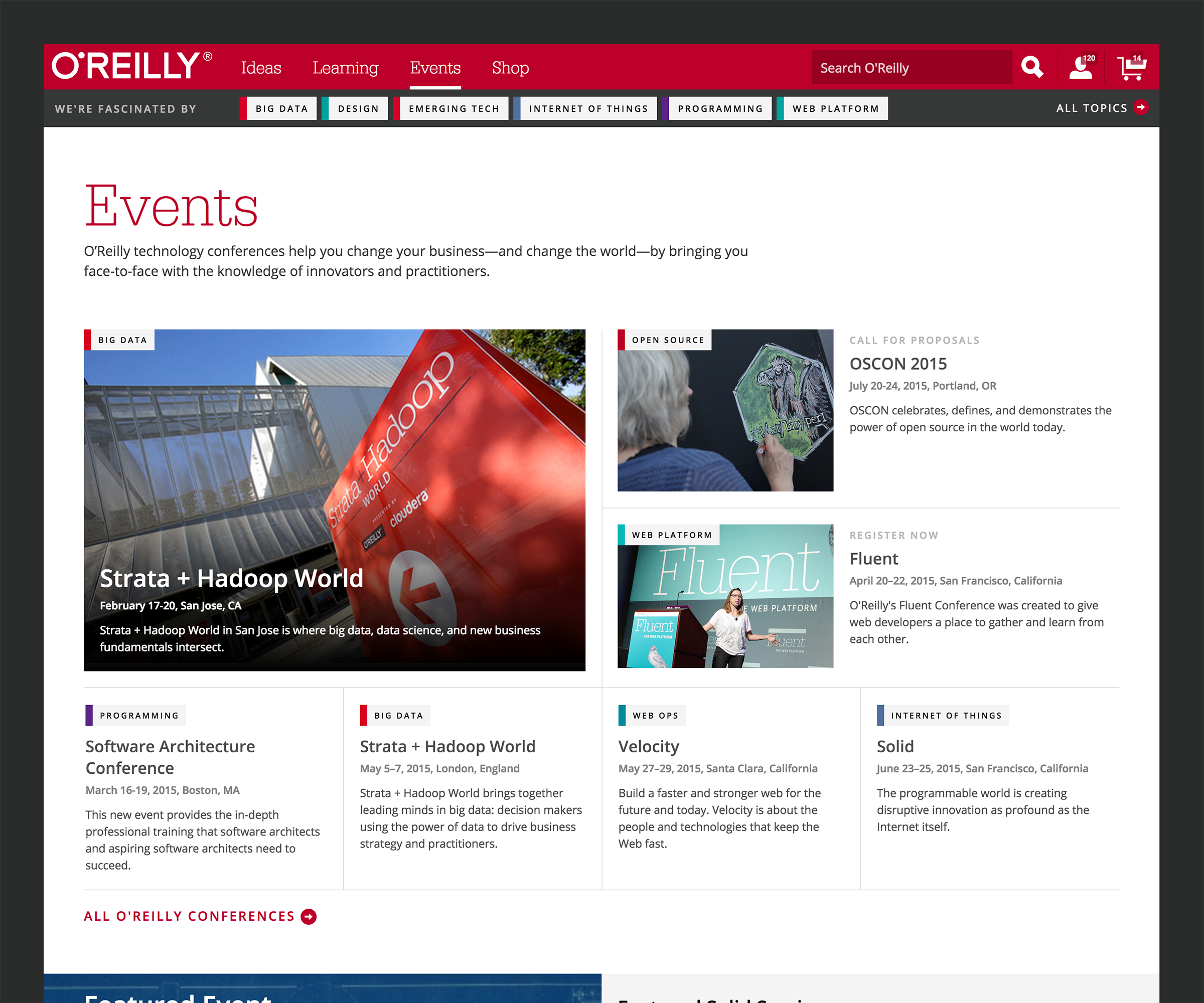
In short: three sections powered by two Display patterns, written as one code block with one modifier. This is the beauty of pattern-based design.
Don’t just build the comp
One of the largest pitfalls in making a modular site is coding exactly to what’s been Photoshopped. A comp is a snapshot in time, an example of elements in use, not canonical documentation for those elements. (That’s exactly why comps may be an artifact of an older time in web design.)
It often falls to the developer to see through the pixels of a comped element to find the actual design pattern. This is why development is design. When I’m coaching agency and product design teams, I often recommend that they move their front-end developers on to the Design team instead of the Engineering team, because I need them to act more like architects than construction workers. (I even recommend ditching “front-end developer” as a title and starting calling them “designer,” but that’s a story for another time.) For most of my projects, I allocate way more time for writing HTML/CSS/JS than I do for in-Photoshop (or -Sketch or -whatever) time, because that’s where the majority of the work—the decision making —happens. In fact, a quick Harvest check puts TJ’s hours on the O’Reilly project at a little over double my own.
I’m currently working with Seven Heads Design to create a new site for Seton Hill University. A lot of our early research pointed to the fact that prospective students are very interested in tying a degree and program to its various career options, so I designed this:

We started to build the “From Degrees to Careers” organism—a Content pattern—but failed to initially realize that we should have been building a “Vertical Tabset,” a Display pattern:
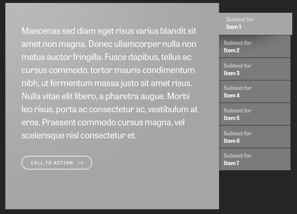
Once we did realize it, we found that it was incredibly simple to apply a similar but different Content pattern (Events) to the “Vertical Tabset” Display pattern to create a new organism:
I’m finding that I have the most success when my Display patterns don’t describe the content within and when my Content patterns don’t suggest anything about their presentation. Not news for those who design with web standards and progressive enhancement, but an occasional reminder doesn’t hurt.
This certainly isn’t a new idea. Web developer Nicole Sullivan has been using the example of the media object for years in how it helped Facebook cut their average CSS bytes per page by 19% and HTML bytes by 44%. This distinction between Content and Display makes up the foundational principles of approaches like Object Oriented CSS.
Decoupling
Ten projects of this type along, I feel like I’m getting the hang of what to look for and how to design this way. For those that are a bit newer though, one of the exercises I often turn to when I’m having trouble visualizing a content workflow is to think about how my boss, my client, or I would manage and maintain the content. I do that by designing a fake CMS for the piece I’m working on.
Imagine you’re assembling a page—starting with small screens, of course—for a site you’re making. Following our formula from above, you could first choose from a list of existing Content patterns, because your CMS would already know about them. Once you’ve chosen a Content pattern, the system would show you all the existing Display patterns in your framework. You choose a Display pattern and watch the preview update to show you what you’re making.
With a construct like this one, each person’s job could break down like this. Initially:
- The content strategist’s job would be to define the Content patterns
- The designer’s job would be to create Display patterns
- The developer’s job would be to create the markup for the Display patterns and create the hooks for Content patterns to flow into the Display patterns appropriately
Once those foundational tasks are completed, the three work closely together to test and tweak the patterns to make sure they’re working as expected. With the completed patterns, the content strategist—or, better yet, the client—can create the entire site by combining Display and Content patterns. Though I haven’t come across a GUI that lets you independently modify Display and Content patterns exactly like this, it’s no surprise that content management systems are trending toward the decoupled route. That’s why this approach of bisecting patterns is so powerful: it mirrors the way that content should be managed and reconciled with its view. Counterintuitively, by decoupling concerns, you’re working more tightly with the people and tools all the way up and down the stack. My most recent projects try to approximate a scrappy decoupling by having the content strategist write JSON simultaneously to Display patterns being created. For example, on a project I recently directed for digital studio Happy Cog, we made Craft publish JSON so that we could use PatternLab for Display patterns and Craft for Content patterns.
Where this all becomes really liberating is when you can have an army of Display patterns that can work with an infinite amount of Content patterns. Though we’re not entirely there yet, I could certainly see distinctions like these being incredibly useful in how we work on pattern-based designs.
Related reading
- Naming CSS Stuff is Really Hard, by Ethan Muller
- From Pages to Patterns: An Exercise for Everyone, by Charlotte Jackson
- Creative Cloud Libraries
- Responsive Design: Patterns & Principles, by Ethan Marcotte
Special thanks to Karen McGrane, Mark Llobrera, Ethan Marcotte, TJ Pitre, Jason Head, Lisa Maria Martin, Josh Clark, Brad Frost, and Kevin Hoffman for reviewing drafts of this article and suggesting edits to get it into top shape. I owe you each a delicious dinner.
Read Next
Titles are Important
Join 67,200+ subscribers to the weekly Dan Mall Teaches newsletter. I promise to keep my communication light and valuable!