This week, I competed in the Relume Rumble for the Relume Design League, a competition to design a landing page live against another designer in just 30 minutes. They say it’s “where web design meets esports.” The winner of the entire bracket earns a cool $10k.
I fancy myself to be a fast designer. I can pinpoint specific times in my career when I’ve gotten markedly faster. I remember when I thought it took about a week to design a solid landing page (2007). I remember when I discovered that I could design a solid landing page in about a day (July 23, 2009). On SuperFriendly projects, I routinely practiced designing pages in a few hours to get stuff out quickly for my teams and clients (2014-ish).
But just 30 minutes? Could I do it? Could you design a landing page in 30 minutes? My gut reaction was that I thought it’d be tough but doable.
Then I watched the previous matches.
Most people had trouble finishing the page. These are award-winning designers whose work I’ve admired. Still, my experience and ego said I’d succeed if I could curb the biggest scourge for designers: decision-making.
So I practiced, using the files from previous matches that Relume made available in the Figma community. I practiced 5 times. I only finished the page once, and barely at that. Uh-oh.
I decided I needed more than an approach. I needed a plan. So I wrote one down, 16 steps in particular. I made it a cheat sheet that I printed out to adhere to during the match.
How’d my plan work? ✨🌟⭐️🥇🏆 I won! 🏆 ⭐️🌟✨
See for yourself by watching the match replay:
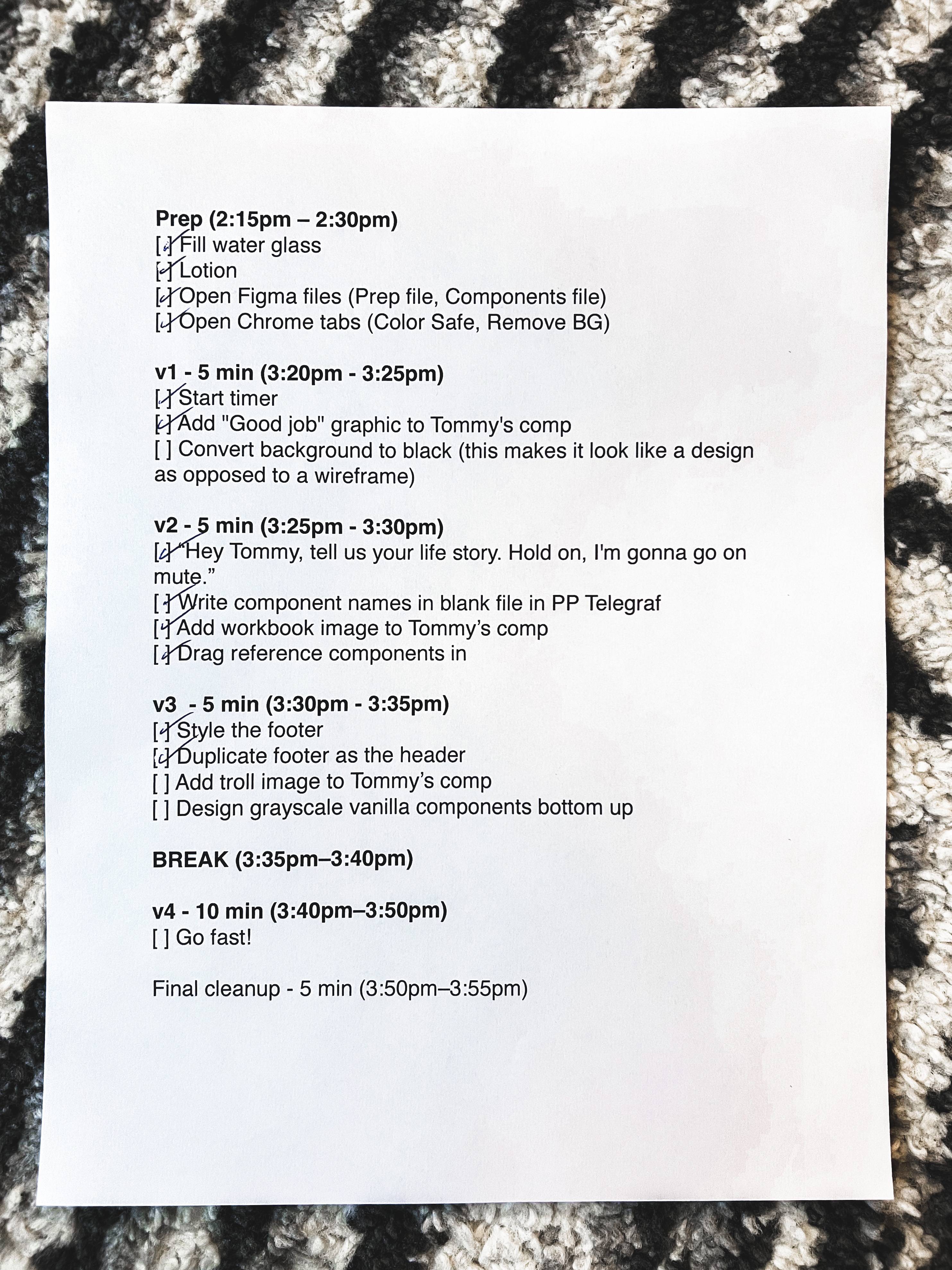
If you’re interested in my strategy, here’s my cheat sheet, and I’ll break down each phase and step below.

Overall
I came up with a few guiding principles that informed these steps:
- I was going up against my friend and seasoned designer, Tommy Geoco. I knew I couldn’t rely on him doing a bad design, so my many years of experience trash talking on the basketball court would need to come in handy here. (Tommy and I regularly do this with each other in Slack about Philly and Arizona sports teams, so I knew it’d be welcome.) I wasn’t sure if I could win, but I maybe I could make Tommy lose.
- It’s easier to revise than create. My hypothesis was that if I could finish the page as quickly as possible—like, within the first 2–5 minutes—I could go back and do multiple passes to make it better each time.
In my practice, I rarely finished because there were too many elements on the page to design in just 30 minutes. If I could somehow combine the page into fewer elements, I’d have a lot less to design. - My wheelhouse in the last few years has been design systems, so any tie to that could probably make the work more familiar, and therefore, faster.
- Most designers design linearly (i.e. one component at a time starting from the top and working their way down the page), but I’ve often been a proponent of what I’ve previously called “outside-in” or “global to local.” It’s a more systematic way of designing where the first thing you design makes the second thing easier, which should make the third thing even easier, and so on. “Outside in” means I work on the larger things first: page layout/scaffolding, structure, overall color palette. Then I work on slightly smaller details: typographic hierarchy, motifs, etc. The last steps are the small individual details that don’t affect anything else but make an individual element sing. (FYI, this is the same approach I take to front-end coding, described well through Harry Roberts’ Inverted Triangle CSS.)
- I’m a good designer, but I’m a great presenter. Perhaps I could fill in the gaps of anything lacking in the design with showmanship both during and after the competition.
Prep (2:15pm – 2:30pm)
- Fill water glass. Proper hydration solves many things in life.
- Lotion. I’m brown. I get ashy. Moisturizing is important.
- Open Figma files. I wanted to have 2 specific files handy (in addition to the Relume Arena):
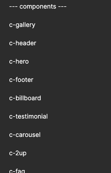
- Components file: As someone who works with design systems a lot, I keep a running Figma file of common components that I like: carousels, FAQs, accordions, billboards, heros, etc. Especially in a time crunch, I figured it’d be way easier to steal my way to an original design than try and come up with something original on the spot. More on this below.
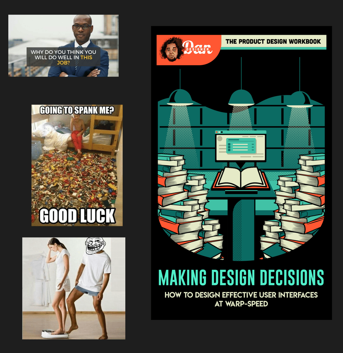
- Prep file: I planned a handful of trolling graphics that I could paste near Tommy’s working area to distract him.
- Open Chrome tabs. I opened a Chrome window with 2 tabs to have handy just in case: Color Safe so I can create color palettes that have sufficient contrast, and Remove Background in case I need to quickly isolate a subject.


v1 - 5 min (3:20pm - 3:25pm)
- Start timer. I keep a digital kitchen timer on my desk to regularly timebox my work so I can keep focused. This was perfect to have so I didn’t need to keep glancing at the clock on the livestream.
- Add "Good job" graphic to Tommy's comp. Let the trolling begin early.
- Convert background to black. In my practice, I found that designing on a white background made the page feel like a wireframe and unfinished, so an easy hack was to change the background to black and design on that. However, the actual subject and theme of our match—“An AI design tool” + colorful and illustrative—threw a wrench in that plan, so I ended up converting the page background to a yellow color I sampled from one of the moodboard images instead.
v2 - 5 min (3:25pm - 3:30pm)
- “Hey Tommy, tell us your life story. Hold on, I'm gonna go on mute.” More planned trolling to both make the audience laugh and throw Tommy off. However, I was so focused on the match that I forgot to do this. I ended up doing this after the break.
- Write component names in blank file in PP Telegraf. The match was sponsored by Pangram Pangram, so one of the soft requirements was to use their typefaces. They gave us 37 families to choose from, and I didn’t want to waste time in the match picking fonts. So, I decided ahead of time that, no matter what the theme was, I’d use PP Telegraf, which I saw as utilitarian enough to work in any style but not so vanilla that it looked like a placeholder typeface.
- Add workbook image to Tommy’s comp. Troll, troll, troll. Tommy admitted later that this one actually distracted him. Success!
- Drag reference components in. Back to design system familiarity, the quickest way to assemble a page is with previously-created components. While I don’t have previously created components in this style, I can use components from different styles—like from other website—to give me an impression of what my page might look like. All I have to do is convert the components to the appropriate style by changing colors and typefaces.
v3 - 5 min (3:30pm - 3:35pm)
- Style the footer. One of the things I learned from both my own practice as well as watching the other matches is that it’s so easy to spend the first half of the match getting the header and hero area perfect, creating a panic that all the rest still has to get done with half the time gone. So, my strategy was to start from the bottom in the hopes I’d have less temptation to spend a lot of time on the least important elements on the page. This strategy didn’t pan out well, as I did the exact same thing by spending too much time on the sign-up area just above the footer. What I learned was that early on, it’s important and necessary to establish a style of some kind of motif that can then be extended throughout the rest of the page.
- Duplicate footer as the header. Where my “style the footer” strategy did come in handy is that I styled the footer in a way that I could reuse it as the header too.
- Add troll image to Tommy’s comp. My plan was regular trolling at a steady clip, but at this point I was panicking slightly so I started to skip steps like this one.
- Design grayscale vanilla components bottom up. In my practice, I learned that it was actually easier and faster for me to design components from scratch that I was familiar with than work with the existing wireframe that I wasn’t as familiar with. That strategy manifested late, as people in the chat—as well as myself—were worried that I wouldn’t get finished with 2 minutes to go, but it eventually worked out.
Break (3:35pm–3:40pm)
There’s a break halfway through to rest and reflect. I still can’t tell if the break was helpful or not.
v4 - 10 min (3:40pm–3:50pm)
Go fast! With half the time gone, my strategy was to move fast. Nuff said.
Final cleanup - 5 min (3:50pm–3:55pm)
My plan was to try and finish with 5 minutes left, and then do some final polish. Ha! Instead, it was more like the final decisions of which corners to cut to get done.
And that was it! There’s a bunch of stuff in my design that I was definitely not happy with, and a few things that I was. Also, there are a handful of things in Tommy’s design that were really smart that I wish I had done in hindsight, like a interesting shape behind the quote, simple treatments on boxes to make them look more polished, and more. Check out both of our finished files if you wanna play around with them.
Despite any regrets and shoulda-woulda-coulda’s, I apparently did enough to impress the audience and the judges to eek out a win! Next week, I advance to the semi-finals, where I take on the formidable Grace Walker! I have my work cut out for me again. I’m spending next week devising a new strategy for my match with her.
How would you have approached this challenge? Similar to my plan? Something totally different? Reply and let me know.
Related
Read Next
Choosing Between Two Good Options
Join 66,800+ subscribers to the weekly Dan Mall Teaches newsletter. I promise to keep my communication light and valuable!