I have a book called Where Chefs Eat. As a reluctant foodie—who still enjoys a Big Mac from time to time—I bought it as soon as I saw it. I figured if I want to eat good food, I should imitate people who know good food.
I think that advice holds true for becoming a better designer too, in areas like choosing a typeface, for example. There’s no shortage of guidance on the internet about how to pick a typeface—over 10 million results, to be exact—but many of them seem written for non-designers and amateur designers with sections like “what is typography?” and “fonts vs. typefaces.” There’s still a large number of designers who know the basics and the theory but still struggle with the practice. So, in the vein of Where Chefs Eat, this is How a Professional Designer Picks Typefaces.
No vanilla ice cream or plain black tees
Let’s start with how I don’t pick typefaces: I try to intentionally avoid choosing typefaces like a non-designer or an amateur designer.
The way I recommend picking typefaces to those groups is to pick something popular. Grotesques and geometric sans are very in right now. Two of the most popular typefaces on Typewolf are Grilli Type’s GT America and Lineto’s Circular. You can’t go wrong with those. They look great and they won’t offend anyone.
The strategy for non-designers and amateurs isn’t to pick a great typeface; it’s to avoid picking a bad one. Vanilla ice cream never tastes bad and a plain black t-shirt will never go out of style.
But a bold flavor or fashion-forward respectively they are not. You won’t attract any attention with this approach, which is part of the important job of a great typeface choice. From the book that initially helped me learn typography: The Elements of Typographic Style, by Robert Bringhurst.
In a world rife with unsolicited messages, typography must often draw attention to itself before it will be read. Yet in order to be read, it must relinquish the attention it has drawn. Typography with anything to say therefore aspires to a kind of statuesque transparency. Its other traditional goal is durability: not immunity to change, but a clear superiority to fashion.
Web browser
In order to pick a great typeface, you have to know great typefaces. In order to know great typefaces, you have to know typefaces.
I spend a lot of time looking at typefaces and browsing type foundry websites. It’s like finding anything special. To find a special record, you might have to go to many record stores. To find a special pieces of furniture, you might have to go to many antique shops. Amazon works great when you know exactly what you want that’s widely available. But finding something you don’t even know you’re looking for means you have to browse.
Start with heart
I’ve been playing the piano since I was 3 years old. I play by ear and am fairly good at playing pop ballads and contemporary songs.
But I’ve always wanted to play jazz, something I’ve never been good at. Improvisation in particular escapes me.
So when Herbie Hancock Teaches Jazz from MasterClass came out in 2017, I watched it immediately.
I got to the lesson about Improvisation and was ready for all of Hancock’s best tips. Finally, it seemed like he was going to share the secret. He said:
You’re born with ears. You’re born with a heart… There’s no method for using them. If it feels right and sounds right, you’re pretty much on the right track.
WHAT.
I was furious. I stopped watching the videos immediately and wrote them off as nonsense.
Years later, as I reflect on that lesson, I realize that’s how I pick typefaces.
I’ve since gone back to watch the rest of the lessons. I realized that he wasn’t saying that’s all there is to jazz. But that’s the first step. If it feels right, you’re on the right track. You’re not finished the work yet, but you’ve moved from step A to step B. (There’s a reason Herbie Hancock is one of the best jazz pianists of all time. I’m embarrassed to say I doubted that for a while.)
Here’s how I start to test if a typeface feels right.
Again from The Elements of Typographic Style, some first principles:
Typography exists to honor content.
Read the text before designing it.
Discover the outer logic of the typography in the inner logic of the text.
Choose a typefaces or a group of faces that will honor and elucidate the character of the text.
I pick a “brand” word that embodies the vibe what I’m trying to design. For example, if I was designing for an automotive company that was trying to create fast, aerodynamic cars, I might pick the word “speed.” I would then type out that word in anywhere from 4 to 100 different typefaces that I pick at random and see if any of them feel right.
(If I’m designing a logotype, I usually use one word. If I’m picking a headline or text face, I might type out a sentence instead.)
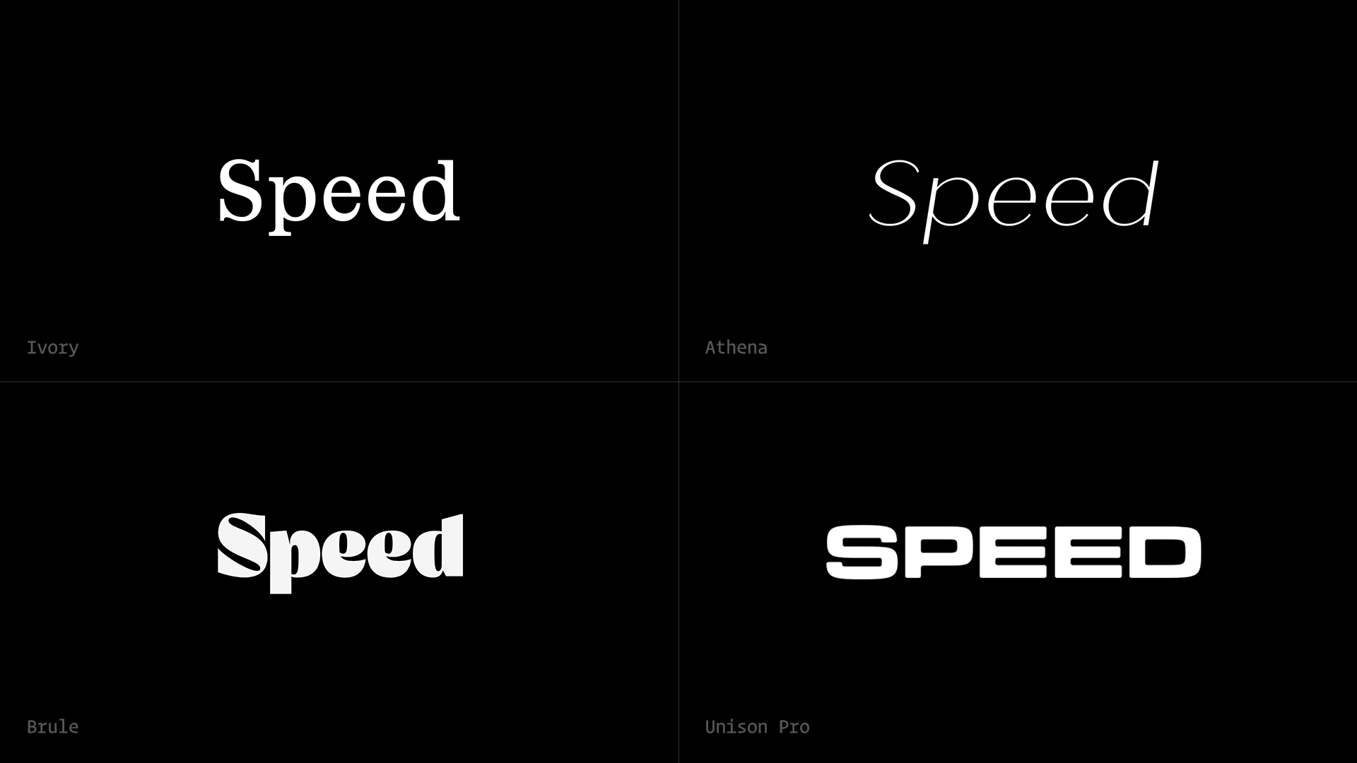
- Ivory: nothing about this speaks to me. Pass.
- Athena: something about the italic feels fast. I'd keep this one, and I’d make a note to do another round of exploration like this with just italic fonts.
- Brule: the curves of the “S” remind me of a windy road with switchbacks that might be fun to drive in a fast car. But the other letters feel too playful. I’m split on this one.
- Unison Pro: the “S” feels like a race track. And something about the extended letters—specifically in “EE”—looks a little bit like motion lines. It’s a keeper.
At this stage, these evaluations are completely subjective. How they feel to me might be way different than how they feel to you… that’s fine!
Zoom in
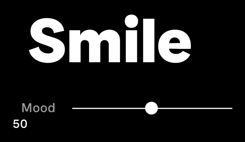
Another thing I like to do to identify great typefaces is look closely at the letterforms to see if they mirror the message of the text. I wish I could remember where I read it, but I heard long ago that good typography should communicate what the text is saying before your brain actually reads the words.
Check out the typeface Faro from Luzi Type. Per their own description:
The font that can smile or be sad. Everything you type has a face, a typeface! Each word you type takes on a unique personality through this versatile typeface. Faro encompasses two distinct moods: Lucky and Sad, allowing you to convey different sentiments in your texts.
If I was setting text about something happy, I might choose the Lucky style where the letterforms change to be a bit more convex to look like the text is smiling.
This is a particularly helpful trick when designing logotypes, as you can further modify the letterforms to help make the point. Check out the logotype Order designed for Ribbon, a company that levels the homebuying playing field by allowing people to make an all-cash offer on a new home. The smart typeface choice allowed them to elegantly modify the “r” and “n” to echo a house + roof shape.
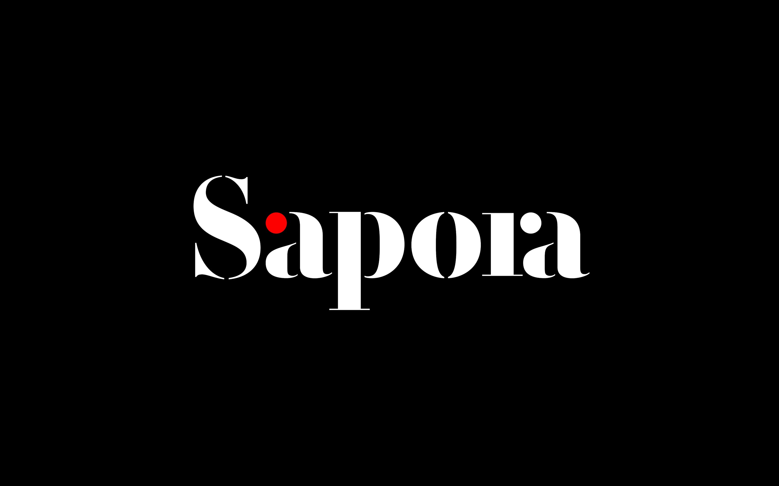
It doesn’t even have to be literal or metaphorical: a great typeface choice can even be purely functional. Angus Hyland’s team at Pentagram chose a stenciled serif style for Sapora to create a very natural-looking “ra” ligature that’s otherwise a pretty tough kerning pair to work with.
In my experience, a great, unique, appropriate typeface choice is one of the most powerful ways to set a brand apart. Any amateur designer can choose a popular, safe typeface, but the best that’ll do is help a brand blend into the sea of homogenous others. An experienced designer can use typography to make a brand stand out from the pack in all the good ways.
In my next article, I’ll show you I once convinced a $750 million company that you probably know well to change their main corporate typeface across all of their properties and packaging even though I was only hired to revamp their digital strategy.
Read Next
You Are Special
Join 67,200+ subscribers to the weekly Dan Mall Teaches newsletter. I promise to keep my communication light and valuable!