Many design system teams think their job is to define best practices for the rest of the organization. Excited about being blessed by leadership as the team to enforce these best practices, the team often resorts to their wish list of things they’ve always wanted to have or try:
- “Let’s reduce our color palette to just the essentials!”
- “Typescript might be a great thing to try.”
- “This seems like the right time to define some motion guidelines.”
- “We’re finally all switching from spaces to tabs!”
This smells like the classic xkcd comic about standards:

This is exactly how that happens. With design systems, there's a specific term for what this leads to: a design system graveyard. Almost every SuperFriendly client is on their third or fourth try at a design system, because the first few “just didn’t take.”
How do you avoid this trap? It’s Activity #5 in our upcoming Design System in 90 Days workbook: identify useful and non-useful patterns in existing design and code.
In other words, don’t try to create best practices. Instead, start by collecting the common practices, and then identify what you want to continue doing within that subset.
A step-by-step way to do that:
- Collect what’s being practiced. (Don’t worry about BEST or COMMON yet. Collect everything.)
- Within that, look for what’s COMMON.
- Within that, look for what’s GOOD.

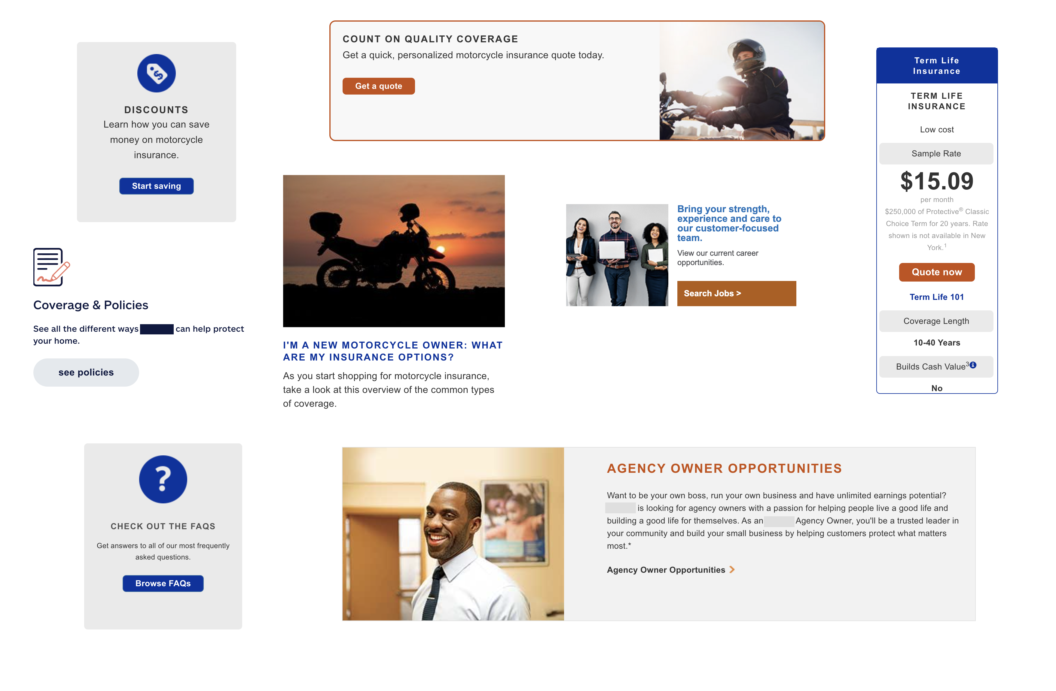
Here's an example. Above are a few “card”-like components, collected from an insurance website. What’s common here?
- Small-ish sans-serif body copy (8 or 8)
- Support for an image, icon, or illustration (7 of 8)
- An all caps headline (6 of 8)
- Some sort of rounded corner call-to-action (CTA) link that looks like a button (6 of 8)
- Left-aligned text (5 of 8)
What’s less common but close? These potentially become variants.
- CTA that’s has either blue or caramel background
- Text alignment (left or centered)
The same kind of pattern spotting applies for the markup too. Here are 3 different ways this similar element has been coded (simplified for the purposes of example):
<div class="article">
<a href="#">
<div class="article-padding">
<div class="row">
<div>
<img class="article-image img-responsive" src="#" alt="" />
</div>
<div class="article-text">
<h2>Headline</h2>
<p>Donec sed odio dui. Etiam porta sem malesuada mollis euismod.</p>
<div class="flat-button article-button">Learn more ></div>
</div>
</div>
</div>
</a>
</div>
<div class="cta-feature threeColumn col-sm-12 col-md-4">
  <div class="module">
    <div>
      <div class="icon-price-selected"></div>
    </div>
    <div class="col-sm-12 no-padding">
      <h3>Headline</h3>
      <p>Donec sed odio dui. Etiam porta sem malesuada magna mollis euismod.</p>
      <a href="#" class="btn btn-primary">Learn more</a>
    </div>
  </div>
</div>
<div class="calloutBox">
  <div class="lpleft">
    <img src="#" alt="" />
  </div>
  <!-- End lpleft -->
  <div class="lpright">
    <h3>Headline</h3>
    <p>Donec sed odio dui. Etiam porta sem malesuada magna mollis euismod.</p>
    <a href="#" target="_blank"><span>Learn more</span></a>
  </div>
  <!-- End lpright -->
</div>
What’s common?
- Headline marked up as
<h3>, followed by paragraph (2 of 3) - Image comes first (3 of 3)
- Kebab case (2 of 3)
Less common?
- Wrapper elements
- Name (article, feature, callout)
Identifying these factors are key in increasing the likelihood of adoption. These can be identified as early as Day 5 and prepare you to created abstract versions on Day 39.
Most teams get adoption backwards. Instead of feature teams adopting a design system component, step 1 is for the design system to adopt an abstracted version of a component that multiple feature teams’ already have in use.
Then, initial feature teams re-adopt the abstracted component. After that, more teams are even likelier to adopt that same component.
You’ll find 50 more activities like this to do in our Design System in 90 Days workbook, releasing on Wednesday June 1, 2022 at 12pm Eastern. Subscribe to our email newsletter for updates on the release!
Read Next
Measuring Speed with Design Systems
Join 66,800+ subscribers to the weekly Dan Mall Teaches newsletter. I promise to keep my communication light and valuable!