Bootstrap and Material Design are incredibly thorough systems, so it stands to reason that many of our clients ask whether or not it’s worth the effort to create a design system from scratch as opposed to using an already mature platform.
Here’s the answer we typically give:
Start with Bootstrap or Material Design if:
- You need to get up and running very quickly
- You’re willing to forego custom branding or code conventions
- A generic or Google-vibe aesthetic suits or enhances your product
Start creating a design system from scratch if:
- Your design system needs to last 3 or more years without a major refactor
- You’re going to need custom branding or code conventions in short order, or otherwise need to make your design system distinct.
We’ve found that teams tend to outgrow OPLs—Other People’s Libraries—at about the 3 year mark. (In this context, “outgrow” means you find yourself overriding or removing more of the library than actually using it.)
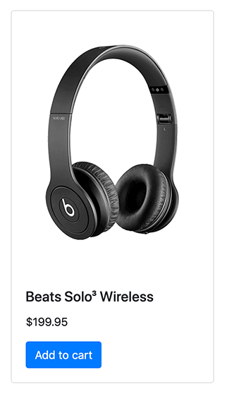
Let’s see how this works with a simple example. Say you wanted to showcase your headphone product in a card. Using Bootstrap out-of-the-box, you can use this HTML…
<div class="card" style="width: 18rem;">
  <img src="headphones.png" class="card-img-top" alt="Beats Solo(3) Wireless" />
  <div class="card-body">
    <h5 class="card-title">Beats Solo<sup>3</sup> Wireless</h5>
    <p class="card-text">$199.95</p>
    <a
      href="/products/headphones/beats-solo-3-wireless/"
      class="btn btn-primary"
      >Add to cart</a
    >
  </div>
</div>
…to create a card that looks like this:

If you’re satisfied with that, great! Bootstrap is a good candidate to jumpstart your design system.
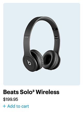
But your team might not be able to live with that, because you need or want your card to look more custom:

Perhaps you’d like your brand typeface for the card heading, so you add a font-family: 'Graphik'; declaration to the card. You use an 8-point grid elsewhere, so you change all of your type sizes, padding, and margin to multiples of 8. And your house coding style is to use a BEM-like syntax, so you modify the markup from <div class="card"> to <div class="c-card">. And you don’t want your cards so contained, so you ditch the borders.
Just for those small amount of changes, we’ve had to touch all but 2 lines of our HTML…
- <div class="card" style="width: 18rem;">
+ <div class="c-card" style="width: 18rem;">
-    <img src="headphones.png" class="card-img-top" alt="Beats Solo(3) Wireless" />
+    <img src="headphones.png" class="c-card_img--top" alt="Beats Solo(3) Wireless" />
-    <div class="card-body">
+    <div class="c-card_body">
-        <h5 class="card-title">Beats Solo<sup>3</sup> Wireless</h5>
+        <h5 class="c-card_title">Beats Solo<sup>3</sup> Wireless</h5>
-            <p class="card-text">$199.95</p>
+            <p class="c-card_text">$199.95</p>
-            <a href="/products/headphones/beats-solo-3-wireless/" class="btn btn-primary">Add to cart</a>
+            <a href="/products/headphones/beats-solo-3-wireless/" class="c-btn c-btn--primary">Add to cart</a>
    </div>
  </div>
…and all of this CSS:
  html {
-   font-family: sans-serif;
+   font-family: 'Graphik', Helvetica, Arial, sans-serif;
  }

- .card {
+ .c-card {
-   border: 1px solid rgba(0, 0, 0, 0.125);
-   border-radius: 0.25rem;
  }

+ .c-card_image--top {
+   background: #deebf2;
+   border-radius: 8px;
+ }

- .card-body {
+ .c-card_body {
-    padding: 1.25rem;
+    padding: 1.25rem 0;
  }

- .card-title {
+ .c-card_title {
-    margin-bottom: 0.75rem;
  }

+ .c-card_text {
+    margin-bottom: 0;
+ }

- .btn {
+ .c-btn {
-    padding: 0.375rem 0.75rem;
  }

- .btn-primary {
+ .c-btn--primary {
-    color: #fff;
+    color: #198ec8;
  }

+ .c-btn--primary:before {
+    content: "+";
+    font-size: 1.5em;
+    margin-right: 0.3em;
+    position: relative;
+    top: 1px;
+ }

- .btn:hover {
+ .c-btn:hover {
-    color: #212529;
  }

- .btn-primary:hover {
+ .c-btn--primary:hover {
-    color: #fff;
+    color: #0056b3;
-    background-color: #0069d9;
-    border-color: #0062cc;
  }
And that’s all just for 1 component. Bootstrap has 24 components in it, so the lift to modify every component isn’t insignificant.
For all that effort, you might as well roll your own.
Further reading
Lee Nelson has written a counterpoint to this article.
Read Next
The Hot Potato Process
Join 66,800+ subscribers to the weekly Dan Mall Teaches newsletter. I promise to keep my communication light and valuable!