Last week, I watched two designers go head-to-head in a high-speed battle to create the best landing page in 45 minutes. One was a seasoned pro. The other was a non-designer using AI.
I’ve thought about it every day since.
The match was part of Build Wars, a 45-minute challenge hosted by Tommy Geoco, Hunter Hammonds, and guest judge Tom Johnson. The contenders? Brett Williams from DesignJoy using Webflow vs. Henrik Westerlund using Lovable.
I think it points to some really interesting shifts in the future of design.
Before I say too much more, watch it for yourself:
The real story
In the end, Brett won both the judges and the audience vote. No surprise: he’s an experienced designer, and “great designer makes great design” isn’t exactly breaking news.
But that’s not the interesting part.
The real story is what happened during the match and what it might be telling us about where design is headed.
The build-up to Build Wars
Before the match, I couldn’t decide who would win.
I didn’t know either of the players personally. Henrik was new to me, and I’ve only exchanged a DM or two with Brett. Based on experience, Brett had the edge. But I also thought someone using a sufficiently advanced AI tool could win just by iterating quickly and stumbling onto something unique.
That uncertainty built my anticipation for the match. I imagine a lot of others felt the same.
(Gotta give Tommy and Hunter their flowers for setting this up so well.)
Pace yourselves
One of the first striking things to me about this match is each player’s pace. If I had to graph it, it’d look like this:
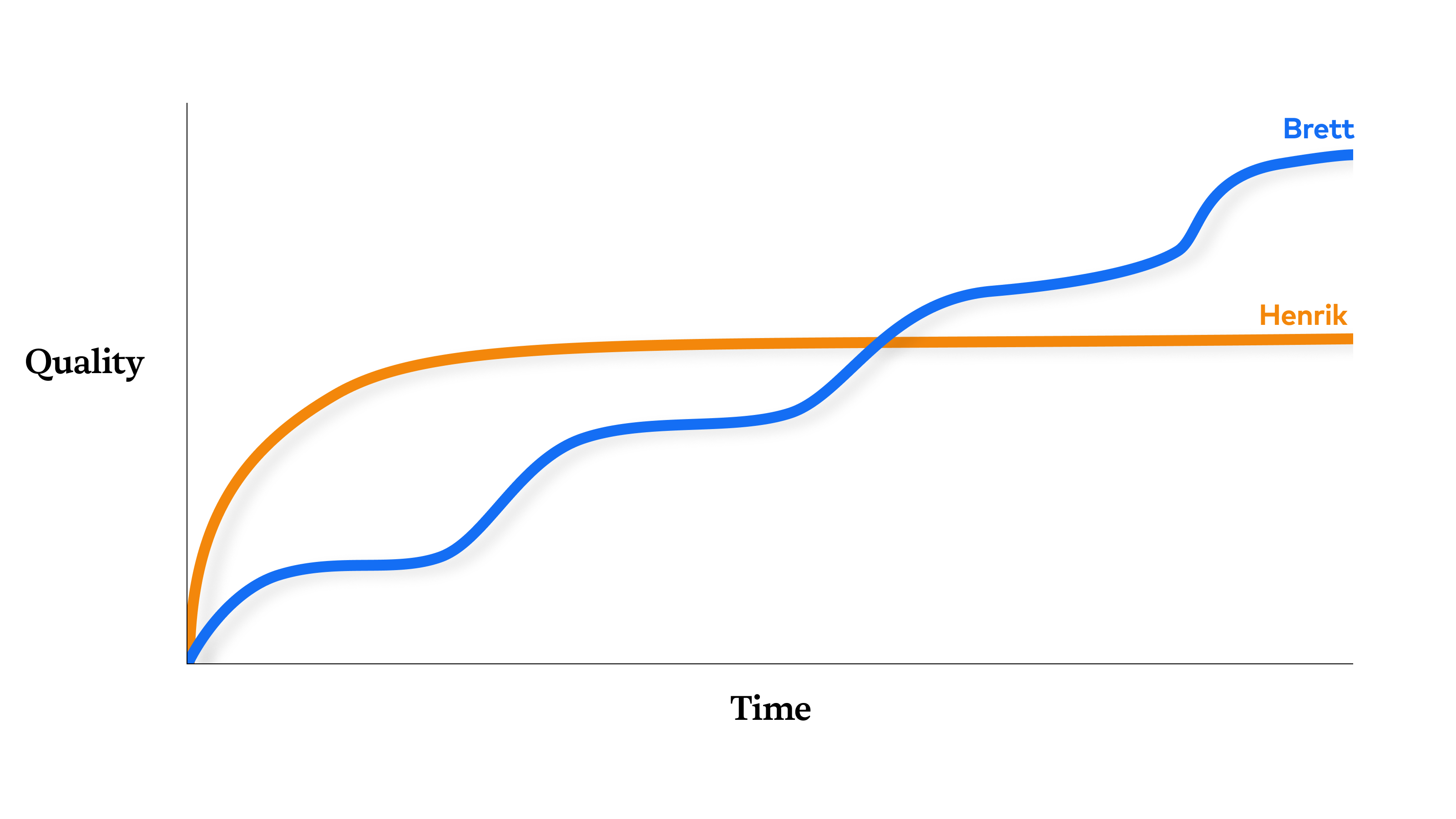
Within the first five minutes, Henrik had a high-fidelity section assembled: logo, navigation, headings, buttons, animations, gradients. At that same point, Brett only had a text box with default styling on a primitive shape.
I think this has to do less with Henrik and Brett and more to do with the tools they’re using. I’m reminded of the quote from professor John Culkin (often misattributed to media theorist Marshall McLuhan):
We shape our tools and thereafter our tools shape us.
We’re watching that play out in real time! The shape of Henrik’s pace is the shape that many generative AI tools encourage: a big burst of energy at the very beginning of the process. This is what’s so exciting about them! Since the beginning of each form, creators have lamented the what writer Natalie Goldberg aptly characterized as the “tyranny of the blank page,” a problem generative AI seems to eradicate.
This is what’s so interesting about this match to me. It’s less about one platform or tool vs. another more than it is a commentary on how design happens, and whether or not that’s changing in a significant way.
Design is deciding
I’ve said it before and I’ll say it again: design is deciding.
The best designers are the best deciders.
That’s the paradox that makes design so challenging for even the most experienced designers. What makes a design great is when we apply our judgment, picking a few choice candidates from thousands of typefaces and millions of colors.
That same “skill” becomes a hindrance when faced with a blank page. We deliberate. We contemplate. We stall. We’re paralyzed by choice. At this stage, there’s too much to choose from.
AI doesn’t have that problem. It just produces. A frame is filled with an illustration. A canvas is littered with components.
But let’s not conflate that with judgment, or even selection. It’s diffusion. It’s pattern matching. It’s statistical synthesis and averaging. And yes, all of those things are part of a designer’s process too. But designers decide whether to follow patterns or diverge from them. Generative AI doesn’t yet consciously do the latter unless instructed to, and it doesn’t yet know if it made a good or bad choice.
To complicate matters, the design process is a series of decisions. Said differently, it’s a series of plateaus, and you only get to the next one if you make a decision you can build on, i.e. a good decision. Until you do that, you’re stuck for a while.
I literally watched that play out during the match, and you can see it in the graphs. Henrik got through the first plateau quickly because he made a few upfront decisions—like which components to use from 21st.dev and feed to Lovable—but then he got stuck. He didn’t seem to know what to decide next. Because Henrik is not a designer. by his own admission. The rest of his match was one big plateau. Brett moved more slowly at first, but his decisions compounded to ultimately overtake where Henrik was stuck.
Around 35 minutes into the match, there was an inkling of a spark on Henrik’s end. He opened a new window and generated a completely new interface. I thought this was a genius move. Here’s what I think happened. I think Henrik came into the competition with an idea of what to make in his head. At some point, he realized that either he achieved what was in his head and it wasn’t as good as he thought, or he was somehow blocked from achieving what was in his head and needed to try a different avenue. Both of these things happen to designers all the time. If I was coaching Henrik, I would tell him that he needs more ideas to collide into each other, so go do another version of the interface, which he did. This is an advantage for him in this competition too: Brett’s moving slowly because of his tool choice, and Henrik has a tool that allows him to move faster. But I don’t think Henrik knew what to do with the second interface. I would have told him to try to combine the best ideas from the first one with the second one, but I don’t think he knew to do that or how to do that.
This is where designers still have an advantage over non-designers: designers know where, when, and how to make decisions. Anyone can make stuff with generative AI, but without the muscle memory of knowing what to make and when, they plateau easily.
Finding motif-ation
If I had to pinpoint the moment Brett won me over, it was 11 minutes in.
He set a paragraph in the typeface Brockmann. Suddenly, his landing page felt different. It wasn’t a generic template—it had personality.
Hunter called it out immediately: “Brett’s already laying down some style.”
I don’t know how much of it he planned in advance and how much emerged as he was designing and exploring, but we as the audience started to see it in that moment.
Henrik, on the other hand, started with default sans-serif type. When he later changed fonts, he picked Plus Jakarta Sans—a good typeface, but one that blends into the sea of modern sans serifs.
Both Brett and Henrik had some interactions that made the judges ooh and ahh, but none of them felt signature to me. They weren’t conceptually relevant, so they felt more gimmicky to me than anything. I chalk that up to the competition rules all but forcing them both to do that, and I think it actually became a distraction to their abilities to design something good. I’d lobby for that requirement to be removed for future Build Wars if the competition is more about great design than building fast.
As is often the case, there’s a German word that perfectly encapsulate a major part of what makes a great design to me: leitmotif. Leitmotif is when a composer assigns a short melody, rhythm, or harmonic progression to a person, place, object, or concept in a piece of music, film, or theater. Every time you hear it, it connects you emotional with that element of the story.
Ludwig Göransson talks about the process of crafting leitmotif when composing the soundtrack for Black Panther, specifically in the theme for Michael B. Jordan’s Killmonger character. He went to Senegal, assembled a group of musician storytellers called Griots, and let them play for a few hours. One of the musicians played a flute called the Fula flute, which Göransson said sounded like Killmonger to him. He gave the flute player some context about the character, and the musician began to work with it. As the theme revealed itself, Göransson knew they had found it:
I got goosebumps, and I was like, “Okay. This is something special.”
That sounds like great design to me. Themes emerge through doing the work, but you have to know how to cultivate it and you have to know where to find it. Sometimes, you can feel when you’ve arrived at something special.
I don’t know if we have a word for when leitmotifs happen visually—maybe “motif” is the closest we have—but this happens all the time in great pieces design, most often in brand identity work and art direction. Think: Lyft’s pink. Nike’s use of Futura Extra Bold Condensed. The Burberry check pattern. Motifs aren’t just aesthetic choices; they’re signatures.
Brett was starting to find his motifs throughout the competition. He brought a few from the start, like the gradients and a particular orange accent color. In my view, the fact that he had any at all and Henrik didn’t is a major contributor to why Brett’s design was considered better.
I’d also argue that Brett only found his real motif after the match was over. He mentioned trying to use the gradients as what he called “visual anchors”—a synonym for “motif” in my opinion—to tie the design together… in his words, to “pierce through.” But he also had this seemingly throwaway tagline he included at the bottom: “Made by humans.” I think Brett realized afterwards that concept was a stronger creative direction, as he later tweeted some swag around that concept that got a lot of love and even partnered up with Creative Department on humans.design to make it a reality. I’m hard-pressed to believe that AI could connect those dots even if it had been able to prompt its way to a design like Brett’s.
Why weren’t these kinds of seeds in Henrik’s design?
Because Henrik isn’t a designer.
And that’s where it gets interesting.
Leveling the playing field
Brett won because he’s a great designer.
Henrik made it a competition even though he’s not a designer.
That’s the real story here.
It shouldn’t be possible for a non-designer to challenge an experienced pro. And yet, for 45 minutes, Henrik did. That’s a testament to how much AI can start to level the playing field.
(For what it’s worth, I think the 45-minute limit helped Henrik. With more time, Brett’s iterative compounding would’ve widened the gap.)
As compelling as this match was, Brett on Webflow vs. Henrik in Lovable was a great appetizer.
The main course I want is Brett on Webflow vs. Brett on Lovable.
It‘s not specifically about Webflow or Lovable. Or Framer. Or ChatGPT. Or Cursor. The real question isn’t, “Can AI tools help non-designers?” We’ve seen they can.
The question is: Can they make elite designers even better?
The future of design isn’t man vs. machine
When technology changes, the bottom always drops out. Smaller farms relying on manual labor went out of business when the tractor came along. Scribes were replaced by the printing press. Railway workers lost jobs as the automobile became more popular. Clients and companies will turn to non-designers who can use AI tools.
But farms that adopted tractors thrived. Some scribes became typesetters, printers, and specialized calligraphers. Many railway workers got new jobs at auto manufacturing plants as machinists, mechanics, and assembly line workers.
AI raises the floor for non-designers. But can it raise the ceiling for designers? I’m betting the answer is yes, and we need the next match to show us how.
If you’re a skilled designer, don’t compare your future to a non-designer using AI. Compare your future to your present, just like you compared your present to your past. Is your design work better now that you use Figma than when you used Sketch or Photoshop? Will it be better if you integrate AI into your workflow?
Now is the time to figure that out, while everyone else is too.
What can a seasoned designer like Brett do with AI? I can’t wait to see it.
Personally, AI has made me a better designer. Using ChatGPT to help with website copy is the tip of the iceberg. In the past few months, I’ve used a small handful of new tools that have leveled up my work in concept, strategy, design fidelity, information architecture, and just about every facet of my work.
In next week’s newsletter, I’ll share how you can use new AI tools to level you up too.
Related reading
- Read Tommy’s writeup in this week’s UX Tools newsletter.
- Brett’s reflections after the competition
- Artificial Intelligence & Humanity, my thoughts from 2 years ago (we’ll see how well this ages)
Read Next
I Sold My Agency SuperFriendly
Join 66,800+ subscribers to the weekly Dan Mall Teaches newsletter. I promise to keep my communication light and valuable!