I’ve never really been happy about the way I’ve worked with typography in design systems before. As I’m currently working on another big design system, it seemed time to change that.
Common wisdom regarding typography in design systems seems to often include:
- T-shirt sizing (small, medium, large, etc.)
- Some context-specific dichotomy like “heading sizes” or “body sizes” or “caption style”
- Some sort of typographic scale
Let’s deconstruct these a bit.
On the surface, t-shirt sizes make good sense. They follow a metaphor that just about all people can understand intuitively. But there are a few areas where I’ve seen them break down, especially when tied to a context like headings or body text:
First, they don’t scale well. Many systems need a few more options than the typical six: XS, S, M, L, XL, XXL. Because of that, I’ve encountered too many systems that try to hack it with a “Medium-2” or “Mini Large” or “XXXXXL” in them, all additions that break the simplicity and intuitiveness of t-shirt size system. I’m counting the days until I find a “Schmedium" style somewhere.
Also, it’s too easy to conflate the h4 style—intended to be shorthand for “the fourth largest heading style”—into actually meaning “use an <h4> element.” After all, <h2 class="h4">is a bit of a mindbender and seems wrong at first glance. I’ve seen those who don’t understand the power of HTML and CSS—whether that’s designers that aren’t very familiar with front-end code or full-stack developers who focus more or back-end or DevOps than front-end—feel forced to choose between appropriate styling and semantic code. They’ll pick an inappropriate element because it looks visually looks right or pick what visually looks right at the expense of semantics and accessibility, defeating the inherent advantages that HTML and CSS have out-of-the-box.
Seeing where this kind of system becomes difficult has taught me a few things:
- Linear systems work well when we can accurately predict how they’ll scale, and we humans suck at predicting how others will use the systems we create. If you call a 12px text size “small” and a 16px text size “medium,” you better be dang sure no one will ever need a 14px text size, or you can kiss your system goodbye.
- Abstracting styles are difficult but worthwhile. Calling it a “caption style” means it’ll likely never get used in the utility navigation, even if it’s the right style. This leads to a lot of duplication in CSS.
- In a system designed to be used frequently, intuitiveness may be over-valued. It might be just fine to ask people to learn a system that has a slight learning curve. Habit may very well be the solution to the difficulty that is creating an intuitive system.
With those in mind, here are some other ways I explored to create a typographic system that works.
Guessability, an alternative to intuitiveness
The Amazon Echo was the first voice-controlled personal assistant I purchased. The thing that most impressed me was how well it catered to things I guessed I could do with it, even if I didn’t know I could.
Coming to terms with the fact that there likely isn’t a wholly intuitive typographic system I could employ and that there likely will be some sort of learning curve actually gives me a bit of leeway. I started to think about systems that could have high guessability.
I explored what kind of guessability I could achieve when drawing upon institutional knowledge, popular knowledge, and common knowledge.
Institutional knowledge
Ever since I stumbled across Andy Clarke’s Star Wars styling, I’ve wanted to try something similar. One of the design systems we’re building right now is for a major airline, so my first thought was to tie the typographic system back to a piece of institutional knowledge: in this case, the fleet. Even if designers and developers aren’t already familiar, this could be a nice way to get some engrained knowledge about the company’s main offerings. Here’s the first pass at that.
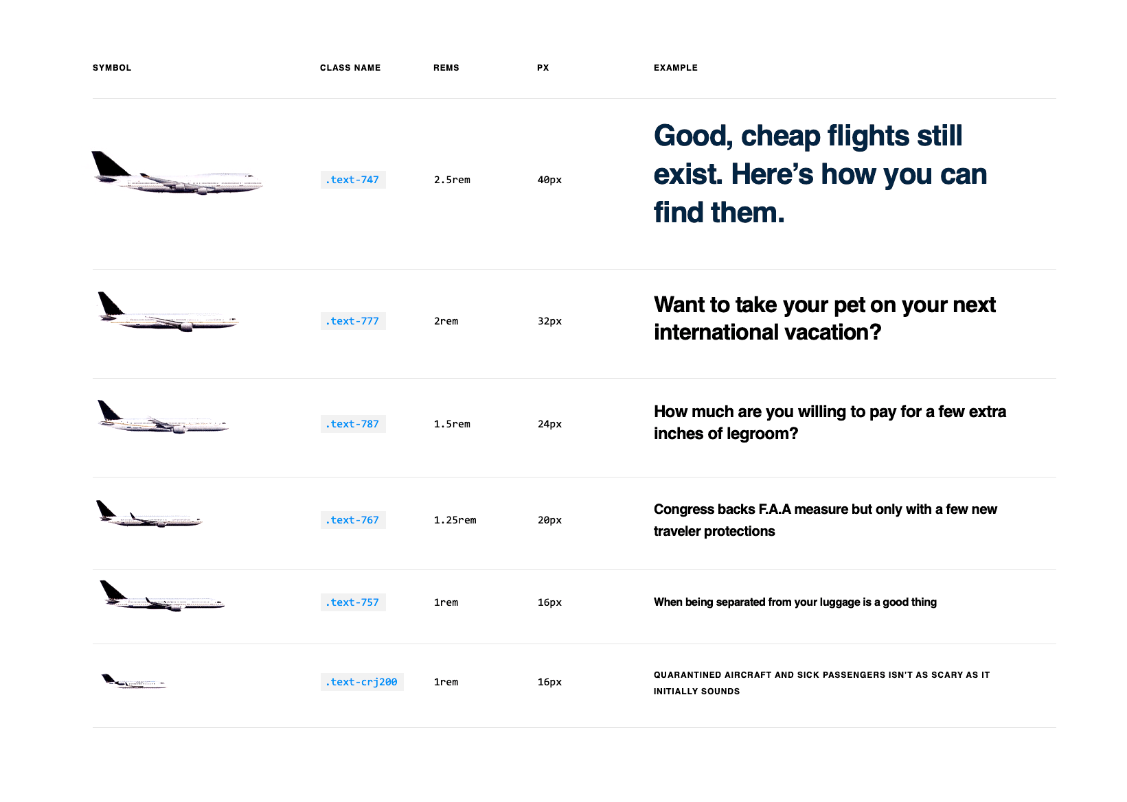
One of the biggest problems with this is that not only is it not intuitive, but it’s actually counterintuitive, essentially unguessable. I do a fair bit of flying on planes, but I learned during this exercise that a 747 is larger than a 777 and a 757 is longer than a 767. And, once I run out of 700-level planes, I have to move to a completely different type of plane—the smaller CRJ line—all of which I imagine to be incredibly infuriating for a designer or developer that’s just trying to set a 32-px headline. This is a non-starter.
Popular knowledge
Since institutional knowledge tended to have too much nuance to be helpful, I decided to try out more popular knowledge. The Brady Bunch and Simpsons characters have inherent age groups and sizes that may map to any typographic scale nicely:
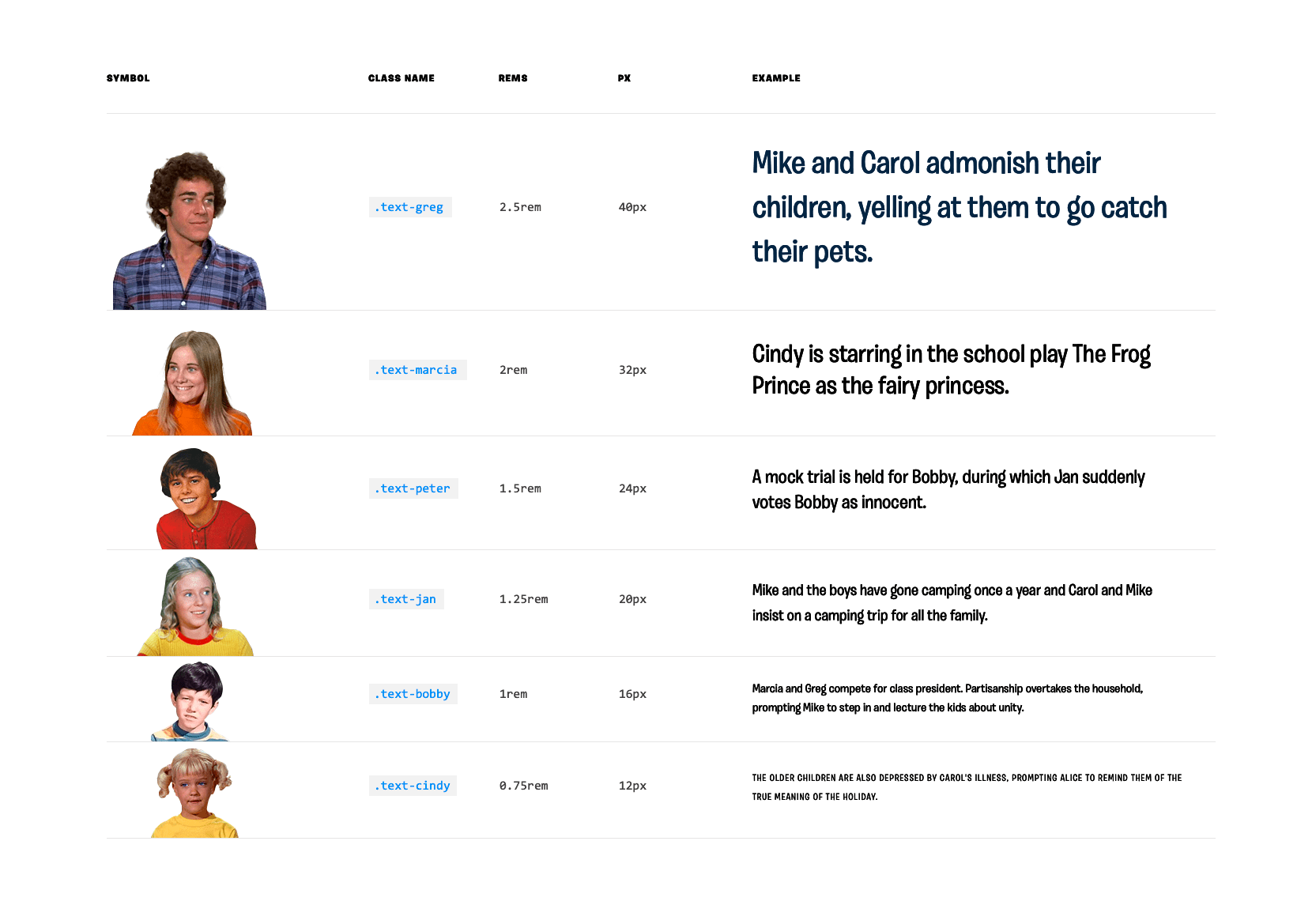
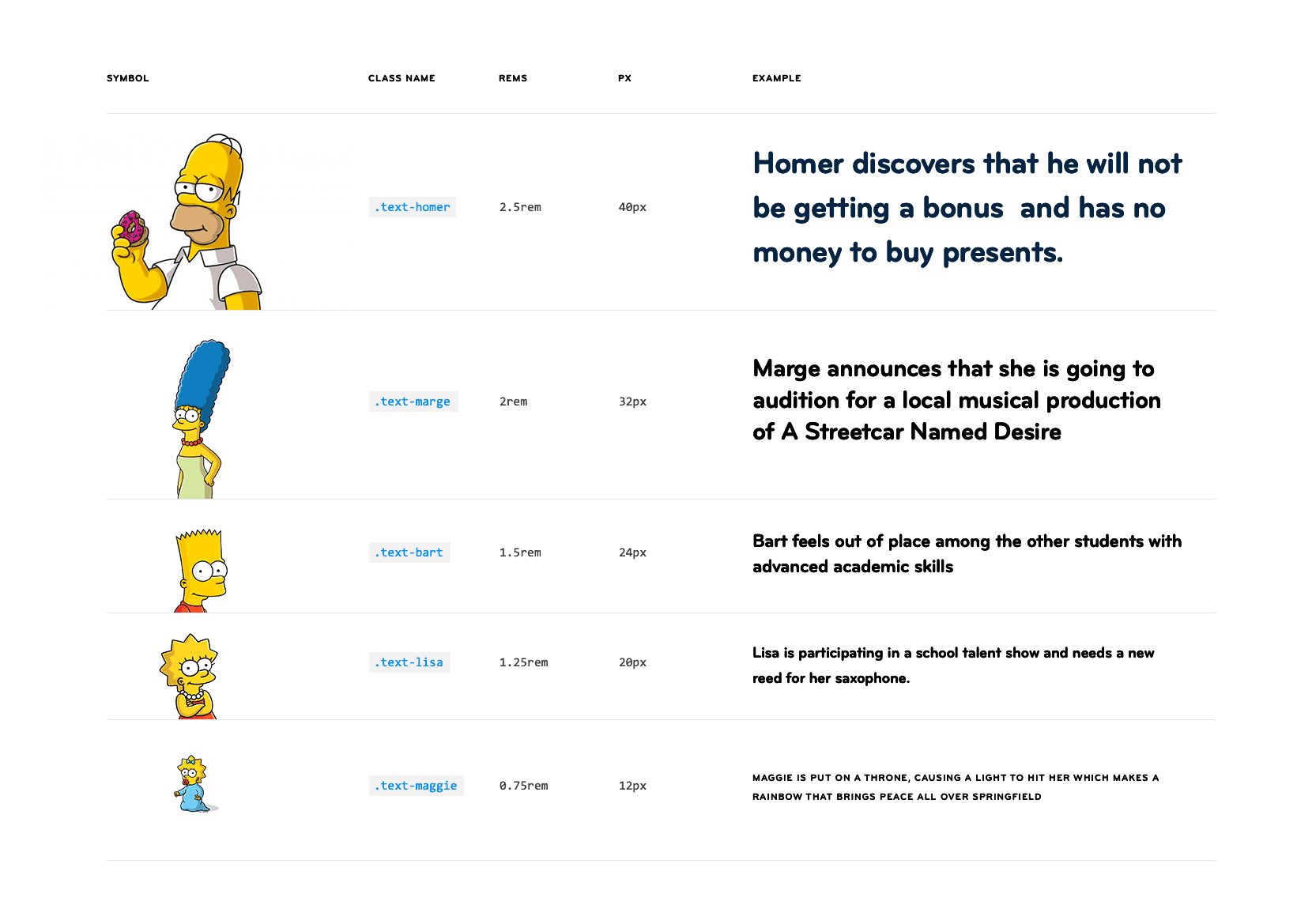
While there’s some merit here, there are definitely problems as well:
- If a designer isn’t familiar with the Brady Bunch or the Simpsons, the system is completely useless, because it’s unguessable.
- There are scale problems here too. The Brady Bunch system features the 6 kids. But what happens if we need a 7th style? Add Alice? And shouldn’t the Alice style be larger than the Greg style? We’s back in t-shirt size territory.
Popular knowledge also seems to have just as many disadvantages as advantages.
Common knowledge
I’ve long been a believer that design systems should contain the smallest number of elements that help you design the greatest variety of interfaces. So, I set out to create the smallest number of unique typographic styles that any interface in this system might need. Starting with the magical number seven, plus or minus two, I challenged myself to create 7 and only 7 typographic styles. I think of them as “presets,” a default combination that acts as a starter to be modified.
I also tried not to be too clever about the names. There are 7 presets, named 1 through 7. The common knowledge here is that anyone that knows how to count gets this system. These are the atomic typographic units from which all the system’s typography stems.
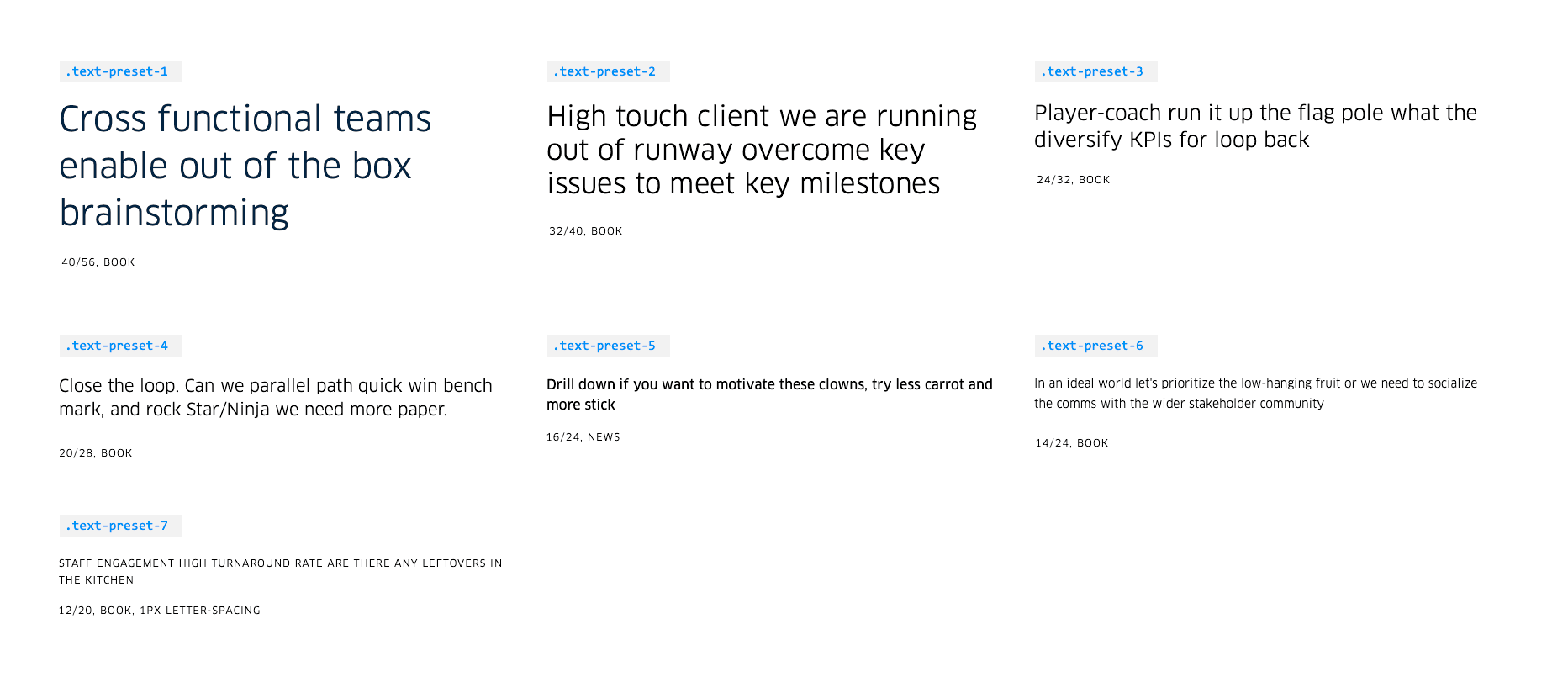
In BEM style, each of these presets also has a bold modifier.
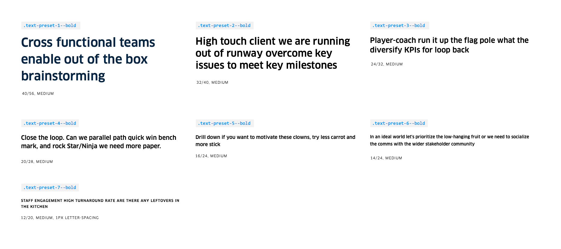
If we try as much as possible to stick with these 7 options but decide we really need another typographic style, it’s easy enough to tack it onto the end as number 8. No need to try to sneak anything in-between the existing presets. The guessability is extremely high here.
A typographic system in code
To actually use this typographic system in a digital product, let’s set up some canonical presets as mixins to be included everywhere. Each preset includes the combination of properties—size, leading, weight… whatever you decide—that should always travel with it. Here’s how that might look in an .scss file:
I’m glossing over a few details of how I set up my CSS files philosophically, which I’ve described in a previous article, “Cooking with Design Systems.”
@mixin text-preset-1 {
  font-size: 40px;
  font-weight: 300;
  line-height: 56px;
}

@mixin text-preset-7 {
  font-size: 12px;
  font-weight: 300;
  letter-spacing: 1px;
  line-height: 20px;
  text-transform: uppercase;
}
These are the only places in your (S)CSS that you should see font-size or line-height or font-weight declarations. Everywhere else in your code, you should be simply including 1 of these 7 presets:
.caption {
  @include text-preset-7;
}

.tabs_title {
  @include text-preset-7;
}

.kicker {
  @include text-preset-7;
}

@mixin text-preset-7--bold {
  @include text-preset-7;
  font-weight: 700;
}
If you do find individual declarations, they should be a sign to you that you’re intentionally overriding or deviating from the system.
This methodology can help you tie different elements to the same canonical typographic preset. This way, any broad changes happen at the preset level and can trickle outward to any component that inherits that style.
So far, so good
To date, we’ve built about 45 pilots utilizing over 80 atoms, molecules, and organisms, and the typographic system of 7 presets has held up without having to have added to it. That’s not to say we don’t have outliers, but so far, I only count twice that we’ve had to make something custom.
What kinds of typographic systems have you found useful?
Read Next
My Experience with Laser Eye Surgery
Join 67,200+ subscribers to the weekly Dan Mall Teaches newsletter. I promise to keep my communication light and valuable!