In 2011, I had the chance to work with another dream client. Crayola, a company that makes somewhere between $500M and $750M every year, hired Big Spaceship—the agency where I was working—to revamp their digital strategy. I was fresh off another successful dream project—art directing the Star Wars website—and I got promoted to design director to have my own team to lead. My bosses decided the Crayola work was a great first project for us, and I was excited to show what we could do.
I led the project from the very beginning. I was in on all the sales calls, and I helped shape our strategy and pitch.
I remember the specific moment in the pitch meeting where we earned their trust. We showed a slide that was our strategy boiled down into a simple diagram—drawn with Crayola crayons, of course.
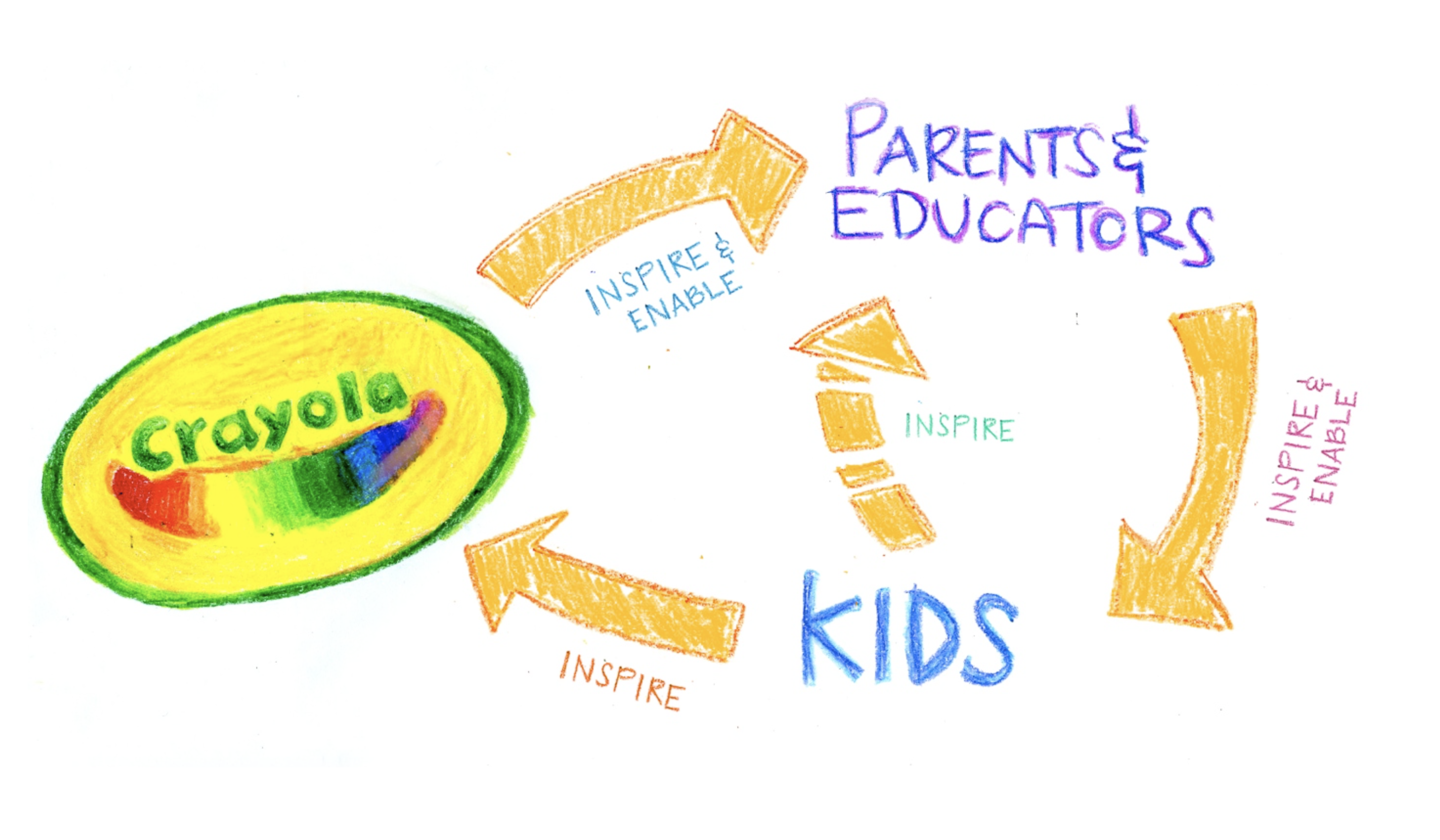
I saw in their eyes that they felt that we “got it.” This was the first important moment that allowed me to be able to suggest things that they wouldn’t have accepted otherwise. The more you accrue moments of trust with your clients and stakeholders, the more influence you gain.
We officially won the work and started the project. It started like many projects do: trading files, onboarding, get our collective heads around what we're doing, and learning to work together.
From the moment we received their brand guide, there was something that immediately bugged me: their corporate typeface, Cronos. There’s nothing inherently wrong with it; it’s a beautiful typeface, drawn by the expert type designer Robert Slimbach. But it just didn’t feel right to me for speaking to parents, educators, and kids—and, as I shared in last week’s post, feel is a big part of how I choose typefaces.
The usage of Cronos also revealed how inappropriate it was for the task: making it fit seemed to require a lot of cheap design tricks like bevels, embossing, drop shadows, extreme gradients, glows, warped text, thick strokes, and more. I was determined to change this, or at least shoot my shot.
Eventually, we got to the point where we were ready to show designs for the new site.
Before showing any designs, I brought up our strategy slide again and asked if we were all still aligned with focusing on inspiring and enabling parents, educators, and kids. They confirmed, so I continued.
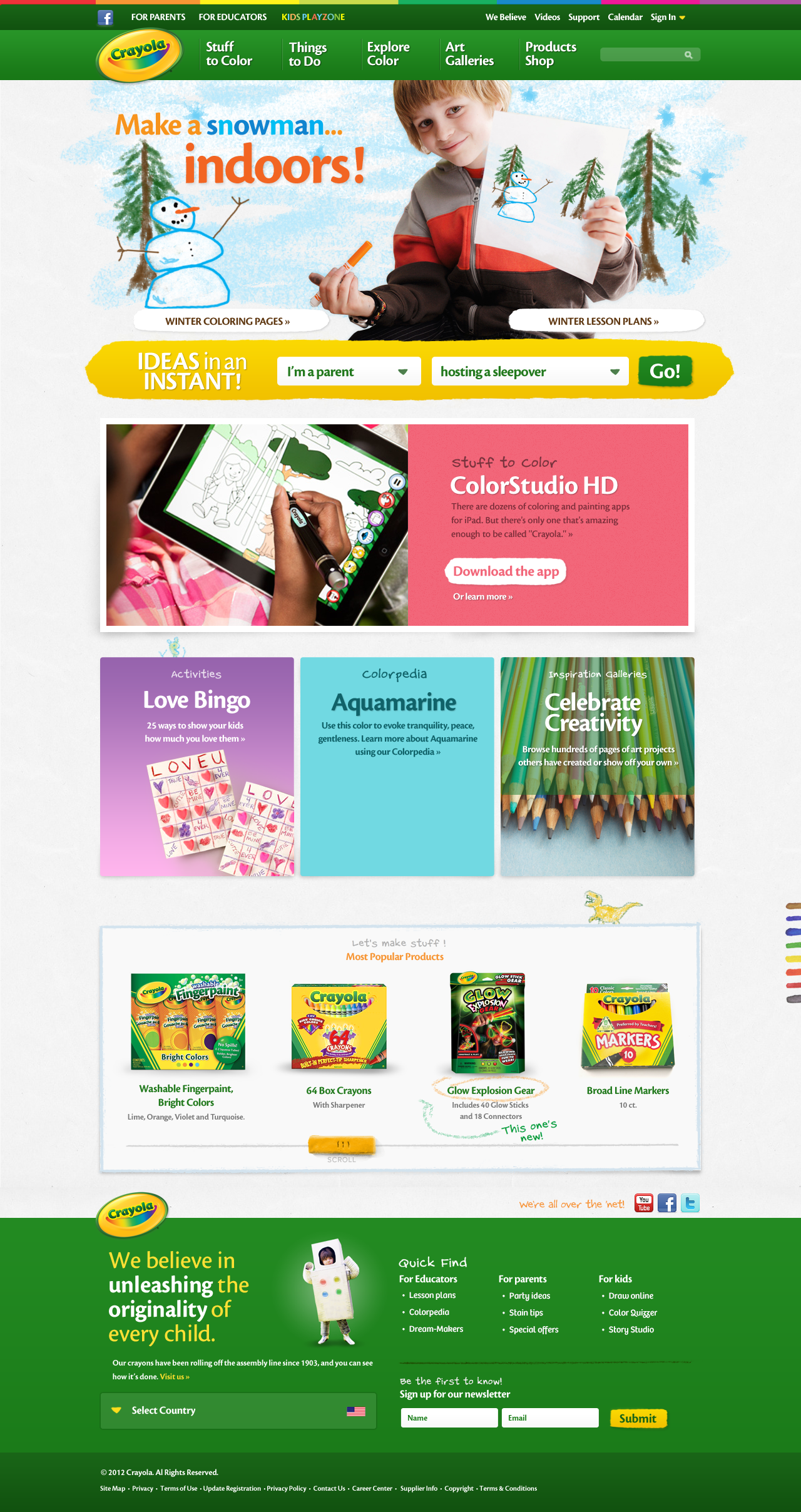
I walked through the new homepage my team and I came up with:
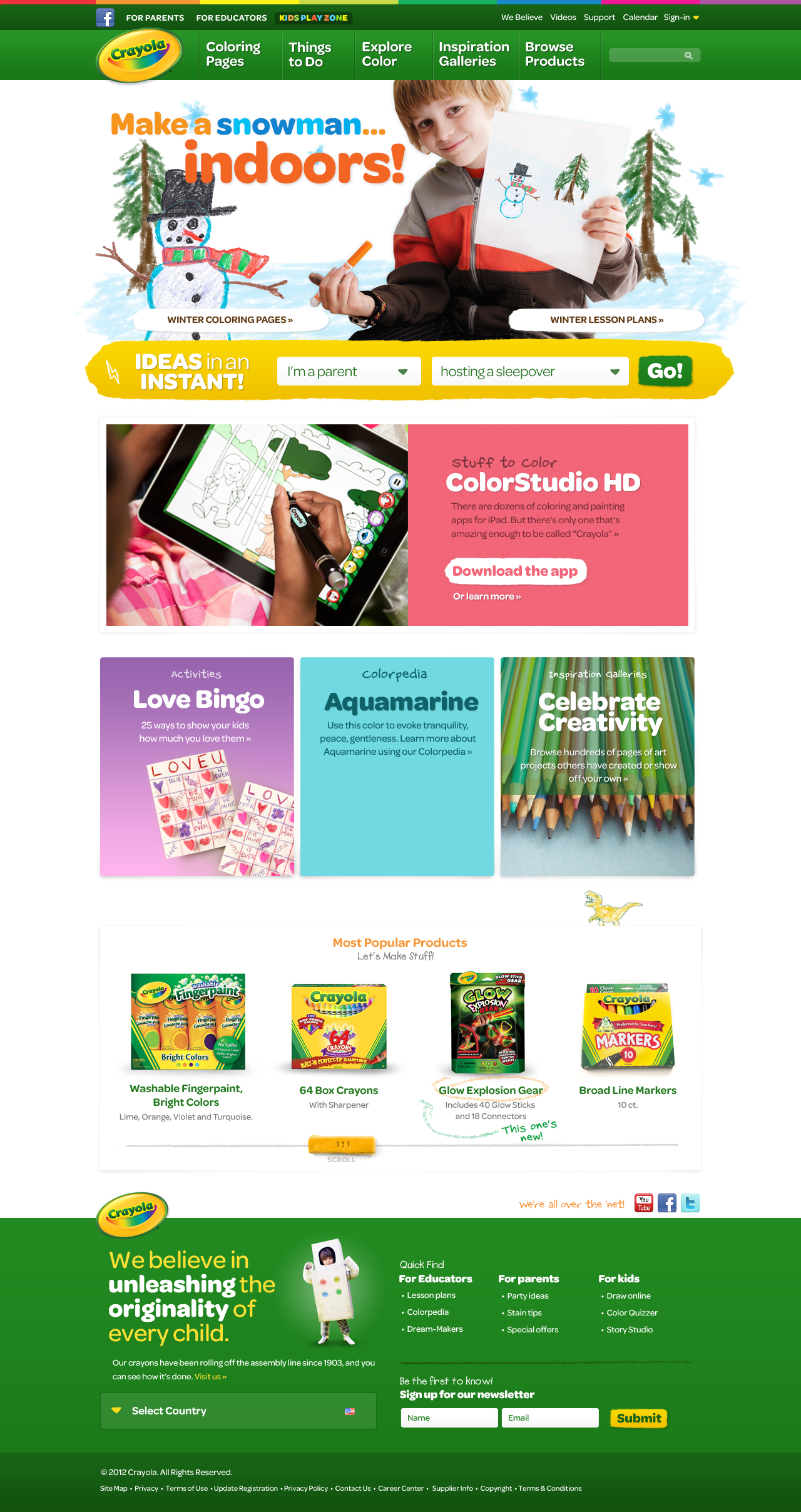
Most notably, there’s no Chronos in sight, on purpose. Instead, we opted to use Omnes from Darden Studio as the primary typeface. One thing I love about the first round of design is that it’s often the opportunity to show my most daring ideas… in this case, showing an option that might require a massive—read: expensive—change to all of their packaging and collateral. If the feedback I get is that it’s too comfortable of a move, I can always show something more conservative in a subsequent round.
Before I finished my walkthrough, I showed 3 simple slides to really drive the point home. Slide 1:

Rather than pontificating about the virtue of geometric sans serifs, I instead showed the alphabet chart that kids learn in school to point that it’s made of simpler forms like circles, lines, and triangles because they’re easier for kids to draw.
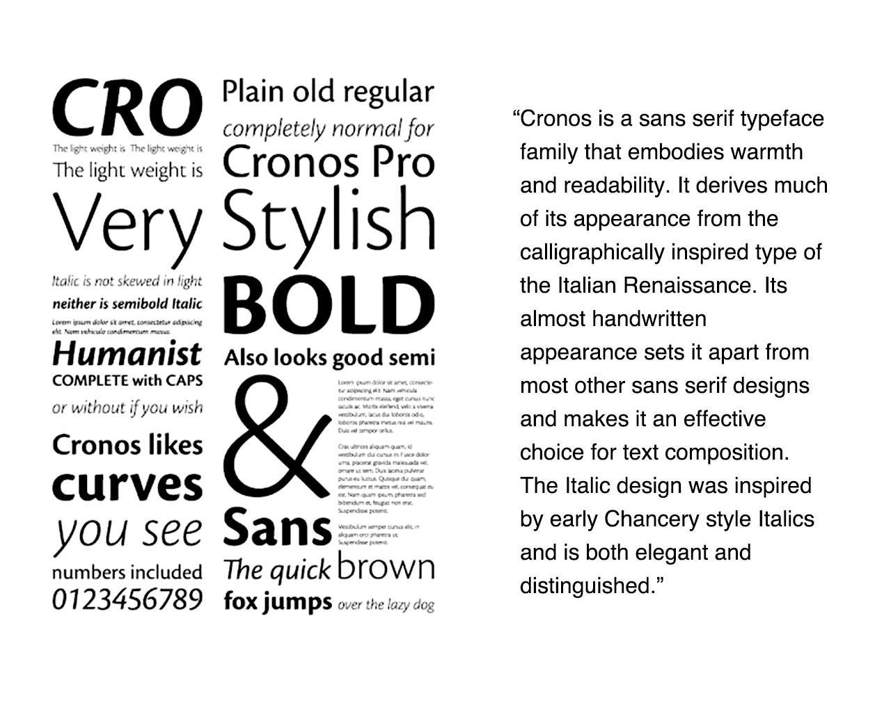
Slide 2 showed a specimen of Chronos, and I showed the text description directly from the foundry. I tried to hammer home the point that using a typeface that’s “elegant and distinguished” isn’t really what we’re going for strategically.
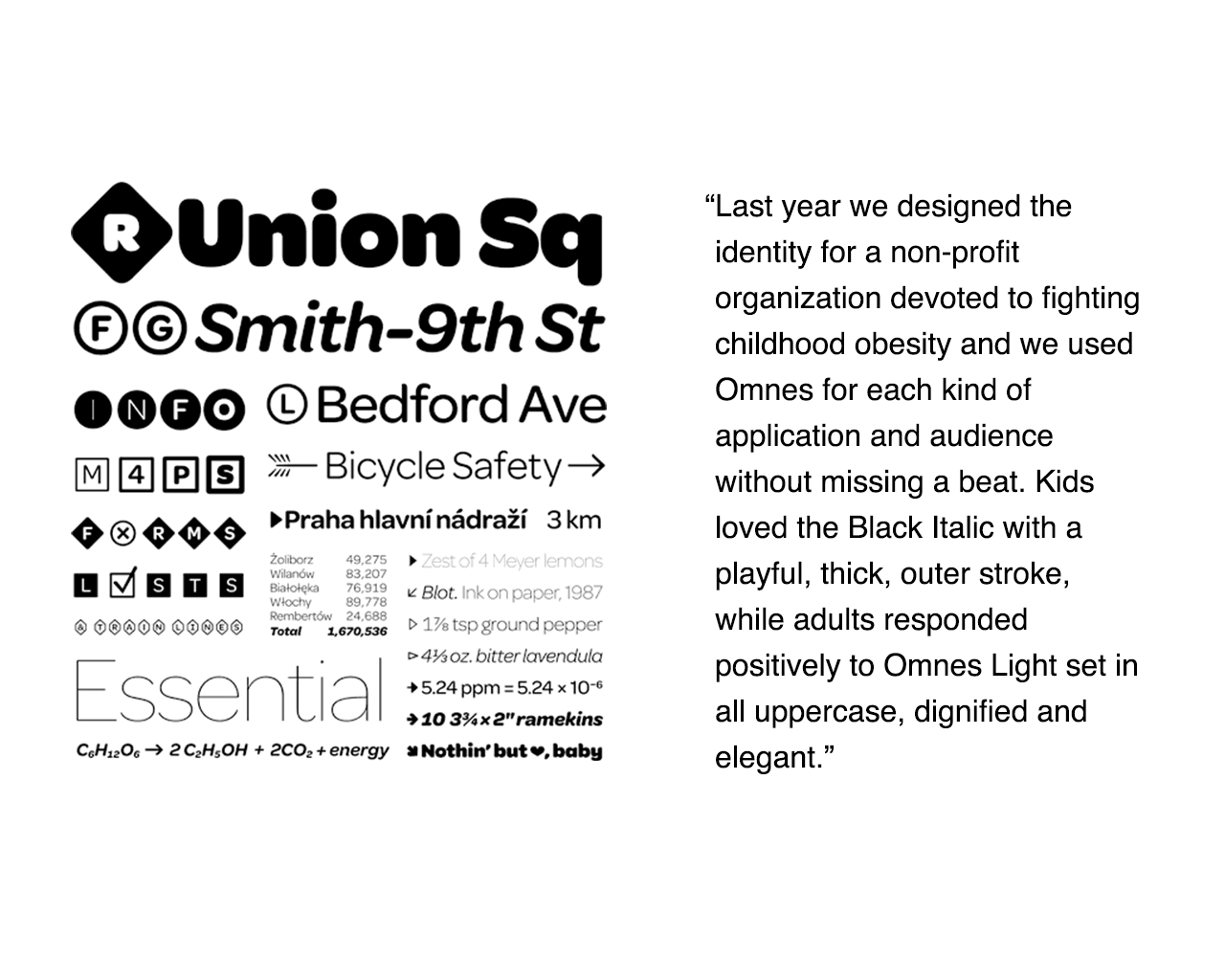
In contrast, the last slide I showed was an Omnes specimen and some text from a review from Armin Vit on Typographica, praising different weights as appealing to both kids and adults.
Because my clients were thoughtful and also because we’d earned some trust already, they took our recommendation seriously and said they'd think it over. Of course, they wondered what this design would look like with Chronos instead of Omnes. And, of course, we already had that prepared because we’d anticipated that it would come up. We showed it to them, prepared for the possibility that they might decide to go with it but emphasizing that this felt much less appropriate to the strategy we were all pursuing together.
A few days later, we received the feedback: they wanted to go with Omnes for the site! Hooray!
A few weeks later, our client surprised us when they shared some sketches of packaging for some new products that used—you guessed it—Omnes!
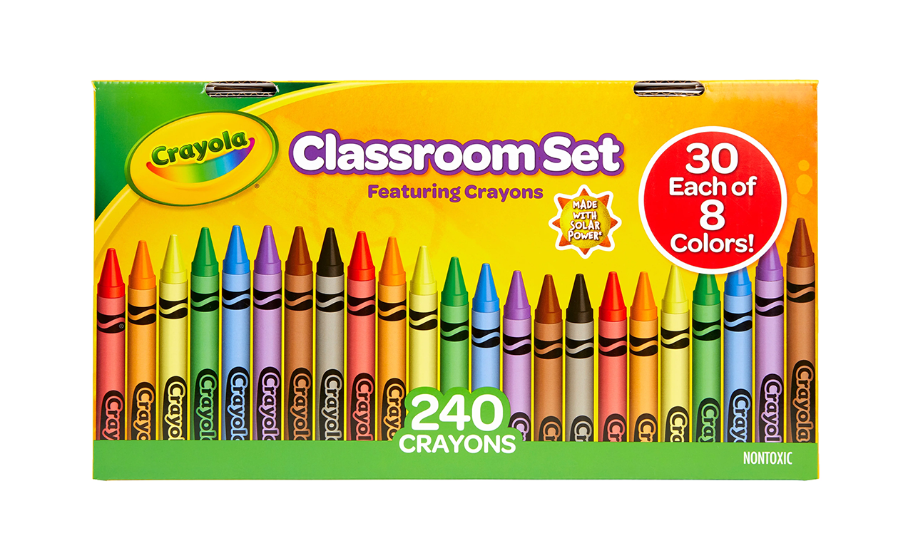
A few years later when my kids were at the school age where we shopped for crayons and markers every year, imagine my delight to find full aisles of Omnes-led Crayola packages in every Target and Walmart we went to.
I reflect often on how remarkable this outcome was, because there were a number of reasons stuff like this often doesn’t happen:
- It’s expensive
- Change is uncomfortable, no matter how objectively good
- Presumably, someone made the original decision for a reason, so we run the risk of discrediting the original decision (and person) by suggesting a change
I think the ingredients that made this possible were:
- Talking about typography as a strategic asset, not just a visual preference or choice
- A client who was willing to hear and truly consider all ideas
- An experienced team with the skills to make valuable suggestions
Of all of the factors, I think the most important ingredient that was a prerequisite was the decision to say something in the first place. I’ve seen too many designers decide too early that it’s not even worth it to suggest anything because the downsides seem too large. For years, we designers yearned for a seat at the proverbial table. But we failed to realize that, before we get access to the table, we can work on being strategic and clearly communicating how design is a strategic exercise. That’s the kind of stuff that keeps our seat at the table because everyone else sees the value of continuously inviting us back.
Read Next
How I Choose Typefaces
Join 67,200+ subscribers to the weekly Dan Mall Teaches newsletter. I promise to keep my communication light and valuable!