A few weeks ago, I kicked off the biggest design system project I’ve ever worked on. I’m incredibly lucky to be working with an organization in the top 10 of the Fortune 500 list to help create a design system that will govern all of the apps and sites they create internally. I’m also incredibly fortunate that they value doing this work well, which means our team has the proper leeway to do what we feel will produce a great outcome.
To ensure I’m as informed as possible, I took the opportunity to spend the first few days of the project to study like I (never) did in college. Physical and digital highlighter in hand and pixels, I pored over some of more popular design systems out there to see what insights I could glean. Here are my notes from those study sessions.
My research style leans heavily toward capturing phrases that stand out to me. I’ve been a long-time admirer of how Susan J. Robertson records passages in her book reviews, so I’ve taken a similar approach in these notes.
New York City Transit Authority Graphics Standards Manual
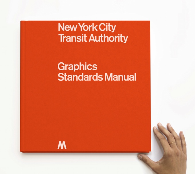
Massimo [Vignelli] used to speak of entropy, that inescapable scientific principle that dictates that systems fall apart, that extremes revert to the mean, that every rare instance of excellence is doomed to succumb to the average… Yet something amazing happened. The system endured. It endured, I think, for one reason… This manual, with all its exhaustive detail and maniacal comprehensiveness, is the reason.
The graphics are markedly consistent, with just enough oddities to make the whole thing interesting.
A slim white band across the top of nearly every sign demarcates… something.
Deferred maintenance meant borrowing against the future.
…a larger brief: a truly unified signage system, to cover the entire subway. It would specify guidelines for not only the look of the graphics but also where they belonged and why, system-wide.
More important than these little visual refinements, though, are the efforts toward comprehensibility. The true goal of the Graphics Standards Manual is not just to pretty things up but to direct people intelligently and swiftly.
A logical system required graphics that had been thoroughly thought through like this—so much so that they became simple again.
…it was a clear [solution] that any tourist could understand. It also never got done.
“…everything in the Unimark system is based on a one-foot-by-one-foot-grid. But in a lot of places, there’s not enough clearance to hang a one-foot-high sign from the ceiling. So what do you do then? The book doesn’t tell you anything.”
An essential part of fixing the New York City subway involved making it comprehensible.
As good as the graphics are, plenty of people still get on the wrong train every day.
The passenger will be given the information or direction only at the point of decision. Never before. Never after.
(I’m impressed at how strong the recommendations in this manual are. We don’t often see that level of assertiveness.)
Whenever new graphics standards are developed or existing standards are revised, new manual pages will be issued.
It is vital that all signs be read easily and understood quickly. This demands the consistent use of a distinctive type face (sic) throughout the entire system.
(Love the strong language!)
iOS Human Interface Guidelines
One thing that strikes me most about the iOS Human Interface Guidelines over other design systems is that it feels as much like a marketing site as it does documentation. The other systems I’ve reviewed feel more like specifications; though well-written, they do feel a bit dry. Perhaps, in true Apple fashion, the housing for the guidelines feels like it’s selling me a bit, enticing me to use it the way a good SaaS site does. It occurs to me that any design system that needs to do some amount of evangelizing—i.e. all of them—should have a bit of sales pitch in them.
As an app designer, you have the opportunity to deliver a killer product that rises to the top of the App Store charts. To do so, you’ll need to meet high expectations for quality and functionality.
(Such powerful language!)
Salesforce Lightning Design System
When I hear and talk about design systems, the quintessential one that immediately comes to mind is Lightning Design System. The Salesforce team has done a fantastic job documenting and sharing how they’ve made this work so well for them. The first pictures in my head about what I’d make for this project certainly resembled the Lightning Design System.
Once I got into it at a granular level, I realized how general and generic everything is. For example, take this passage about tables from the Displaying Data guidelines page:
A table is the most basic format for displaying a list. Each record is represented by a single row of data that begins with the record’s primary field and shows additional fields in subsequent columns. The data is labeled using column headers that can be interactive. This display type is appropriate for large numbers of records because you can easily scan it and navigate the list using sorting, filtering, or scrolling.
That’s a great guideline, but there’s nothing about it that’s specific to Salesforce developers. It’s useful for anyone making a table, anywhere, ever.
The whole site is full of great general knowledge like this. So why does this stand out as a great example of a design system for me? I eventually realized that what’s so special to me about the Lightning Design System isn’t the system itself as I originally thought, but how effectively the team has evangelized it. Between the talks I’ve seen, tweets I’ve read, and Slack channel discussions I’ve observed, everyone is talking about Lightning. Any good design system needs people to use it, and that means it also needs people to extol its virtues so that others use it too. Lightning is likely the best example I’ve seen of that philosophy executed well.
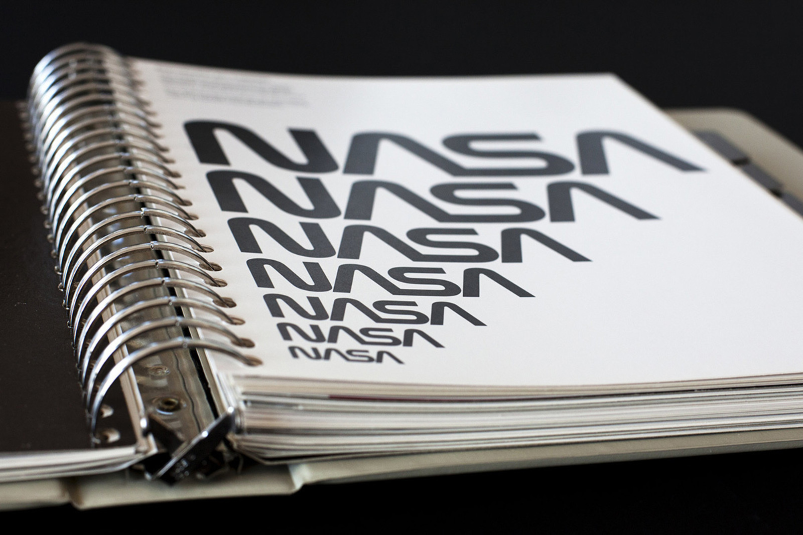
National Aeronautics and Space Administration Graphics Standards Manual
[The logo] was accepted by the arts commission, though reluctantly, with a note about its “limited sculptural possibilities.”
…a graphics identity program had the potential to do for government agencies what it had done for corporations: convey modernity rather than stodginess, and forward-looking and efficient practices rather than hidebound ones.
“…if government publications—from tax returns to road signs—were attractive and easy to read, people would read them and respect them… the morale and the productivity of our public servants would rise dramatically if they could work in a decent environment.”
…the problem was not just one of type sizes and white space but of administration.
A good graphics program could unify the 11 NASA centers, at least visually, and at the same time systematize all the documents, signs, and other materials they produced, which at the time varied from crude to nondescript.
“In order to succeed, a program which departs from the accustomed must have the full support of every NASA employee. Top-level management must take the lead, our experts in the field of graphic design must follow, and all of us must see that the specifics are diligently monitored to insure that standards of excellence are maintained.”
(The important of good governance from the start!)
Perhaps because [top executives had] been left out of the process, they were irritated, and their disdain found a focus right away, because some of them flat-out hated the new logo.
(The importance of involving stakeholders)
“Why wasn’t [the process] handled this way from the start? I don’t have to like it, but I can see it’s a real program, and I’m okay with it now.”
Material Design
I didn’t quite get the hype about Material Design when it first launched, largely because of the way it was announced. (I still don’t really get it, which is why I asked.) I actually thought the launch video was a parody. The language the designers used might as well have been announcing major scientific breakthrough, not the way a few shapes and colors have been arranged on a screen. That’s not to knock anyone, but, as a fairly pragmatic designer, that type of pontificating doesn’t resonate with me. It seems like a lot of sizzle without the steak. Perhaps that’s because the designers I learned from often had incredible foundations and concepts for all of their work. (Seriously, read the amazing comment thread on this Designologue, kids.)
I’ll also admit that there’s a bit of envy there too. I’ve instructed many a design intern or apprentice to consider consistent light sources for their interfaces by shining a spotlight of physical elements on their desks and paying specific attention to the changes in perspectives, shadows, and more. It always gets my goat when something I’ve been doing for a long time gets branded as new. Props to the Google Design team for recognizing the power of wrapping an impactful narrative around common practice.
It wasn’t until I watched the video about color theory that I heard a little gem I finally could connect with. As the opening line, the narrator says:
There are no wrong colors.
It dawned on me: the beauty of Material Design is that it’s nearly impossible to make a bad design, even—or especially—if you’re not a designer. I realized that it’s the opposite paradigm of the type of design I admire. Take, for instance, the sites you’d come across in a gallery like The FWA or Awwwards. Many of those are beautifully art-directed and have a very strong and unique aesthetic sense. But I’ve had the privilege of knowing and talking to some of the designers whose sites regularly get featured there. Many of them design based on intuition and what feels right to them from their vast experience, but struggle to articulate why it works. That’s not replicable or transferable to anyone else, which is perhaps the most desired quality of a design system. That kind of work is often about a strong aesthetic with little rationale, but the key to Material Design seems to be very strong opinions about a very ordinary style.
While I could do without the high-falutin’ pomp and circumstance, I can certainly appreciate how a very high level of philosophy and principles can be a compelling rallying cry for adoption.
Airbnb Design Language System
Though I appreciate the great writing the Airbnb team has done about their new design system, it's hard to get much more than surface insights without being able to test drive Airshots. But even without seeing the tactical output, this nugget from VP of Design Alex Schleifer’s post really resonated with me:
You can’t innovate on products without first innovating the way you build them
I love that they’re addressing the important fact that good tools for working with design systems don’t exist yet.
IBM Design Language
There are 2 specific things I really appreciate about the IBM Design Language:
First, they make it clear right up front that the purpose of their design system is to foster a consistency that supports their brand:
The IBM Design Language is a set of living guidelines that communicates our brand promise through our products’ experiences.
That brand promise is then reinforced by asking the design system user if what they’re making looks, sounds, thinks, and performs like IBM. A question like, “Does the visual design enhance people’s understanding of how the world works?” has a strong point of view; it states the job design has to do, which also means it implies what the design does not have to do. I love that!
The other thing I love about the IBM Design Language is that the site looks like some put thought into the job of the site itself. It eschews what is becoming the standard “design system look” of left-side (and sometimes fixed) navigation and content to the right. It feels more like a marketing site than a piece of documentation, which I’m leaning more and more toward as the right idea for my client.
I’ve reviewed a few more design systems like the Harmony Design System from Intuit, the Microsoft Design Language, the U.S. Web Design Standards, Origami by the Financial Times, and a few others, and I’m definitely finding more similarities than discrepancies.
The biggest observation I’ve had is that almost every one includes principles and guidelines that are extremely general. That’s totally understandable; I mean, at some point, a good tabset is just a good tabset. But, while it’s useful for any reader to understand how to make a better website in general, I think these are a missed opportunity. The job of the Microsoft Design Language is not only to help a designer or developer to create a great app, but to help them create a great Microsoft app. What makes a great Microsoft app? How is a great Microsoft app different than a great Google app? This is the kind of thing a design system should have guidelines for: perspective, point of view, extending creative direction to everyone that decides to build something with the design system. That stuff should be baked in. Otherwise, we all might as well use Material Design and call it a day.
I think that’ll be my first metric for success. If the design system I create for my client can be specific about what makes a great site or app specifically for them and why it’s better in-context than any one of the systems listed above, I’d say we’re headed in the right direction.
I realize that’s a tall order and I’m a short guy, but that’s never stopped me before.
Read Next
Apprenticeships
Join 67,200+ subscribers to the weekly Dan Mall Teaches newsletter. I promise to keep my communication light and valuable!